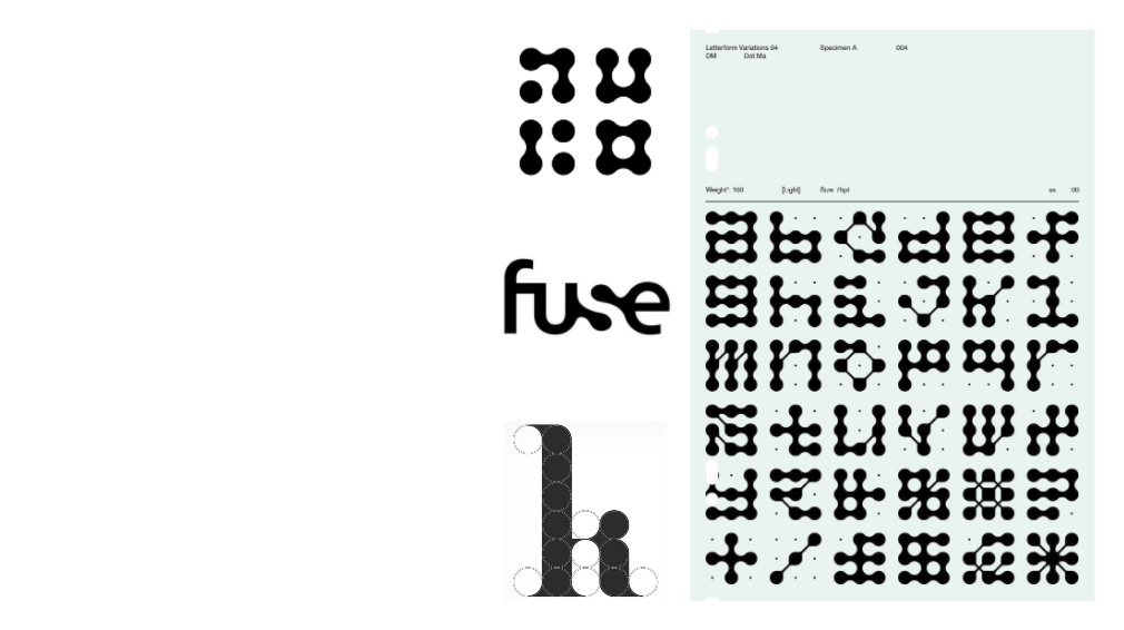
In our first PlayLab workshop, we were introduced to the world of shapes, typography, and branding through the lens of Alice Galli, a freelance graphic and motion designer from Catania, Italy. Alice shared her practice, particularly her unpublished typeface Lydra, and guided us in exploring how simple shapes can evolve into complex narratives.
Shapes as the Foundation of Design
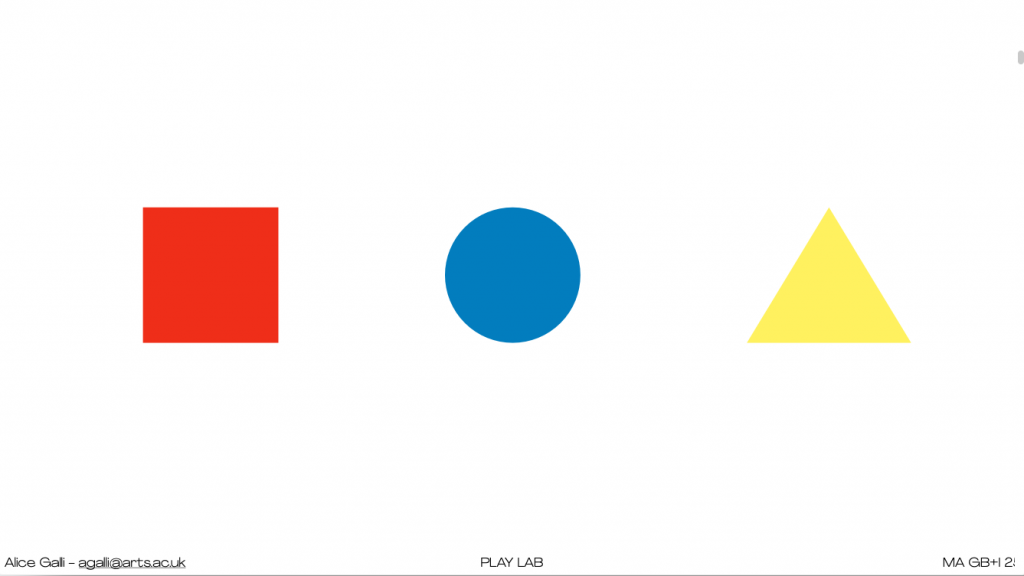
Alice began with three primary forms square (red), circle (blue), and triangle (yellow) a nod to Bauhaus in Germany (1919), and Wassily Kandinsky’s exploration of geometry and colour. We also learned how women in the Bauhaus were largely confined to textile design, while figures like Herbert Bayer went on to design iconic typefaces later picked up by global brands like Nike and even vodka advertising.
Each shape carries its own meaning in branding:
- Square – stable, grounded
- Circle – spiritual, calm
- Triangle – dynamic, energetic
This thinking immediately linked to real-world examples: the Headspace app uses circular forms in its motion videos to visualise breathing; London Underground employs strong geometric signage; and NTS radio plays with light as shape.
Narrative Power of the Triangle
The triangle proved to be the most versatile. It can signify mountains, play buttons (YouTube), or even luxury branding, like the downward-pointing triangle in Prada’s logo. Adding colour shifts meaning further: Toblerone builds its brand on a mountain-shaped triangle, while Doritos emphasises their snack’s geometry with “be more triangle.”
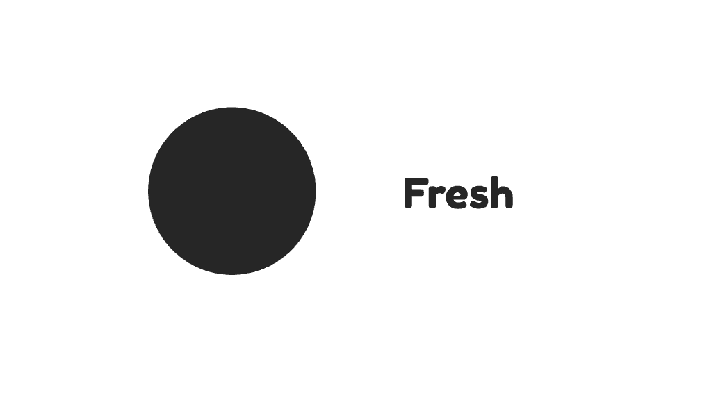
Our Group’s Process: Fresh + Circle
Our team chose to focus on the circle, pairing it with the idea of freshness to inspire a new brand concept. We brainstormed keywords such as natural, fundamental, molecular, organic, and sustainable. These values connected freshness (juicy, raw, unprocessed, green) with the circle (wholeness, cycles, energy, community).
Finding Connections: Fresh × Circle
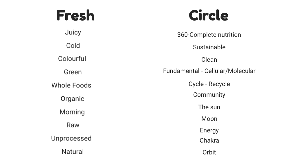
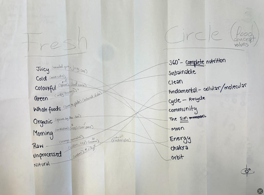
One of the key exercises in our process was to bridge the idea of “Fresh” with the conceptual values of the circle, especially within food branding.
We brainstormed words around freshness, juicy, cold, colourful, green, whole foods, organic, raw, unprocessed, natural and then aligned them with the symbolic qualities of the circle wholeness, 360° nutrition, sustainability, community, energy, cycles.
Some interesting connections emerged:
- Juicy ↔ Energy: the burst of flavour and vitality mirrors the energetic, flowing quality of a circle.
- Green / Organic ↔ Sustainable / Community: fresh produce links to cycles of nature and shared food culture.
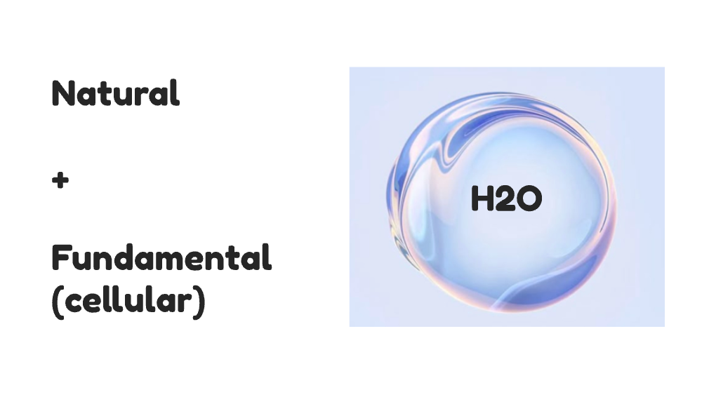
- Raw / Unprocessed ↔ Fundamental / Cellular: the purity of raw food reflects the elemental, molecular meaning of the circle.
- Morning ↔ Cycle / Orbit: freshness at the start of the day relates to daily rhythms and circular repetition.
This mapping exercise helped us see how abstract shape values could be tied to concrete branding narratives. For example, a circle is not just a form it can stand for wholeness, balance, and community, all of which are deeply relevant to the story of “fresh” food products.
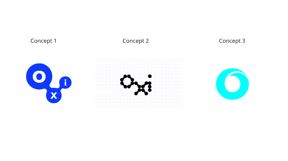
From there, we began sketching names and identities:
- OMI (from the Yoruba word for water)
- OXI (oxygen, essential balance)
- O-ter (orbit + water)
- Ripples (a visual metaphor for expansion)
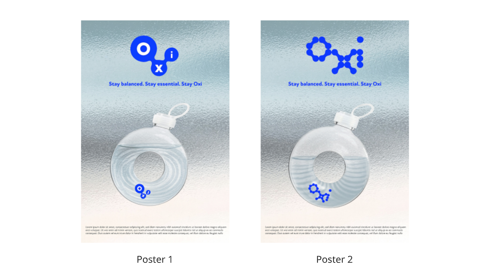
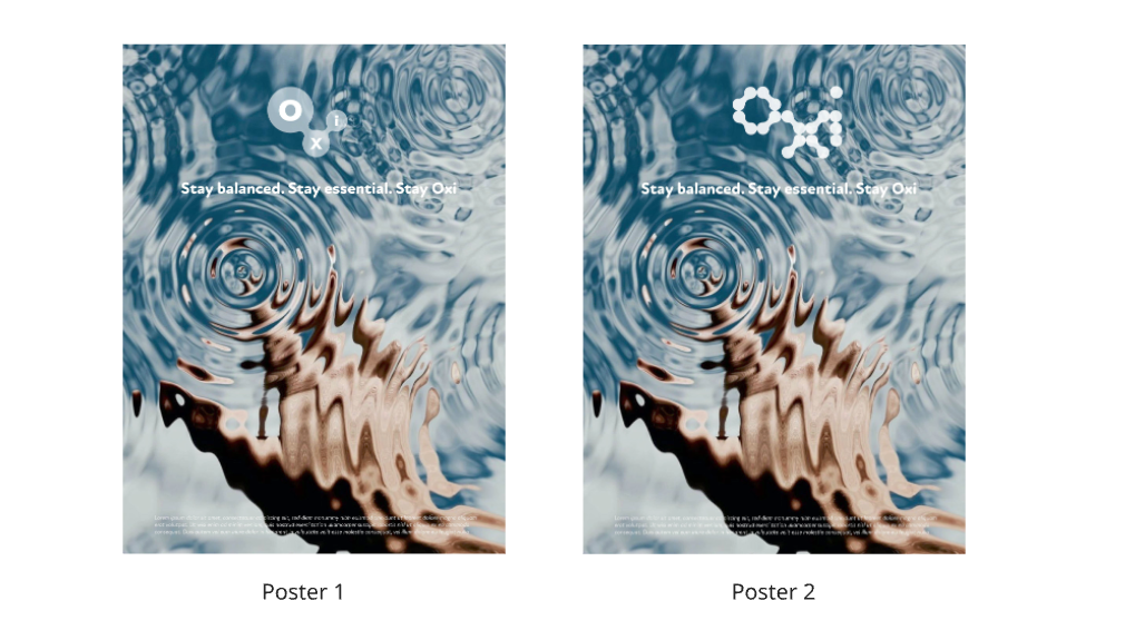
We eventually gravitated towards OXI, because of its clean, elemental connection to oxygen and water. We developed the tagline:
“Stay balanced. Stay essential. Stay Oxi.”
Visual Exploration
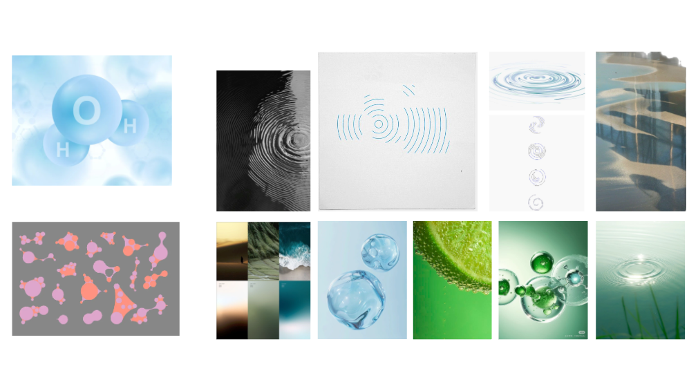
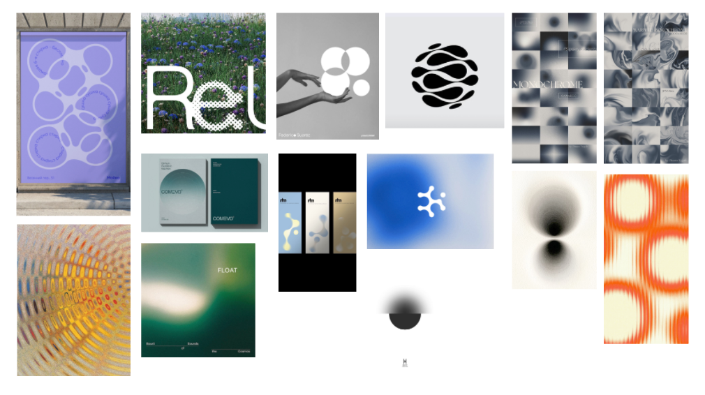
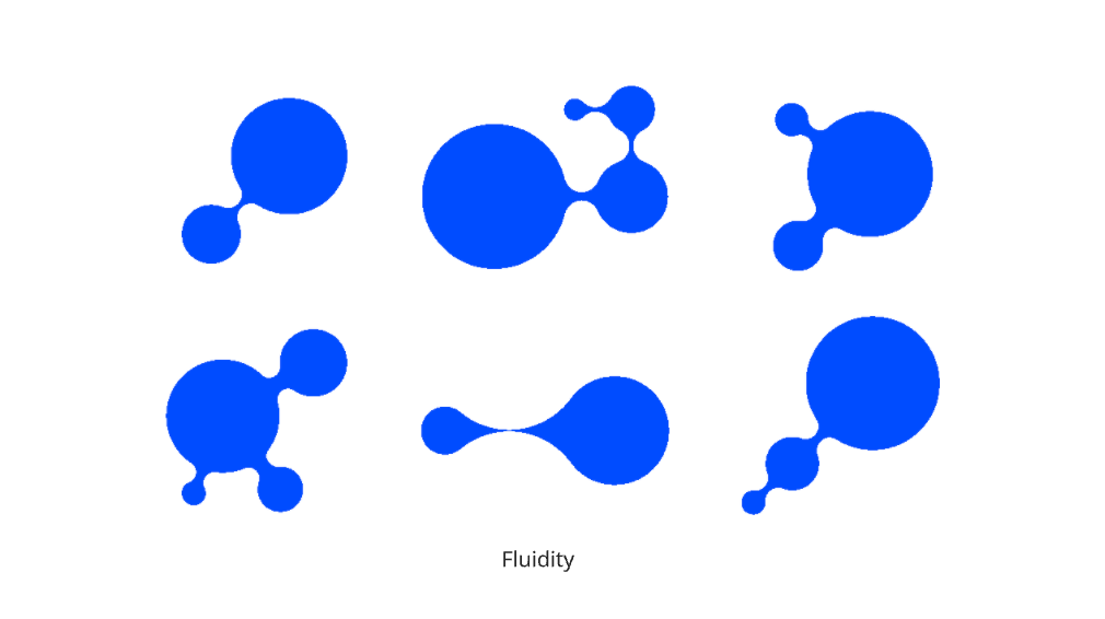
We experimented with both analogue sketches and digital mockups overlaying circles, repeating ripples, and intersecting “O” and “X” forms. Some ideas were inspired by molecules, cycles, and drops of water.
Personally, I was most drawn to the wordmarks built with circular typeforms, since the workshop itself was framed around creating a typeface from shapes. For me, designing the letters through circular construction felt the most conceptually strong direction for OXI.
Unfinished but Evolving
This remains an unfinished design project. As a group, we spent a lot of time developing research and conceptual groundwork, but didn’t have enough time to fully resolve the final poster or typeface. We hope to revisit the project later to refine the wordmark and visual identity further.
Reflection
Even though incomplete, the workshop showed me how a single shape like the circle can generate powerful stories and identities. OXI represents a balance of concept and form, and this process reminded me that branding is not just about the final output, but also about exploring meaning and narrative through design.
Leave a Reply