Context and Progress
As Rotation 1 concludes, this stage of my project marks the transition from research and conceptualisation to initial visual design development.
Following my Sensing Belonging study at LSBU Sports Hall, my concept Re:Play was developed as a community-driven brand system that transforms the transient badminton environment into a space of reconnection and shared rhythm.
Since the final submission is due in January 2026, these initial design assets represent an early visual exploration rather than a finished outcome.
Working Process: Visual Exploration
Before developing the initial brand assets, I focused on building a visual foundation through iterative experiments with typography, effects, colour palettes, and composition.
This stage aimed to translate the energetic and rhythmic qualities of the badminton experience into a cohesive visual identity.
Typography & Motion Effect Exploration


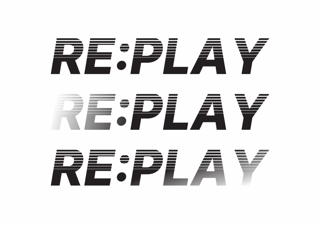
I began by experimenting with different typographic treatments to express rhythm, speed, and repetition.
Using motion-inspired line effects and angled letterforms, I tested how visual vibration could represent the sound and movement of rallies.
These trials helped define the direction of the final wordmark dynamic yet structured, reflecting the collective rhythm of play rather than individual performance.
Colour and Gradient Testing
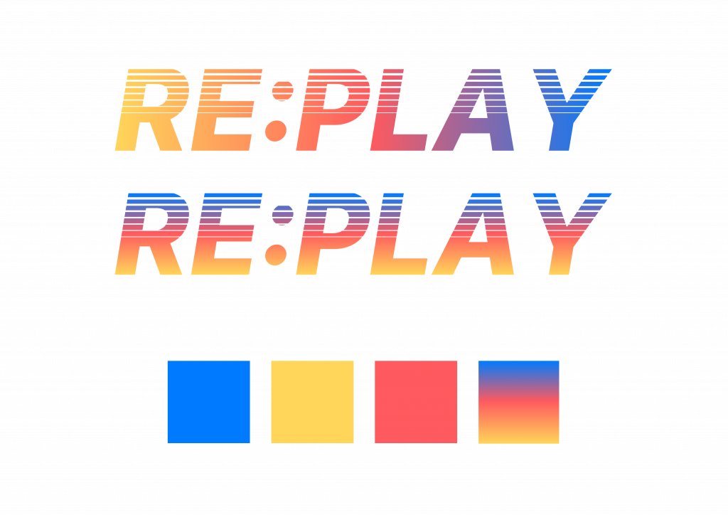
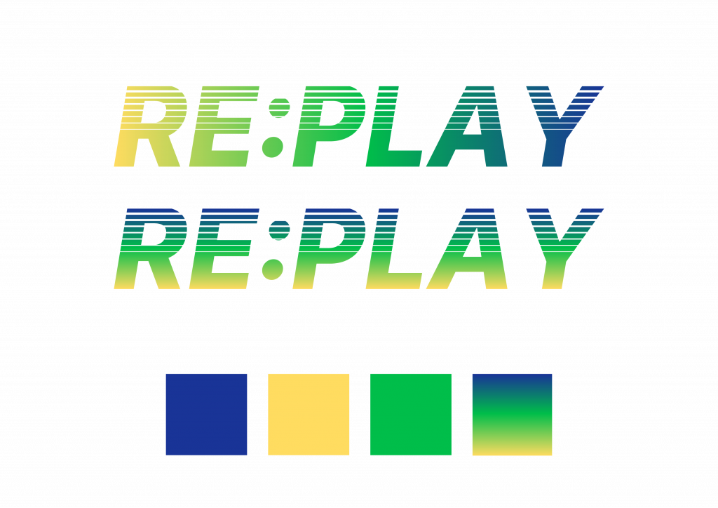
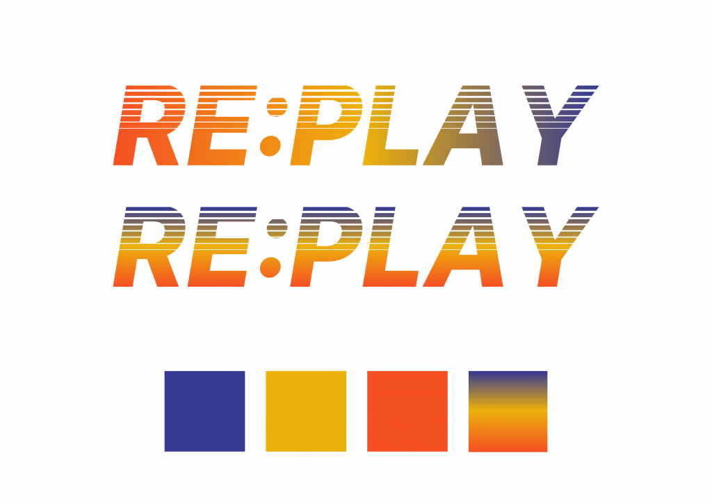
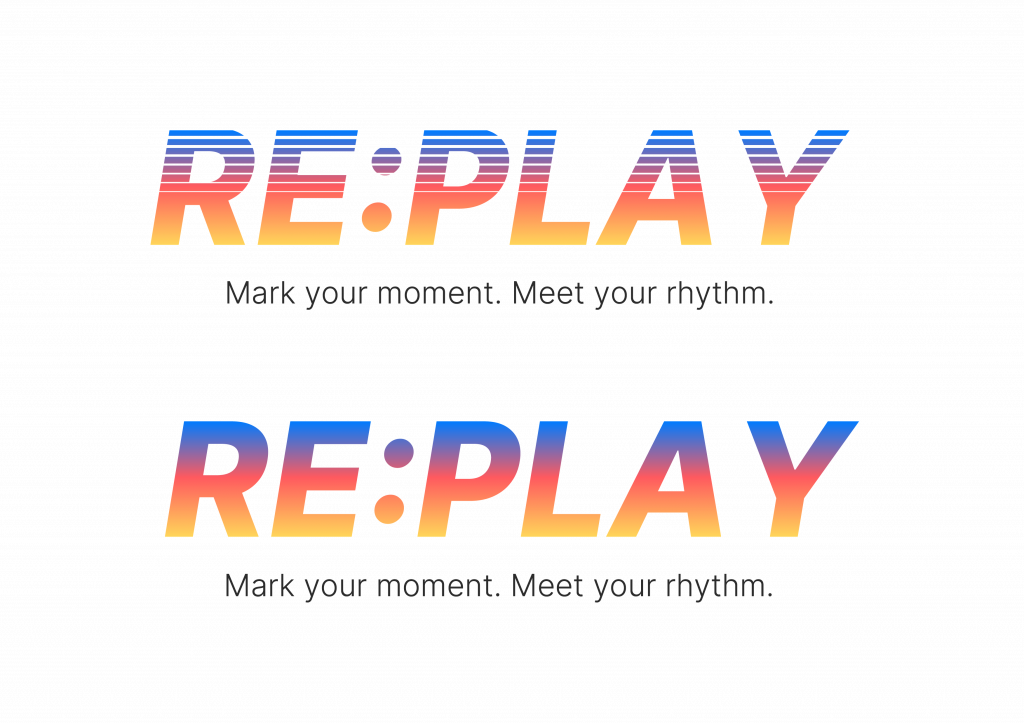
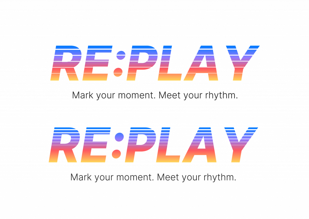
Next, I explored several colour palette combinations, testing both solid and gradient applications.
The goal was to find a balance between energy and inclusivity: colours that feel active and playful without being overly commercial.
Gradients were particularly effective in visualising transition and connection echoing how players move, interact, and overlap across sessions.
Through this process, I realised the gradient could symbolise diversity in rhythm rather than a fixed brand tone.
Poster Illustration and Layout Experiments
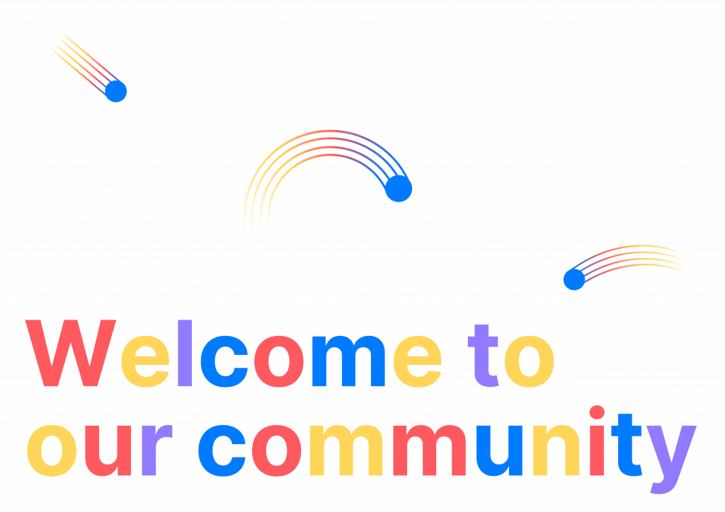

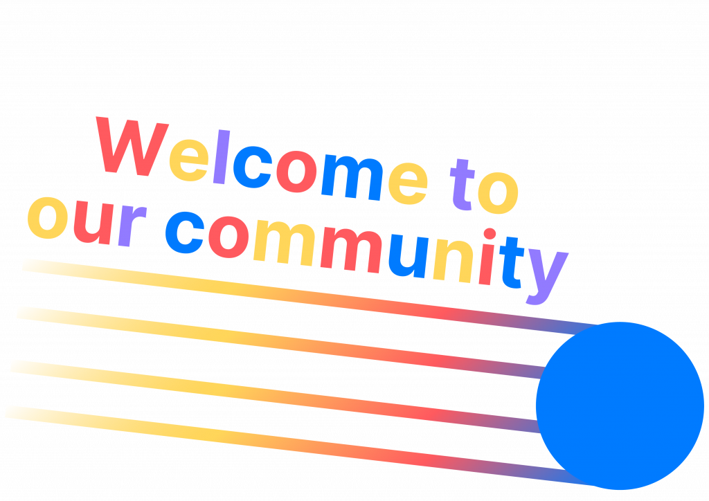

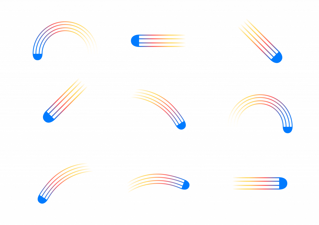
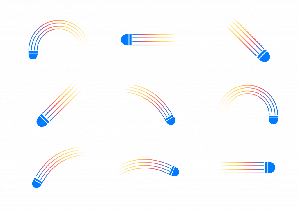
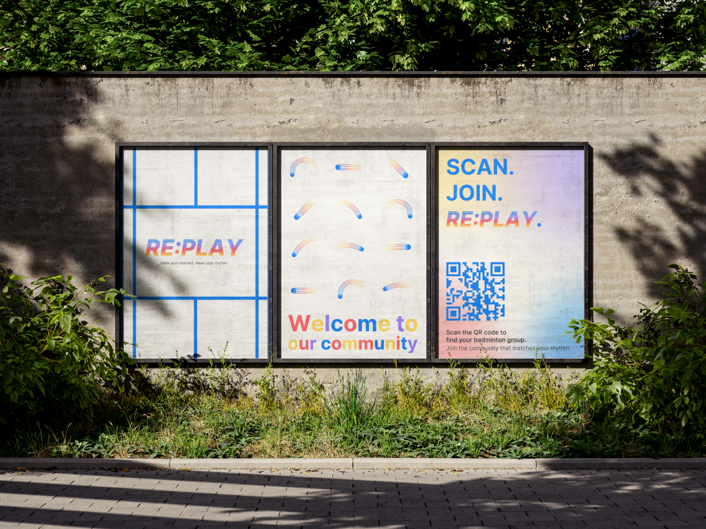
The poster development began with testing the composition and visual rhythm of shuttle-inspired illustrations.
Each curve was informed by actual badminton movements serve, smash, clear, drop, and drive transforming sport trajectories into graphic motion lines.
I tested various ways to integrate the illustration with text elements such as “Welcome to our community”, aiming to find a layout that felt open, approachable, and rhythmically balanced.
This exploration helped me understand how to visualise belonging through movement and how visual rhythm could support the brand’s welcoming tone.
Initial Design Assets
For this phase, I produced three key brand assets that visualise the early identity of Re:Play:
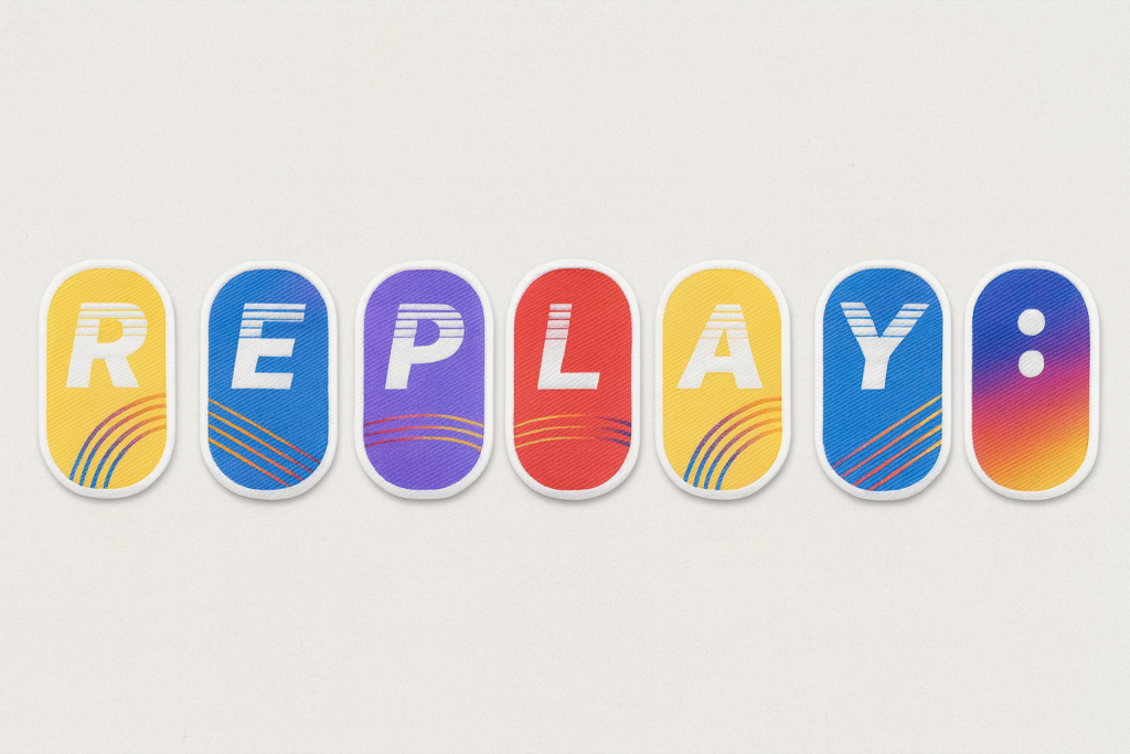
- Fabric Stickers – representing the collectible R, E, P, L, A, Y : tag system. Each colour and curve references movement and energy within the badminton hall.
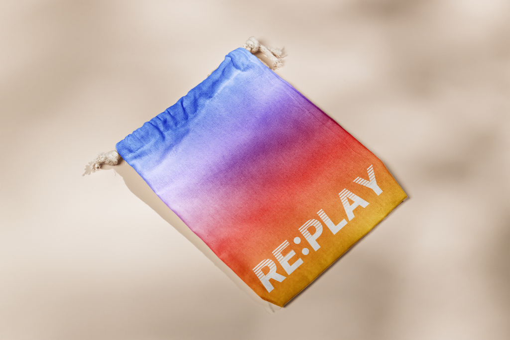
- Reusable Collection Bag – designed as a tactile, personal archive for players to store their collected tags. The soft gradient fabric reinforces the brand’s sensory focus on touch and motion.
- Posters – positioned as public touchpoints for welcoming newcomers and promoting community visibility. The illustrations are based on the trajectories of shuttle movement Serve, Smash, Clear, Drop, and Drive translated into flowing curves and kinetic compositions.
Design Rationale
The identity currently focuses on rhythm, colour, and motion rather than literal representation of badminton.
My intention was never to design a sports product brand, but a community experience brand.
Therefore, the design language emphasises connection through rhythm rather than equipment or competition.
The gradient palette emerged from my observation of players’ clothing and energy within the space sportswear in badminton culture is often vibrant, layered, and expressive.
Rather than assigning symbolic meaning to each hue, I used gradients to visualise diversity in motion: multiple players, backgrounds, and tempos blending into a single shared rhythm.
This reflects my earlier insight that belonging in badminton is dynamic, not fixed.
Feedback Reflection
During the recent feedback session, peers and tutors provided valuable perspectives that revealed gaps in clarity and communication:
- Some viewers outside the badminton context perceived the visuals as belonging to a music or performance brand, due to the emphasis on rhythm and gradient colour.
- Others noted that the brand could better communicate welcome and inclusion, suggesting that I integrate more explicit badminton cues (e.g. shuttle or racket forms).
- A few comments encouraged the development of a distinct logo for the community itself, to strengthen its collective identity.
This feedback highlighted an important challenge: balancing metaphorical design language (rhythm, connection, sound) with contextual specificity (badminton as cultural and spatial practice).
Reconsideration and Next Steps
Based on this critique, I am currently reframing my next design stage for Rotation 2:
- Reconsidering the brand name (potentially Re:Match or Re:Game) to better align with the sporting context while preserving the idea of repetition and reconnection.
- Exploring ways to integrate shuttle-inspired element possibly through iconography, motion lines, or texture so that the community connection is visibly anchored in badminton.
- Refining the colour narrative, articulating how gradients express rhythm, diversity, and energy without becoming too abstract.
- Continuing to test how the brand system functions socially, rather than visually how it enables players to feel recognised, included, and “in rhythm” with others.
Reflection on Learning
This design phase deepened my understanding of how visual identity operates as communication, not only aesthetics.
Feedback revealed that clarity of intention is as crucial as conceptual strength.
Designing for community requires empathy, translation, and iteration especially when representing intangible experiences like rhythm or belonging.
In the next stage, I aim to create a more grounded visual system that balances symbolic meaning and recognisable form, ensuring that Re:Play (or its new form) resonates both with insiders of the community and with those encountering it for the first time.
Leave a Reply