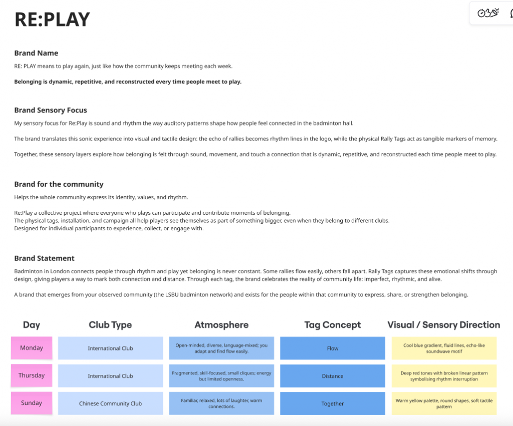
Dear Farmer: Building a Brand Through Research, Empathy & Empowerment
Part 1: Research
Our Rotation 02 brief invited us to explore branding through open methods working transparently, showing our process publicly, and learning directly from systems rather than assumptions. Our group (Kee, Gwen, Roxanne, Roxin and I) began with five simple but powerful questions:
Who’s here?
Who knows about this?
Who could it be for?
What else is happening here?
Who else is here?
These five questions shaped the foundation of our research.
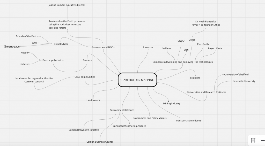
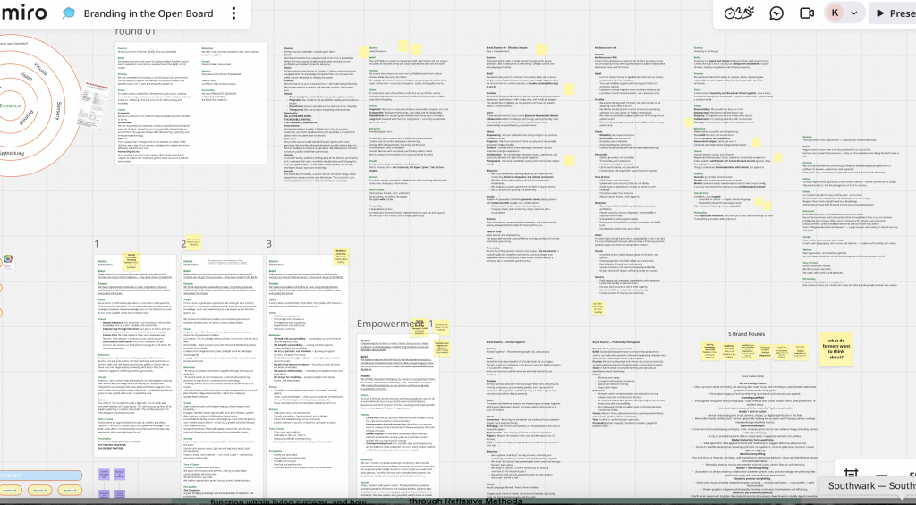
1. Who’s here? Stakeholder Mapping
We started with a wide stakeholder mapping exercise to understand who exists in the ecosystem of Enhanced Weathering (EW). Using online sources, industry reports, NGO documents, and competitor websites, we mapped a broad network:
- Internal stakeholders: scientists, geochemists, engineers, project managers, designers, farm operators.
- External stakeholders: farmers, landowners, NGOs, policymakers, environmental activists, carbon-credit platforms, mining suppliers, and academic institutions.
This helped us see how interconnected and multi-layered the Enhanced Weathering world is from scientific knowledge all the way to local farming communities.
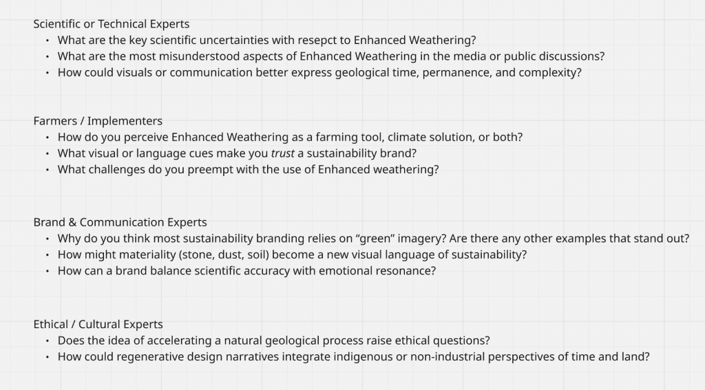
2. Who knows about this? Expert Research & Outreach
We then identified who currently holds knowledge in this field:
climate researchers, soil scientists, regenerative agriculture experts, carbon market analysts, and government advisors.
We prepared interview questions for four categories of experts:
- Scientific / Technical Experts
- Farmers / Implementers
- Brand & Communication Experts
- Ethical / Cultural Experts
We reached out to researchers, scientists, and policy advisors across climate-tech, agriculture, soil science, and carbon-removal sectors. Although we didn’t receive responses within the two-week window, the process helped us refine our blind spots and understand which expertise is central to the EW ecosystem.
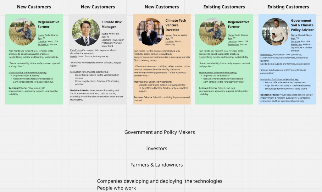
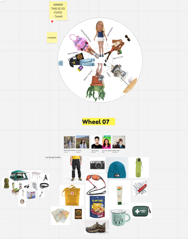
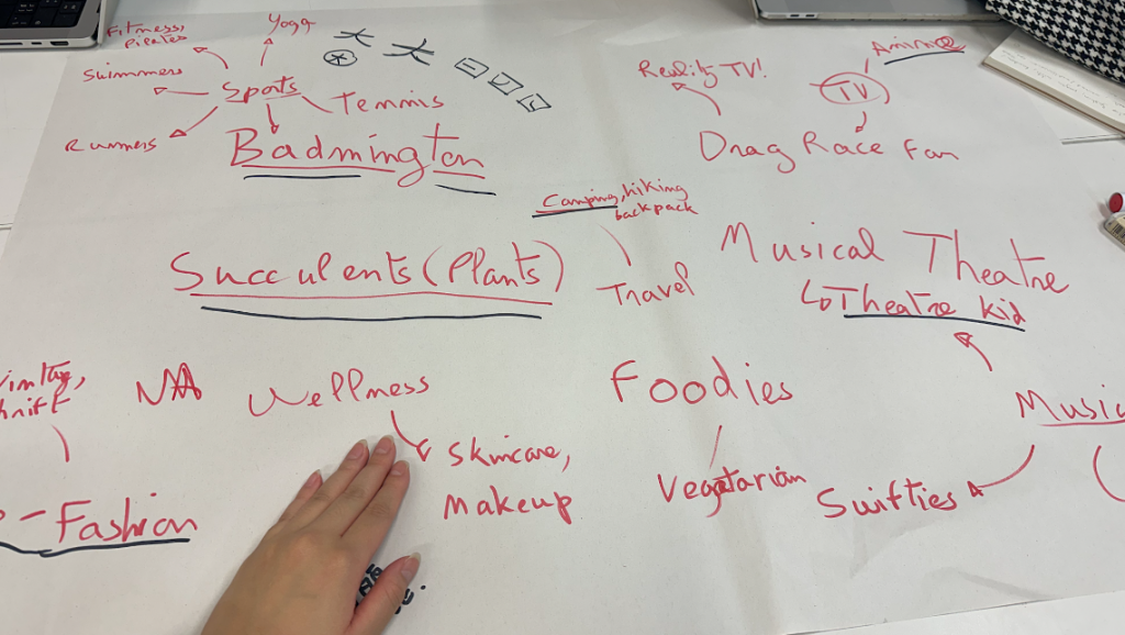
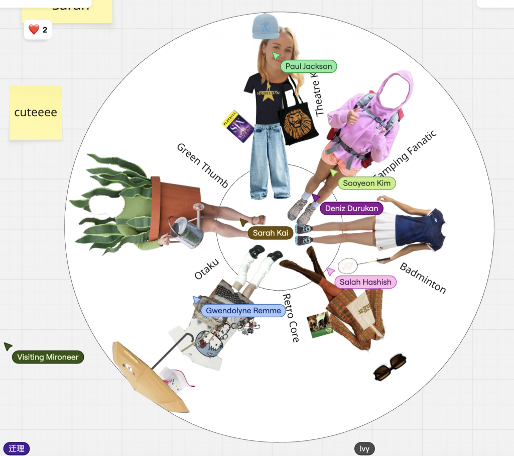
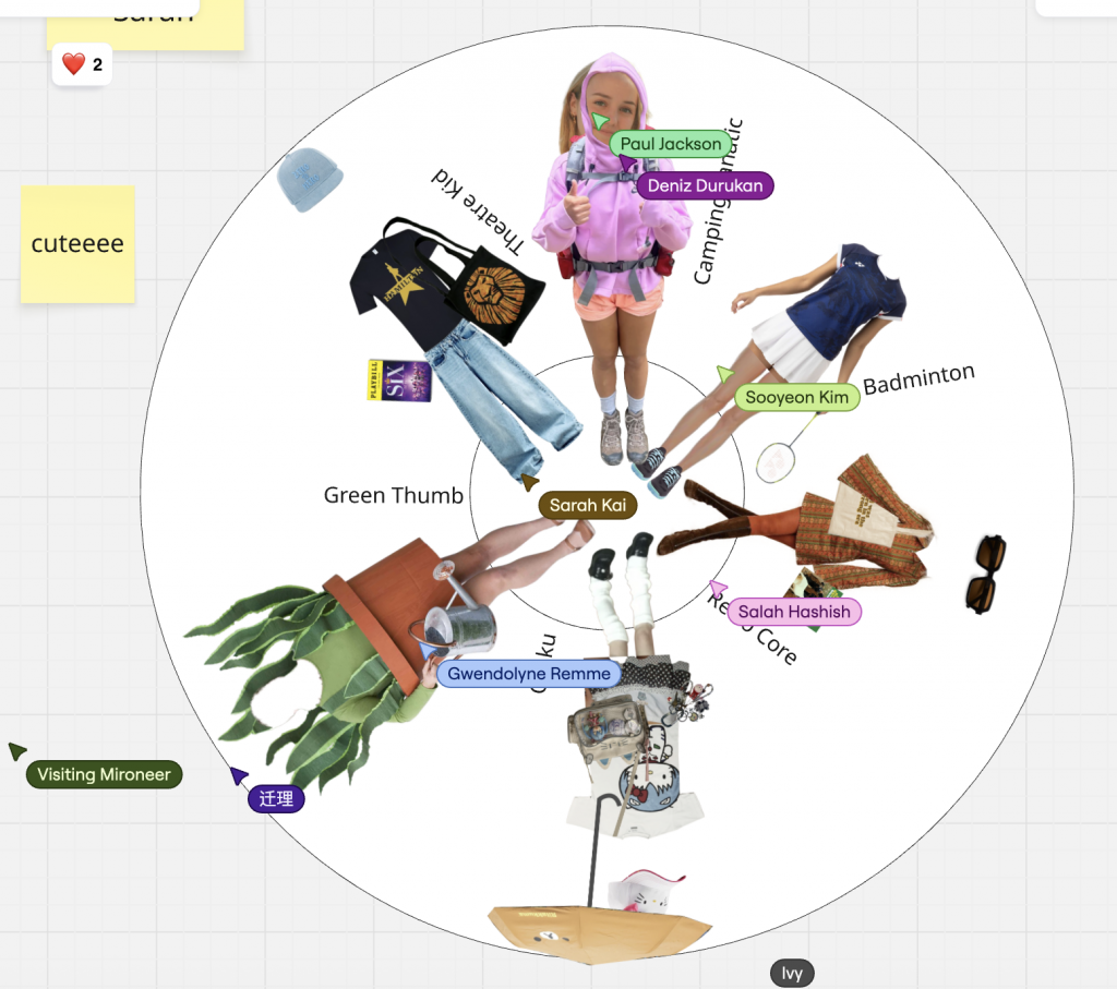
3. Who could it be for? Audience Definition & Personas
Initially, we created five personas across different potential audiences: venture investors, policy advisors, climate-tech managers, general consumers, and regenerative farmers.
Through discussions and early critique, we realised our project required a farmer-first direction. Enhanced Weathering succeeds only if farmers accept it, trust it, and experience real value from it. So our final audience became:
→ Farmers and agricultural communities.
They became the emotional, functional, and narrative heart of our brand.
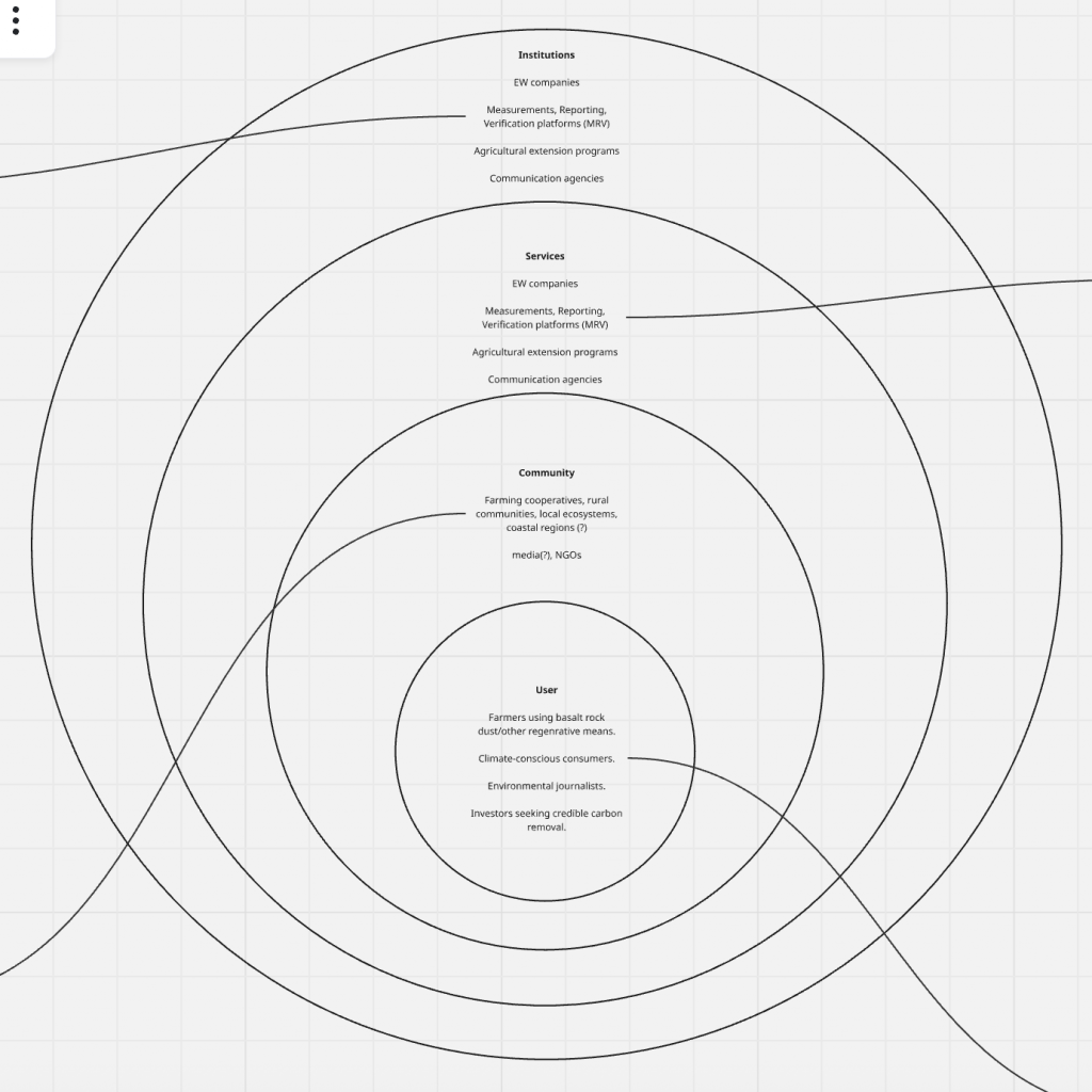
4. What else is happening here? Ecosystem Mapping
Our ecosystem map reframed Enhanced Weathering as a living system supported by four layers:
User Level
- Farmers using basalt rock dust
- Climate-conscious consumers
- Environmental journalists
- Investors seeking credible carbon removal
Community Level
- Farming cooperatives
- Rural communities
- Local ecosystems and coastal regions
- Media groups and NGOs
Services Level
- EW companies
- MRV (measurement, reporting, verification) platforms
- Agricultural extension programs
- Communication agencies
Each layer had roles, enablers, and constraints, revealing systemic barriers like low farmer awareness, weak outreach capacity, high operational costs, or lack of trust in carbon markets.
Institution Level
- EW companies (regulation + technology)
- MRV frameworks
- Regulatory bodies
- Soil and climate governance systems
This mapping helped us understand where a brand could intervene not just visually, but structurally.
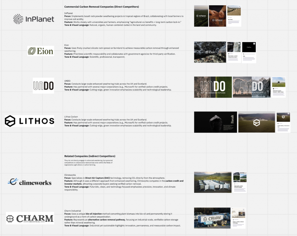
5. Who else is here? Competitor Analysis
We explored four direct EW competitors:
- InPlanet (Brazil) — community-centred, tropical agriculture focus
- Eion (US) — highly scientific, verification-driven
- UNDO (UK/Scotland) — large-scale, industrial trials
- Lithos (North America) — data-driven and AI-powered precision agriculture
And indirect competitors like Climeworks (DAC) and Charm Industrial (bio-oil carbon storage).
We analysed each company’s tone, visual language, brand positioning, audience, and experience journey.
This helped us understand what EW brands were already doing well and where gaps existed:
farmers were rarely the emotional centre of these brands.
Part 2: Think, Feel, Do
We moved next into the emotional landscape of farmers:
How do they currently see EW, and how do we want them to think, feel and act?
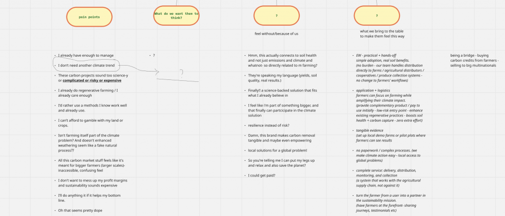
Pain Points
Farmers commonly expressed (through online sources, forums, research papers):
- “I already have enough to manage.”
- “I don’t need another climate trend.”
- “This seems too risky, expensive or science-heavy.”
- “I use methods I trust and understand.”
- “I can’t gamble with my soil.”
- “Carbon markets feel inaccessible and confusing.”
- “It sounds like something only big farms benefit from.”
These pain points guided our communication tone simple, familiar, practical.
What We Want Them to Think
- “This connects directly to my soil and yields.”
- “This is science I can trust.”
- “This solution fits the way I already farm.”
- “Carbon credits feel less confusing now.”
What We Want Them to Feel
- Resilient instead of at-risk
- Supported, not pressured
- Part of something meaningful and bigger
- That climate action is accessible, practical, and locally relevant
What We Bring to the Table
- Practical, no-disruption logistics
- Tangible demonstrations (pilot plots, local evidence)
- Clear, simplified science
- A full-service system (distribution, monitoring, collection, carbon-credit handling)
- A farmer-first narrative that treats them as leaders, not users
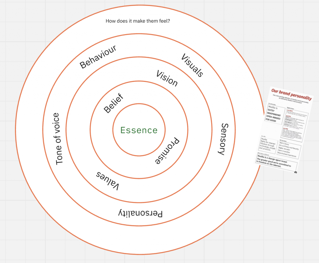
Brand Essence Development
We explored five early routes:
- Wisely sharing knowledge
- Land that earns
- Ease + empowerment
- Resilience over risk
- Investing in our future
After critique, we realised we needed a single essence to build multiple routes from.
“Regeneration” was our first attempt but felt too broad and not uniquely meaningful.
So we pivoted to a more specific, grounded essence:
Brand Essence: Empowerment
Essence
Empowering farmers to make climate action simple, profitable, and collaborative—turning complex science into everyday opportunities.
Belief
Everyone deserves access to clear, science-based climate solutions. Real change happens when we remove barriers and build connections.
Promise
We simplify Enhanced Weathering for real-world use. We handle the complexity so farmers can focus on growth, community, and impact.
Vision
A climate economy where participation is open to all—and where farmers become profitable environmental leaders.
Values
- Clarity first
- Empowerment through connection
- Shared success
- Uncompromising trust
Tone of Voice
Clear, competent, collaborative.
Personality
The Ecosystem Connector.
The Pragmatic Educator.
The Action-Oriented Guide.
Part 3: Verbal Narrative Exploration
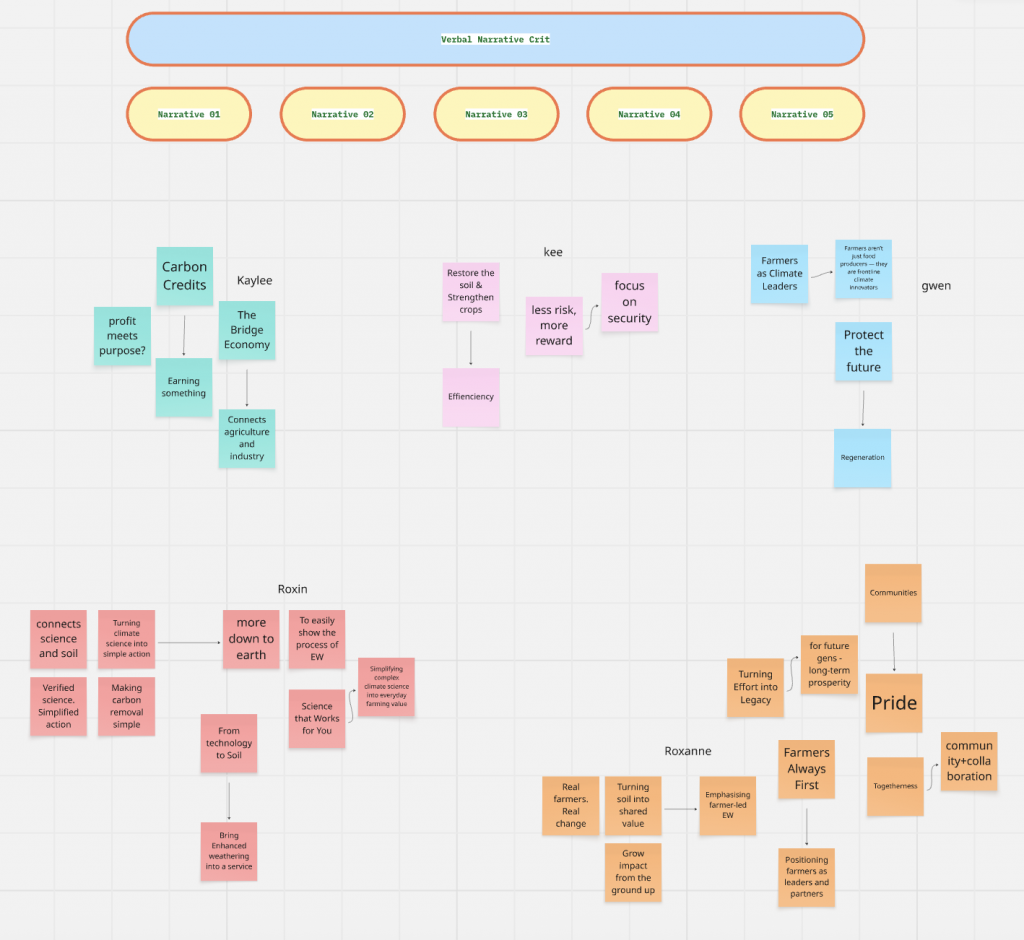
Each of us developed one narrative route:
- Resilience Over Risk
- The Value Bridge
- Farmers as Climate Leaders
- Simplifying Climate Science
- Farmers Always First (Hero Archetype)
Crit Feedback (Summary)
During the verbal narrative crit, a few themes emerged:
1. Keep the brand farmer-first, simple, and clear.
Avoid abstract, conceptual visuals. Stick to real soil, real fields, real equipment.
2. “Resilience Over Risk”
Very relevant. Visuals needed to feel more grounded and less artistic.
3. “The Value Bridge”
Concept strong but initially too abstract. Needed to be expressed in down-to-earth language.
4. “Farmers as Climate Leaders”
A high-level identity piece useful for the emotional framing of the final narrative.
5. “Simplifying Complex Science”
A core pillar. Vital for adoption of EW.
6. “Farmers Always First”
A human, emotional route strong alignment between Gwen and Roxanne’s directions.
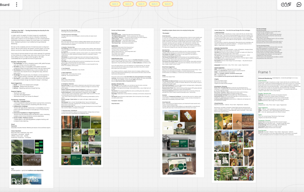
Overall Synthesis
Our final direction became a fusion of:
- farmer identity & empowerment
- clarity & simple science
- security & resilience
- shared value & connection
This synthesis shaped our final narrative: Dear Farmer.
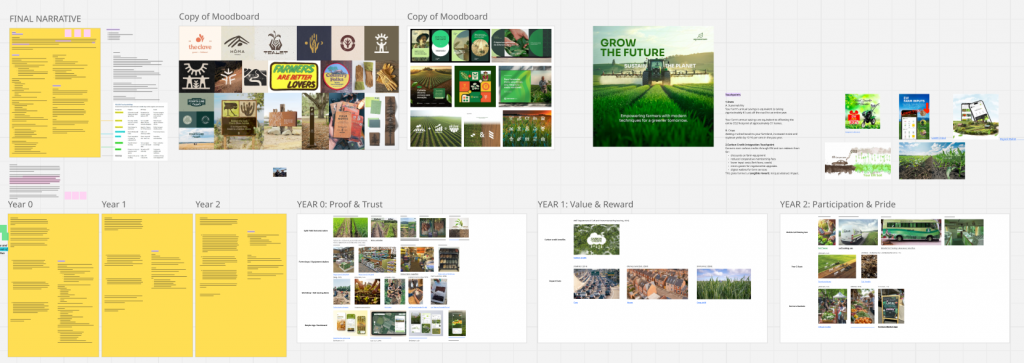
Part 4: Final Narrative
Dear Farmer: Our Brand Story
Dear Farmer is a brand built on empowerment.
A climate solution designed not to burden farmers, but to strengthen them.
Our narrative begins with a simple belief: farmers already lead the way in adapting to a changing climate. Our role is to support that leadership with clarity, tools, and trust.
Using Enhanced Weathering a natural volcanic mineral applied to soil we turn rainfall into a climate ally. The process enriches soil, improves yields, and captures carbon without adding extra work.
Our story unfolds through yearly letters, mirroring the seasons. Farming takes time, and so does regeneration. Letters allow us to speak in the same rhythm farmers already understand: slow, steady, patient.
Each letter shows what matters most:
- Year 0 shows proof
- Year 1 shows value
- Year 2 shows pride
Letters feel personal and grounded not like a digital notification or marketing message. They create continuity and trust, one season at a time.
Year 0: Proof & Trust
In Year 0, Dear Farmer introduces Ferratech® through proof, not pressure.
We adopt a small section of land, apply volcanic rock at no cost, and let the natural process begin. Rainfall triggers carbon-locking reactions. Soil improves quietly beneath the crops. Farmers keep 100% of profits; we handle the science.
Our touchpoints are practical:
- split-field demonstrations
- soil testing workshops
- free samples through local farm shops
- satellite-verified progress tracking
- a simple, bot-less platform
Year 0 exists to earn trust through results before asking for any commitment at all.
Year 1: Value & Reward
One year in, farmers can see and feel the difference.
- Maize and soybean yields rise by 12–16%
- CO₂ removal equals the footprint of 37 homes
- Soil shows measurable improvements in pH and mineral balance
Farmers begin unlocking financial benefits through carbon credits and agricultural incentives.
Touchpoints now focus on value delivery:
- a carbon-credit wallet
- lower input costs
- equipment discounts
- micro-grants for regenerative upgrades
- clear environmental statistics
Year 1 empowers farmers with real, practical benefits not ideals.
Year 2: Pride & Participation
By Year 2, the farmer becomes a local climate leader.
Soil tests from our “Regeneration on Wheels” mobile van reveal richer soil, stronger nutrient density, and long-term carbon storage equal to 22,400 mature trees.
Cereal yields increase by 20%.
Farmers begin sharing their experiences at markets, cooperatives, and conventions helping others join the movement.
Touchpoints reflect community and pride:
- soil-testing vans at local events
- clear impact visuals (trees, yields, CO₂ savings)
- presence at farmers’ markets
- storytelling through the voices of farmers
Year 2 shows sustainability not only working but spreading.
The System Behind the Narrative
To clarify the logic of our brand:
Problem: farmers face rising climate pressure but carry all the risk.
Belief: climate action should empower farmers, not add to their load.
Solution: Enhanced Weathering supported fully by Dear Farmer.
We provide the rock dust, logistics, verification, and carbon-credit access.
Payoff: regenerated soil, better yields, clearer economics.
Brand sustainability: built on trust, continuity, and community impact.
This mirrors the “Brand System” summary in our PDF:
challenge → bridge → payoff → solution → shift.
Conclusion
Rotation 02 taught me that branding isn’t just visuals or slogans it’s a system of relationships.
Through open research, emotional mapping, expert framing, and narrative critique, our team built Dear Farmer, a brand that respects the pace of farming, the intelligence of farmers, and the complexity of climate solutions.
Instead of selling sustainability, we grounded it.
Instead of overwhelming farmers with science, we simplified it.
Instead of asking them to trust us, we chose to earn it year after year.
Dear Farmer became not just a brand, but a partnership built on empowerment, clarity and shared growth.