Tag: Branding

  • Initial Design Development Sensing Belonging: Re:Play

    Context and Progress

    As Rotation 1 concludes, this stage of my project marks the transition from research and conceptualisation to initial visual design development.
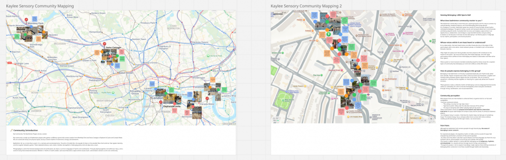
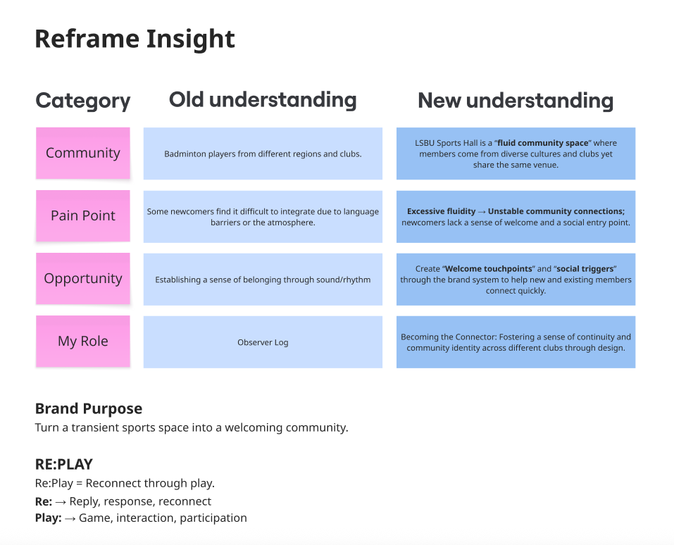
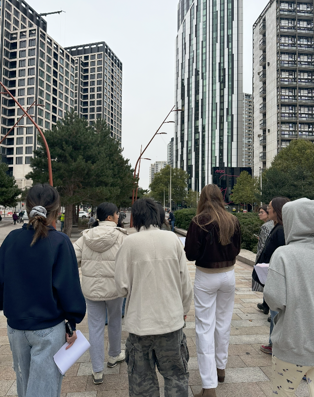
    Following my Sensing Belonging study at LSBU Sports Hall, my concept Re:Play was developed as a community-driven brand system that transforms the transient badminton environment into a space of reconnection and shared rhythm.
    Since the final submission is due in January 2026, these initial design assets represent an early visual exploration rather than a finished outcome.

    Working Process: Visual Exploration

    Before developing the initial brand assets, I focused on building a visual foundation through iterative experiments with typography, effects, colour palettes, and composition.
    This stage aimed to translate the energetic and rhythmic qualities of the badminton experience into a cohesive visual identity.

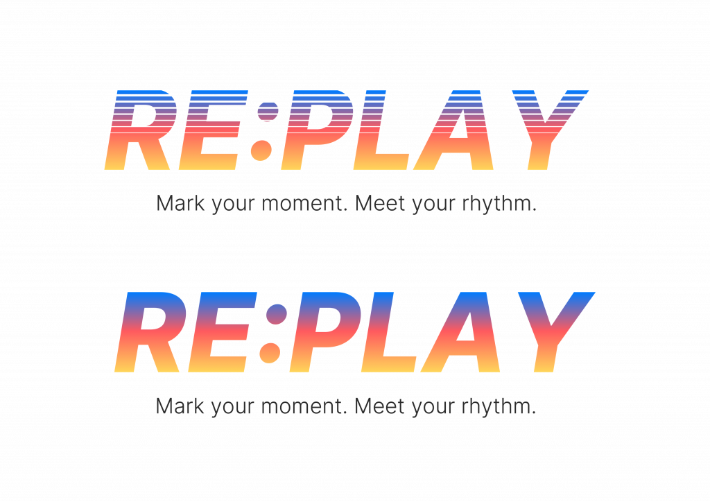
    Typography & Motion Effect Exploration

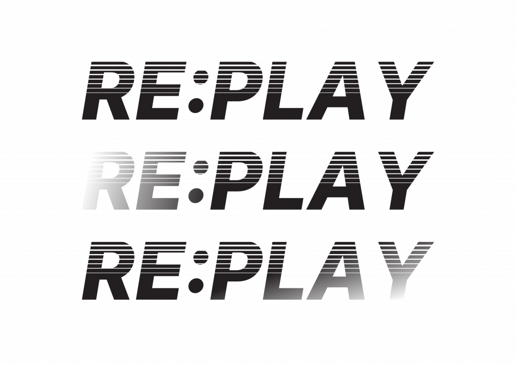
    I began by experimenting with different typographic treatments to express rhythm, speed, and repetition.
    Using motion-inspired line effects and angled letterforms, I tested how visual vibration could represent the sound and movement of rallies.
    These trials helped define the direction of the final wordmark dynamic yet structured, reflecting the collective rhythm of play rather than individual performance.

    Colour and Gradient Testing

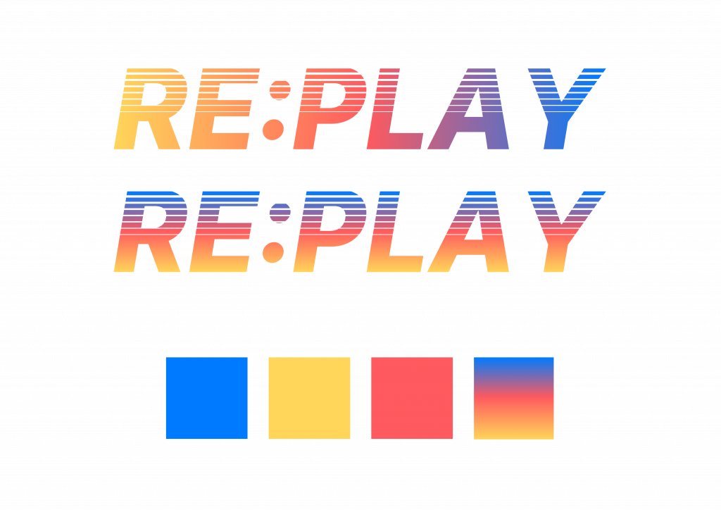
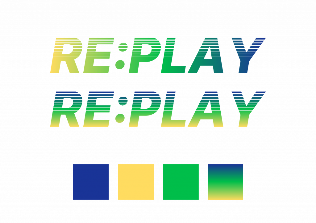
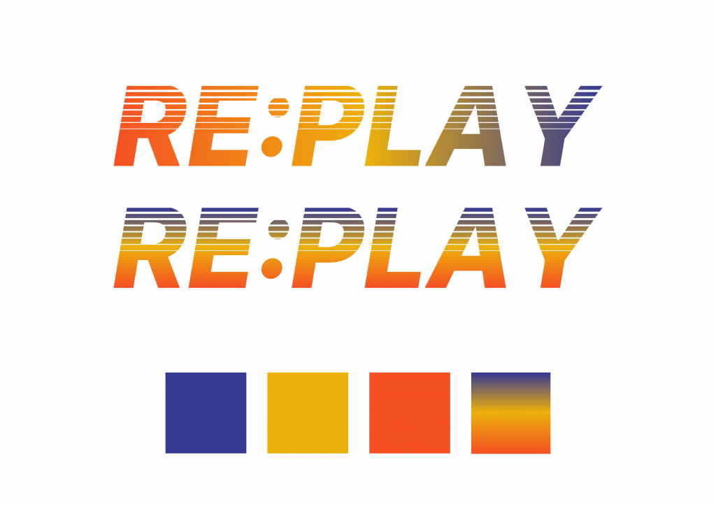
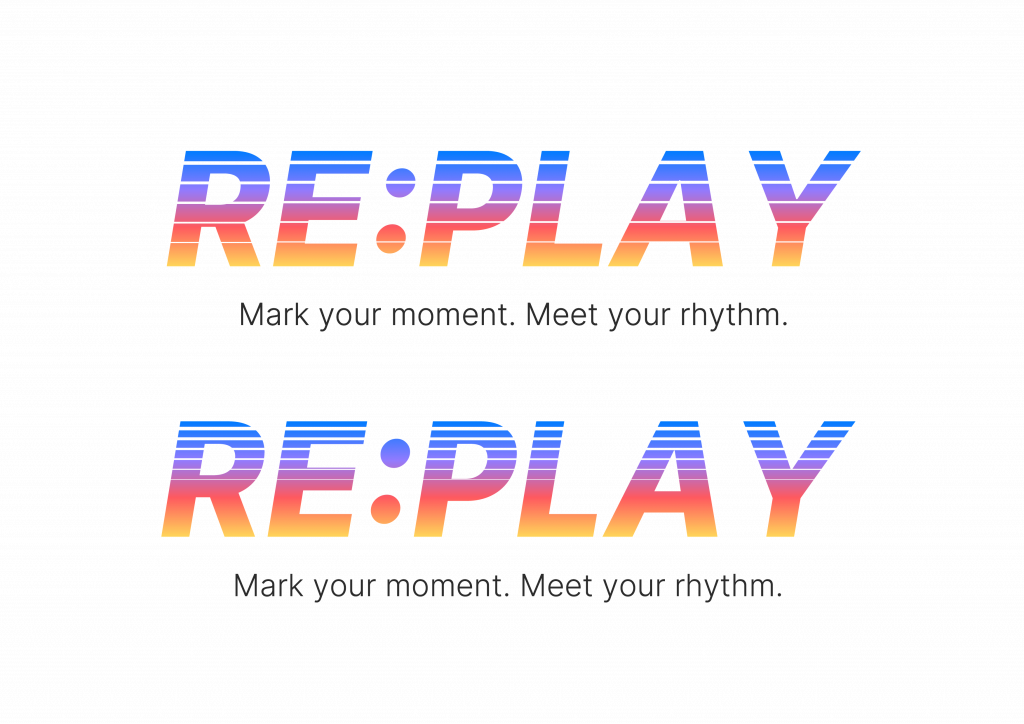
    Next, I explored several colour palette combinations, testing both solid and gradient applications.
    The goal was to find a balance between energy and inclusivity: colours that feel active and playful without being overly commercial.
    Gradients were particularly effective in visualising transition and connection echoing how players move, interact, and overlap across sessions.
    Through this process, I realised the gradient could symbolise diversity in rhythm rather than a fixed brand tone.

    Poster Illustration and Layout Experiments

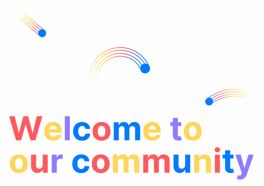
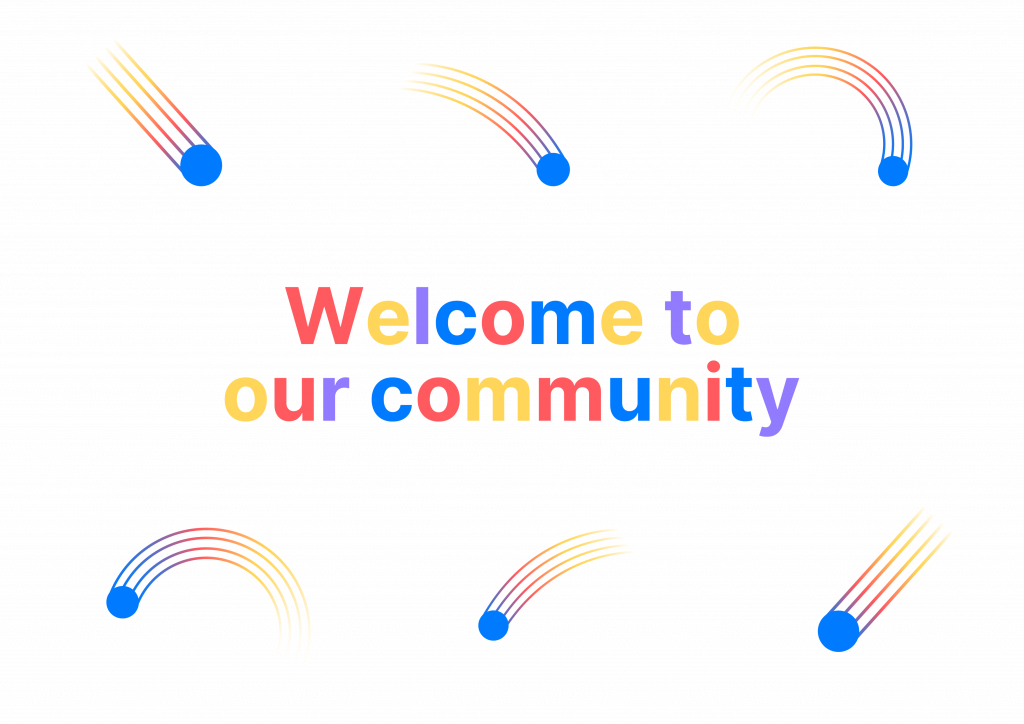
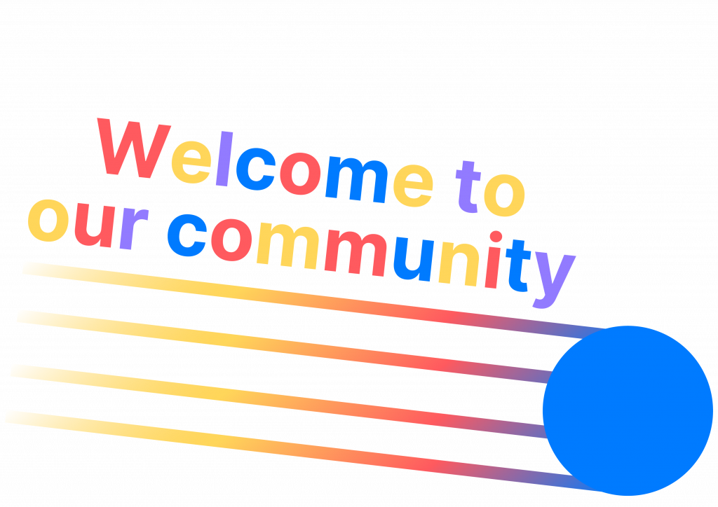
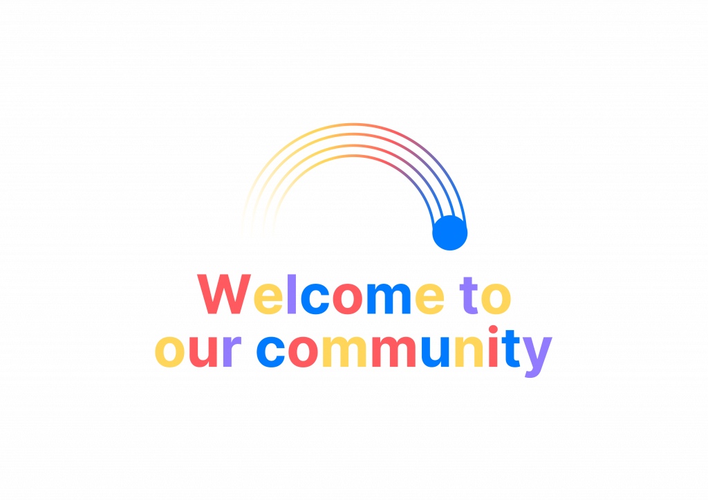
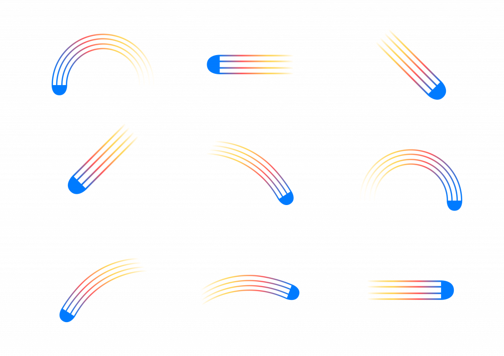
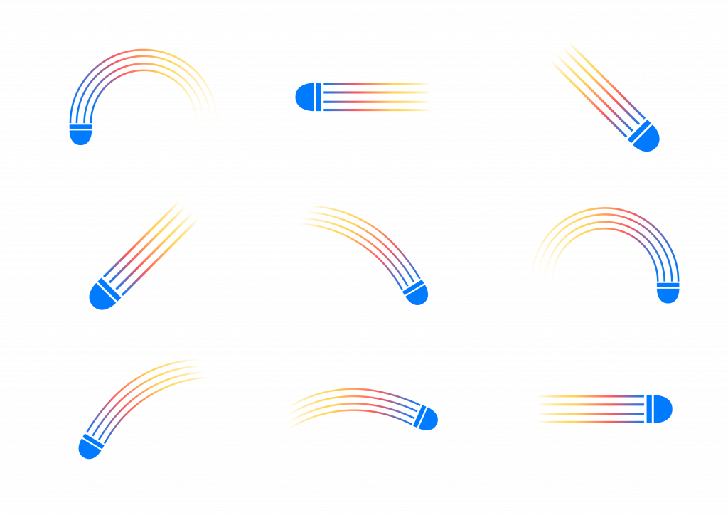
    The poster development began with testing the composition and visual rhythm of shuttle-inspired illustrations.
    Each curve was informed by actual badminton movements serve, smash, clear, drop, and drive transforming sport trajectories into graphic motion lines.
    I tested various ways to integrate the illustration with text elements such as “Welcome to our community”, aiming to find a layout that felt open, approachable, and rhythmically balanced.
    This exploration helped me understand how to visualise belonging through movement and how visual rhythm could support the brand’s welcoming tone.

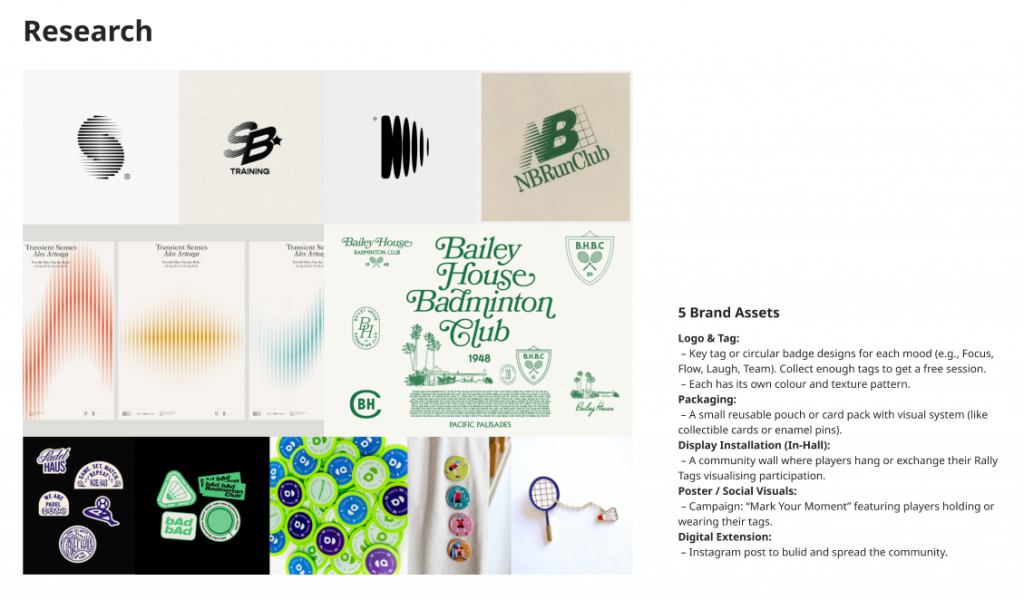
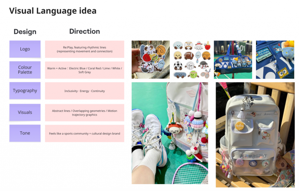
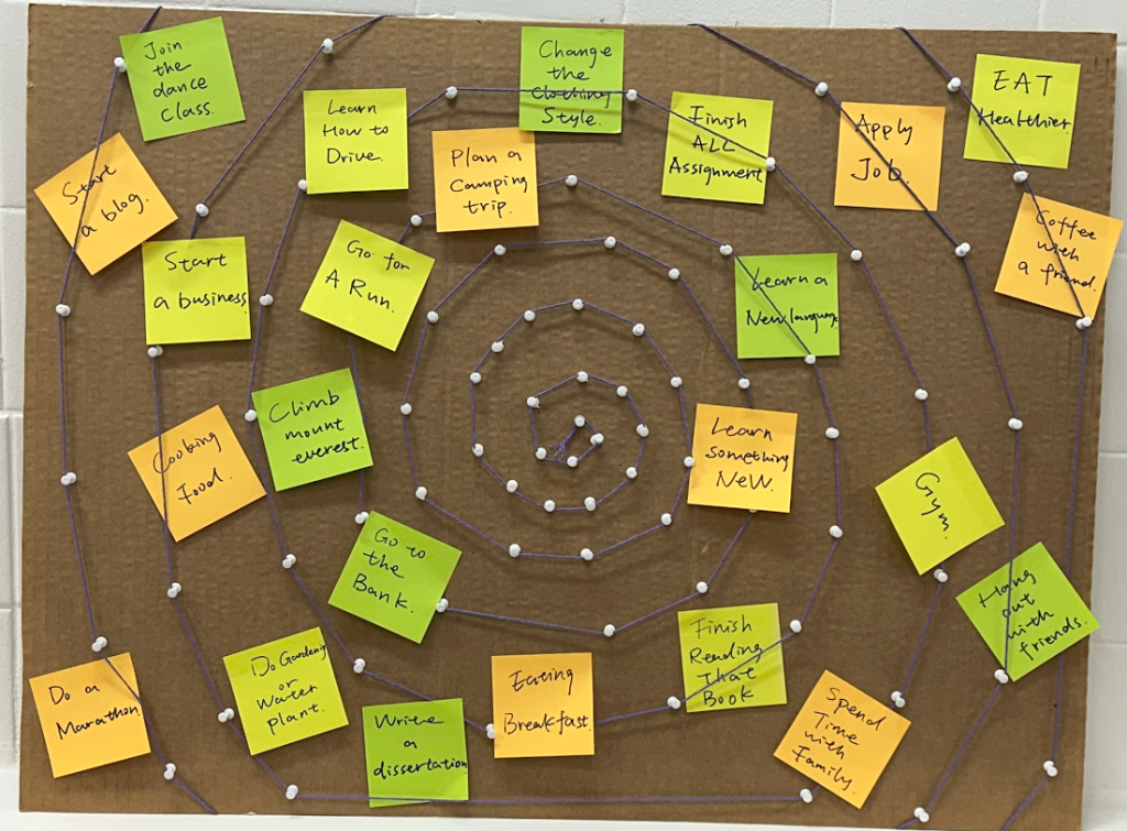
    Initial Design Assets

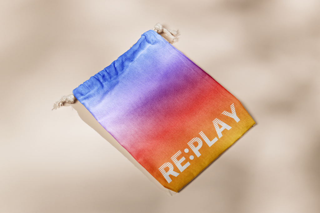
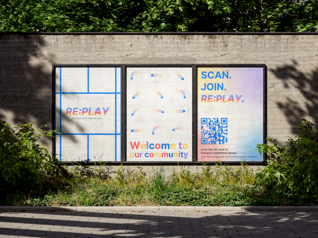
    For this phase, I produced three key brand assets that visualise the early identity of Re:Play:

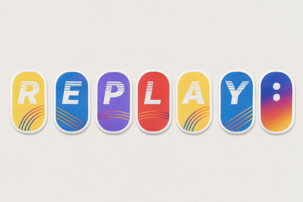
    1. Fabric Stickers – representing the collectible R, E, P, L, A, Y : tag system. Each colour and curve references movement and energy within the badminton hall.
    2. Reusable Collection Bag – designed as a tactile, personal archive for players to store their collected tags. The soft gradient fabric reinforces the brand’s sensory focus on touch and motion.
    3. Posters – positioned as public touchpoints for welcoming newcomers and promoting community visibility. The illustrations are based on the trajectories of shuttle movement Serve, Smash, Clear, Drop, and Drive translated into flowing curves and kinetic compositions.

    Design Rationale

    The identity currently focuses on rhythm, colour, and motion rather than literal representation of badminton.
    My intention was never to design a sports product brand, but a community experience brand.
    Therefore, the design language emphasises connection through rhythm rather than equipment or competition.

    The gradient palette emerged from my observation of players’ clothing and energy within the space sportswear in badminton culture is often vibrant, layered, and expressive.
    Rather than assigning symbolic meaning to each hue, I used gradients to visualise diversity in motion: multiple players, backgrounds, and tempos blending into a single shared rhythm.


    This reflects my earlier insight that belonging in badminton is dynamic, not fixed.

    Feedback Reflection

    During the recent feedback session, peers and tutors provided valuable perspectives that revealed gaps in clarity and communication:

    • Some viewers outside the badminton context perceived the visuals as belonging to a music or performance brand, due to the emphasis on rhythm and gradient colour.
    • Others noted that the brand could better communicate welcome and inclusion, suggesting that I integrate more explicit badminton cues (e.g. shuttle or racket forms).
    • A few comments encouraged the development of a distinct logo for the community itself, to strengthen its collective identity.

    This feedback highlighted an important challenge: balancing metaphorical design language (rhythm, connection, sound) with contextual specificity (badminton as cultural and spatial practice).

    Reconsideration and Next Steps

    Based on this critique, I am currently reframing my next design stage for Rotation 2:

    • Reconsidering the brand name (potentially Re:Match or Re:Game) to better align with the sporting context while preserving the idea of repetition and reconnection.
    • Exploring ways to integrate shuttle-inspired element possibly through iconography, motion lines, or texture so that the community connection is visibly anchored in badminton.
    • Refining the colour narrative, articulating how gradients express rhythm, diversity, and energy without becoming too abstract.
    • Continuing to test how the brand system functions socially, rather than visually how it enables players to feel recognised, included, and “in rhythm” with others.

    Reflection on Learning

    This design phase deepened my understanding of how visual identity operates as communication, not only aesthetics.
    Feedback revealed that clarity of intention is as crucial as conceptual strength.
    Designing for community requires empathy, translation, and iteration especially when representing intangible experiences like rhythm or belonging.

    In the next stage, I aim to create a more grounded visual system that balances symbolic meaning and recognisable form, ensuring that Re:Play (or its new form) resonates both with insiders of the community and with those encountering it for the first time.

  • Sensing Belonging: Re:Play from Observation to Brand Concept

    1. Revisiting My Community

    After the feedback session, I redefined my focus to the LSBU Sports Hall badminton community a place that truly represents my personal and cultural sense of belonging in London.
    Badminton is more than a sport for me; it’s a way to connect emotionally, socially, and culturally. The rhythm of rallies, the sound of the shuttle, and the synchronised movement of players form a shared language of belonging.

    As an international student, this community gives me a sense of home. It reminds me that belonging is not fixed by place or language, but by rhythm, participation, and shared presence. Through play, I experience both grounding and release a balance between personal focus and collective energy.

    2. Observation and Sensory Mapping

    Using sensory ethnography, I documented how belonging is expressed through five sensory and behavioural categories: sound, light/space, movement, emotion, and social interaction.

    Key Findings

    • Sound: overlapping hits, squeaks, and calls form a rhythmic soundscape a mix of focus, chaos, and familiarity.
    • Light / Space: bright fluorescent lighting energises but also compresses the visual field.
    • Movement / Rhythm: rallies produce both physical connection and social hierarchy speed signifies belonging.
    • Emotion / Belonging: comfort comes from familiarity and repetition; small in-groups form through routine.
    • Social Interaction: conversation between matches and small gestures like passing shuttles act as unspoken rituals of inclusion.

    Insight: Belonging in this community is not spoken but performed through rhythm, gesture, and timing.
    The same rhythm that unites experienced players can also isolate newcomers who can’t yet “read” the pace of the hall.

    3. Community Insights and Voices

    Through short conversations with players from Monday, Thursday, and Sunday sessions, I found that the badminton community’s sense of belonging is rhythmic and situational rather than stable.

    Least-heard voices

    Quiet or transient members those who join alone or move between clubs often remain unnoticed, even though their quiet participation still contributes to the hall’s rhythm.

    Expression of belonging

    Players connect through movement and coordination more than through language. Laughter, rallies, and small gestures build inclusion; belonging emerges through shared timing rather than speech.

    Community perception
    1. You can recognise someone’s play by sound.
    2. The airflow by the side door is the best place to rest.
    3. The ceiling’s too low for clear shots.

    These comments reveal how physical space, rhythm, and interaction intertwine. The environment itself choreographs belonging it dictates pace, comfort, and visibility within the group.

    5. Reframing Insight

    This reframing clarified the purpose of my design: to transform a transient sports space into a welcoming community.

    6. Brand Concept Development from Idea to Re:Play

    I explored several directions during concept ideation Rally+, ShuttleShare, Home Court, and Rally Tags each testing how visual design can translate connection through motion.
    After feedback, I selected Rally Tag as the foundation because it embodies the physicality of play and turns invisible connections into tangible memory objects.

    The final brand name emerged as RE:PLAY, built from two ideas:
    Re: reply, response, reconnect
    Play: game, interaction, participation

    Together, Re:Play symbolises the repetitive, rhythmic nature of community life belonging that is reconstructed every time people meet to play.

    7. Brand Concept: Re:Play connect through Motion

    Brand Purpose

    To transform a transient sports hall into a welcoming and connective community, where every game becomes a chance to reconnect.

    Brand Statement

    Re:Play is a community-driven brand that celebrates connection through motion.
    In the constantly changing rhythm of LSBU Sports Hall, it transforms play into a shared language of belonging where every rally becomes a moment to mark, remember, and reconnect.

    Sensory Focus

    • Sound captures rhythm and communication: the echo of shuttles, the squeak of shoes, the murmur of players.
    • Touch embodies participation and physical connection the grip of the racket, handshake, or collecting a tag.

    Through design, these sensory cues are translated into visual and tactile identity elements abstract lines, rhythmic gradients, and collectible physical tags.

    8. Brand Assets

    1. Logo & Tag System

    A collectible tag series forms the core of Re:Play’s identity.
    Each week’s session releases a fabric sticker—R, E, P, L, A, Y—with the “:” tag as a limited edition.
    Players attach them to their badminton bags, gradually spelling RE:PLAY as they attend more sessions.
    Completing the full set unlocks a free session transforming participation into playful motivation.

    2. Packaging Design

    A reusable fabric pouch allows players to store and display their tags. It serves as both a tactile keepsake and a record of community presence.

    3. Animation for Sports Hall Display

    A looping animation of rhythmic lines and shuttle trails projected inside LSBU Hall acts as a digital pulse of belonging, reminding players that every rally adds to the shared rhythm.

    4. Posters & Social Visuals

    Three main posters communicate Re:Play’s tone:

    1. Mark your moment. Meet your rhythm.
    2. Welcome to our community.
    3. Scan. Join. Re:Play.

    These are adapted for social media and digital screens to attract new members.

    5. Digital Extension

    An Instagram page and WhatsApp group allow players to connect between sessions bridging online continuity and offline participation.

    9. Reflection

    Re:Play taught me how methodology can evolve into brand strategy. What began as sensory observation of light, sound, and rhythm developed into a systemic understanding of community dynamics.
    Through ethnography, mapping, and reframe, I learned that design can act as a connector turning motion, sound, and shared space into a collective identity.

    Belonging is dynamic, not static.
    It happens in rhythm, repetition, and the moments when people play together again.

    This project helped me see myself not just as a designer but as a translator between movement and meaning, using visual and sensory design to make invisible social bonds visible.

  • Brand Experience: Glocalising Tusker in the UK

    Workshop Summary: Understanding Brand Experience and Glocalisation

    This week’s Brand Experience workshop explored how global brands adapt and translate their identity into new cultural contexts through brand activations experiences that invite direct interaction between brands and audiences. The key takeaway was that brands are not static symbols but dynamic cultural resources that co-create meaning within specific social and geographic contexts.

    We learned that glocalisation (global and local) is the process where global brand strategies are reinterpreted and reshaped by local cultures. Rather than imposing a one-size-fits-all identity, successful brands adapt their visual language, storytelling, and experiences to resonate with local audiences while maintaining core values.

    Glocal marketing was described as blending global consistency with local relevance keeping brand DNA intact while responding to local consumer preferences, trends, and cultural touchpoints. Examples like Coca-Cola’s “Tasty Fun” localisation in China and The Old Irish Pub chain in Scandinavia showed how cultural translation builds authenticity and connection.

    We also discussed cultural identity in branding how brands reflect and shape cultural values. As Holt (2006) and Schroeder (2009) note, brands act as carriers of meaning, embedding themselves in cultural narratives. For this workshop, we were challenged to explore this through the design of a brand experience that imports one culture into another, using creative localisation to bridge the two worlds.

    Task 1: Brand Activation — “Rhythm & Roll by Tusker”

    Allocated Brand: Tusker Lager, Kenya’s most iconic beer brand (founded 1922).
    Core Values: Togetherness · Adventure · Authenticity · Cultural Pride

    Tusker embodies East African heritage a celebration of community, music, and the joy of shared experiences. Our challenge was to bring that spirit to the UK in a way that feels both authentically Kenyan and locally engaging.

    Concept Overview

    Title: Rhythm & Roll by Tusker
    Meaning: A creative nod to “Rhythm & Blues” and the roller-skating rhythm culture popular in both Kenya and the UK. It blends African rhythm, urban nightlife, and the social energy of skating connecting people through movement, music, and togetherness.

    The activation reimagines Tusker’s East African warmth within London’s dynamic social scene through a roller-skating pop-up event, partnering with Roller Nation (Tottenham), one of the UK’s leading retro roller disco venues.

    Task 2: Brand Experience Design

    Brand Positioning in the UK Market

    The UK beer market is dominated by global giants such as Heineken, Guinness, and Carlsberg, yet consumers aged 25–40 are increasingly drawn to story-driven, experiential, and culturally diverse brands. With rising demand for global flavours and event-based drinking, Tusker has the opportunity to position itself as a taste of Kenya through shared rhythm and energy.

    The Activation Experience

    Event Name: Rhythm & Roll by Tusker
    Tagline: Refresh Your Rhythm

    Experience Design:

    • Venue: Roller Nation, Tottenham transformed into an immersive space combining Afrobeat and EDM, neon lights, and African pattern graphics inspired by Tusker’s iconic elephant and Kenyan textiles.
    • Visual Identity: Elephant-skin and tribal patterns merge with neon roller-rink aesthetics, creating a vibrant fusion of Kenyan tradition and London nightlife.
    • Activities:
      • Roller skating sessions to live DJ sets
      • “Skate with Tusker” photo zone
      • Pop-up bar serving Tusker Lager and mocktail variants
      • Interactive wall featuring the Kenya–UK connection map (Nairobi ↔ London)
    • Cultural Touchpoints:
      • Afrobeat rhythms symbolising Kenyan vitality
      • Pattern and colour palette (yellow, pink, blue neon) merging African motifs with London’s retro disco vibes
      • Inclusion of the growing Black roller-skating community in the UK, highlighting cultural continuity and inclusivity

    Launch Campaign Strategy

    Campaign Objective

    Introduce Tusker as a cultural bridge “Kenya’s beer meets London’s rhythm” celebrating diversity, togetherness, and global-local fusion.

    Key Campaign Elements

    1. Social Media Launch
      • Hashtag: #RhythmAndRoll #TuskerUK #TasteOfKenya
      • Teaser clips featuring roller skaters, Afrobeats soundtracks, and Tusker bottles under neon lights.
      • Countdown posts and influencer collaborations from both Kenyan diaspora and UK roller-skating communities.
    2. Collaborations
      • Partner with Roller Nation London, Afrobeats DJs, and diaspora community groups for cultural authenticity.
      • Pop-up tastings at universities (targeting international students).
    3. Visual Campaign Assets
      • Posters: “We Bring Tusker Lager to the UK” featuring London icons (Big Ben, red buses) blended with Kenyan flag colours.
      • Ambient branding: Elephant-inspired floor projections and LED signage.
      • Merchandise: “Refresh Your Rhythm” T-shirts and limited-edition Tusker cans with UK–Kenya dual flag design.
    4. Event Launch
      • Soft launch during Black History Month in October.
      • Press and influencer night featuring live music, skating demos, and interviews with Kenyan creatives in the UK.

    Reflection

    Through this project, I learned how glocalisation allows a brand to evolve not by abandoning its origins, but by translating cultural essence into local relevance. Tusker’s Kenyan identity is not diluted in the UK context; instead, it becomes a connector of communities, uniting Londoners through shared rhythm, joy, and inclusivity.

    This exercise reinforced how brand experience design goes beyond marketing it’s about creating spaces of cultural exchange where products, people, and place intersect meaningfully.

  • Week 4 Sensory Ethnography Walk

    During the Sensory Ethnography workshop, we were asked to walk around Elephant & Castle and record our impressions through the five senses. At first, I felt quite confused about the purpose of this task. I wasn’t sure whether I was meant to record my personal feelings, or to connect it with my own community. However, as I began walking, I realised the activity was about training our ability to observe the world through embodied experience noticing how sound, smell, texture, and movement shape the atmosphere of a place.

    The environment felt cold and windy, with the rhythmic noise of buses, cars, and people passing by. I noticed red buses moving through the grey sky, and a strong smell of rubbish near the street corners. At one point, the smell of food from nearby stalls made me feel unexpectedly hungry showing how emotion and memory can be triggered by sensory cues.

    Through this process, I learned how sensory ethnography allows designers to feel rather than just analyse. Even though I was unsure at first, I now understand this walk as a method for exploring belonging and identity through sensory experience. Moving forward, I want to apply this approach to my badminton community, capturing how sound, rhythm, and space shape our shared sense of energy and connection.

  • PlayLab workshop 05 Semiotics is the study of sigh process with Marco Minzoni

    Understanding Semiotics in Branding

    Semiotics is the study of sign processes how meaning is created, interpreted, and communicated through symbols, forms, and structures. In this workshop with Marco Minzoni, we explored how signs can function as systems of communication within visual design and branding. Marco introduced the theories of Charles Sanders Peirce, who identified three key categories of signs: icon, index, and symbol.
    An icon resembles what it represents (for example, Apple’s logo, which looks like an apple); an index shows a direct relationship or cause (such as Amazon’s arrow connecting A to Z); while a symbol depends purely on cultural understanding (like Nike’s swoosh or Mercedes-Benz’s star).

    Marco also discussed how the Bauhaus principles remind designers that shapes such as the square, triangle, and circle are not only visual elements but also carry psychological and emotional associations. In branding, these geometries form the foundation for structure, identity, and communication.

    Activity 1: Reinterpreting Brand-Marks through Shapes

    For the first activity, I was assigned the square as my foundational shape. I chose three existing brand-marks from different semiotic categories:
    Icon — Domino’s Pizza

    Index — Adobe

    Symbol — Microsoft

    Each of these brands already carries a distinct geometric structure that naturally relates to the characteristics of the square are stability, logic, and order. Domino’s represents the iconic level because its logo literally resembles a domino tile; Adobe’s mark functions as an index, linking the abstract “A” shape to the creative tools it provides; and Microsoft’s four squares stand as a symbol, representing systems, diversity, and integration across the digital world.

    I then reinterpreted these logos through circle and triangle compositions. The exercise revealed how much emotional weight the base shape carries:

    • When translated into circles, the marks felt softer, friendlier, and more human.
    • When transformed into triangles, they appeared sharper, more energetic, and dynamic.
    • The square, in contrast, remained calm, logical, and balanced the most structural of all three.

    Through this process, I realised how form alone can shift brand personality and even alter the semiotic category: for instance, Domino’s circular version moved closer to a symbolic sign than an icon, because the resemblance became less literal. This activity deepened my awareness of how geometry influences meaning.

    Activity 2: Group Project: “Lucky Table”

    For the second activity, I worked with four other Chinese classmates. We decided to celebrate a part of our shared heritage by creating a fictional brand inspired by Mahjong, a traditional Chinese cultural game. Our brand, called “Lucky Table,” aims to introduce Chinese board games to global audiences not only as entertainment, but also as cultural experiences that promote understanding and diversity.

    Through the Lucky Table, our social community invites others to experience the charm of Chinese heritage, fostering diversity, understanding, and harmony across cultures.

    The brand’s concept comes from the belief that each seat around a Mahjong table carries its own kind of fortune. In Chinese culture, where you sit your feng shui position can influence your luck and energy. Here, “lucky” becomes tangible, while the table itself becomes a shared platform of interaction and communication.

    Visually, our brand-mark uses the square to represent the four sides of a Mahjong table, each side reflecting one of our core brand values:

    • East — Structure: the logic of play.
    • South — Connection: the bond between players.
    • West — Balance: the harmony of strategy.
    • North — Heritage: the memory of culture.

    The logo’s structure is pieced together from four geometric forms that nearly form a complete square but leave a slight gap symbolising openness and ongoing cultural exchange. This incomplete frame suggests the meeting of players, cultures, and ideas at the same table.

    For the three semiotic versions:

    • The Icon mark directly represents the Mahjong table and tiles, making it tangible and recognisable.
    • The Index version uses overlapping rectangular structures that imply social connection and play.
    • The Symbol simplifies these elements into abstract green forms arranged in a square rotation, representing unity and balance without direct imagery.

    This translation between semiotic types subtly shifts the brand’s tone from playful and concrete (icon), to conceptual and relational (index), to modern and universal (symbol).

    Workshop Reflection

    This workshop helped me understand how deeply form and meaning are intertwined in brand communication.
    The square, my assigned shape, guided every design and storytelling decision it naturally suggested structure, order, and rationality, which became the essence of Lucky Table.
    By exploring how icon, index, and symbol function across visual and cultural levels, I learned that semiotics is not just about decoding visuals, but about constructing experiences that connect people through shared meaning.

    Ultimately, this session allowed me to bridge cultural heritage and design thinking, translating Mahjong’s traditional symbolism into a modern design language that reflects global communication where the table becomes a metaphor for connection, dialogue, and belonging.

  • PlayLab Workshop 02: Branding, Personality and Shapes with James Stockton

    In this week’s PlayLab workshop, we explored the idea that logos are overrated and began asking: what else makes a brand? A brand is not just a logo but an identity built through sound, smell, colours, shapes, and even the way products feel. For example, Apple’s brand goes far beyond the bitten apple logo. It’s in the shape and curve of the phone, the sleek glass UI, and even the packaging experience. Similarly, IKEA’s identity is not just its blue-and-yellow logo, but the iconic blue bag, the Swedish meatballs, and the feeling of straightforward affordability. Netflix has its instantly recognisable sound, Lush is tied to smell, and McDonald’s can be identified simply by the ambience of its restaurants.

    We also looked at how shapes carry personalities:

    • Circle: spiritual, warm, inclusive, nurturing, balanced
    • Square: stable, reliable, trustworthy
    • Triangle: ambitious, loud, aggressive, dynamic

    In our group, we were given the combination of Ambitious + Circle. At first, these two qualities seemed contradictory: circles are inclusive and balanced, while ambition is about pushing outward, expanding, and striving for more. But instead of seeing them as opposites, we framed ambition as a circle that keeps growing bigger and bigger, never standing still.

    From this, our idea was born: a service to help people who struggle to manage their agenda. Everyone has daily priorities short-term, long-term, and urgent tasks. But arranging them clearly can feel overwhelming. Our concept uses the circle as a way to organise and expand ambition, creating a tool that visually and intuitively sequences tasks. The circle becomes both nurturing and ambitious: it holds everything together while constantly expanding to reflect growth, energy, and resourcefulness.

    Visualising Ambition Through the Circle

    For our Ambitious + Circle brief, we wanted to explore how a brand could help people manage their busy lives and never-ending goals. Our idea was to create a service for people who struggle to organise their agenda those juggling long-term goals, urgent deadlines, and everyday tasks.

    We started by thinking about how to show the feeling of a messy agenda. Inspired by evidence boards (like in detective films), we decided to physically represent tasks as colourful sticky notes connected with threads. This approach let us visualise how ambition often feels: full of energy but tangled, scattered, and overwhelming.

    • Board One (Messy Agenda): a chaotic web of tasks, connected in random directions, capturing the stress of too many priorities competing for attention. The overlapping threads represent the confusion and pressure of trying to do everything at once.
    • Board Two (Organised Agenda): a circular structure with tasks arranged neatly, radiating outward. Here, the circle becomes ambitious but balanced growing bigger while still keeping order and clarity.

    To bring personality into the brand, we also added playful circle characters. These characters made the boards feel approachable and fun, reinforcing the idea that ambition doesn’t always have to be stressful. It can be light-hearted, inclusive, and supportive. Since we weren’t allowed to use logos in this project, these characters became the face of our brand moment.

    This exercise showed me that branding is not just about logos or visuals. It’s about personality, senses, and behaviours how a brand feels, acts, and even grows with you. Through this exercise, we translated the abstract idea of Ambitious + Circle into a physical, interactive experience. The circle is not static; it expands, organises, and embraces ambition helping people visualise and manage their goals with clarity and energy.