Tag: GBI

  • Week 4 Sensory Ethnography Community Mapping

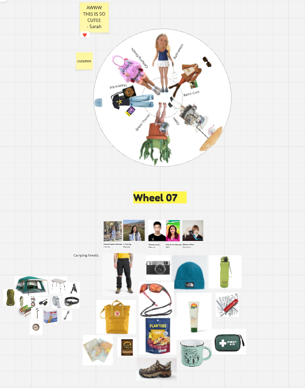
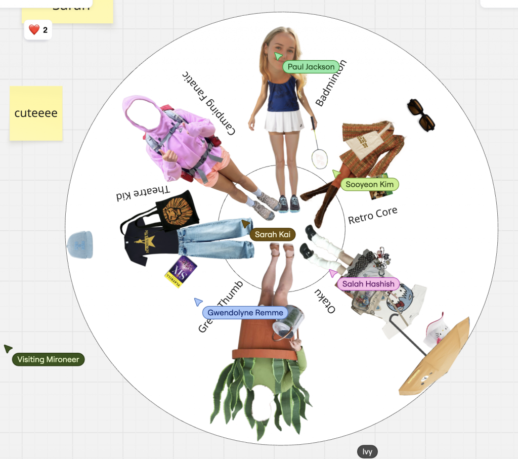
    Sensing Belonging: The LSBU Badminton Community

    My chosen community is the badminton community, which I belong to both culturally and socially. It connects to my emotional well-being, cultural background, and creative curiosity. Through this project, I explore how the sensory experience of badminton — sound, rhythm, motion, and teamwork — can be understood through design. It’s a community that unites people across languages and identities through shared energy and play.

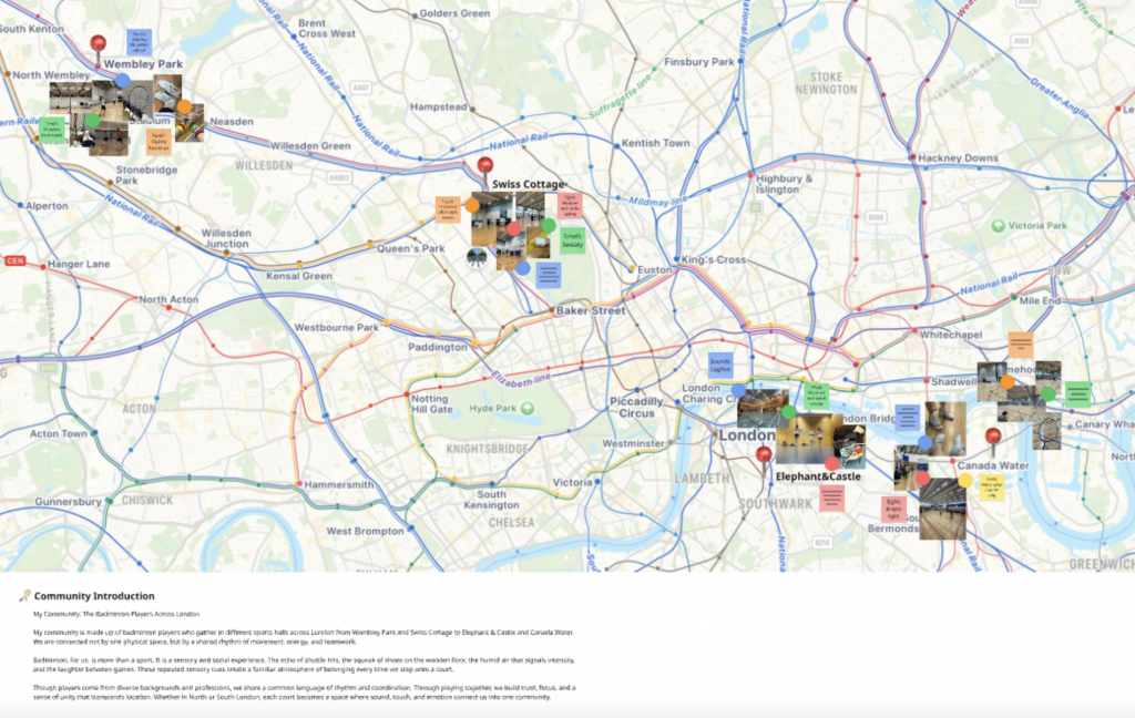
    At the beginning, my community mapping covered four different areas in London Wembley Park, Swiss Cottage, Elephant & Castle, and Canada Water where I joined various badminton clubs using an app over the past two years. These clubs weren’t connected by a single location, but by a shared rhythm and energy that bonded players through play.

    After the Thursday feedback session, I decided to narrow my focus to the LSBU Sports Hall, a place I visit most frequently. This helped me go deeper into sensory observation and analyse how design can express the feeling of belonging through motion and sound.

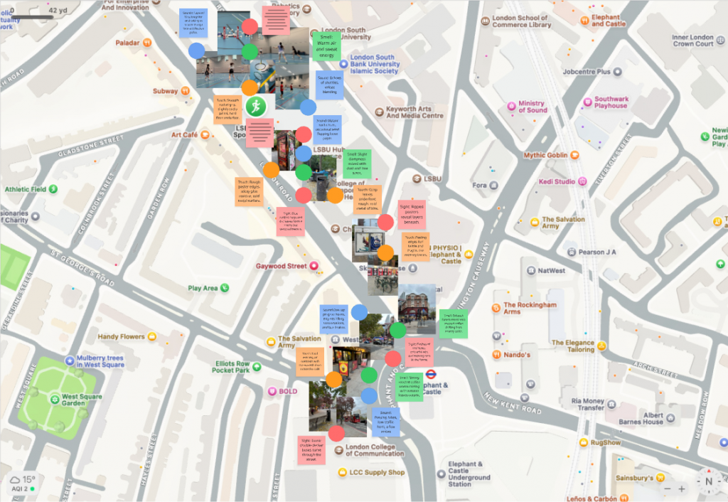
    Revised Mapping: LSBU Sports Hall

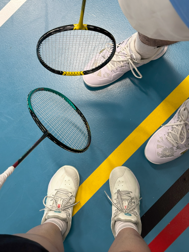
    The LSBU Sports Hall feels compact and enclosed, amplifying every sound and movement. The crisp impact between the shuttlecock and racket becomes a rhythmic cue a language of motion that every player can understand.
    When I play, I can almost “hear” the style of my opponent before I see it. The echo of shuttles, shoes sliding, and voices merging create a soundscape that feels both competitive and comforting.

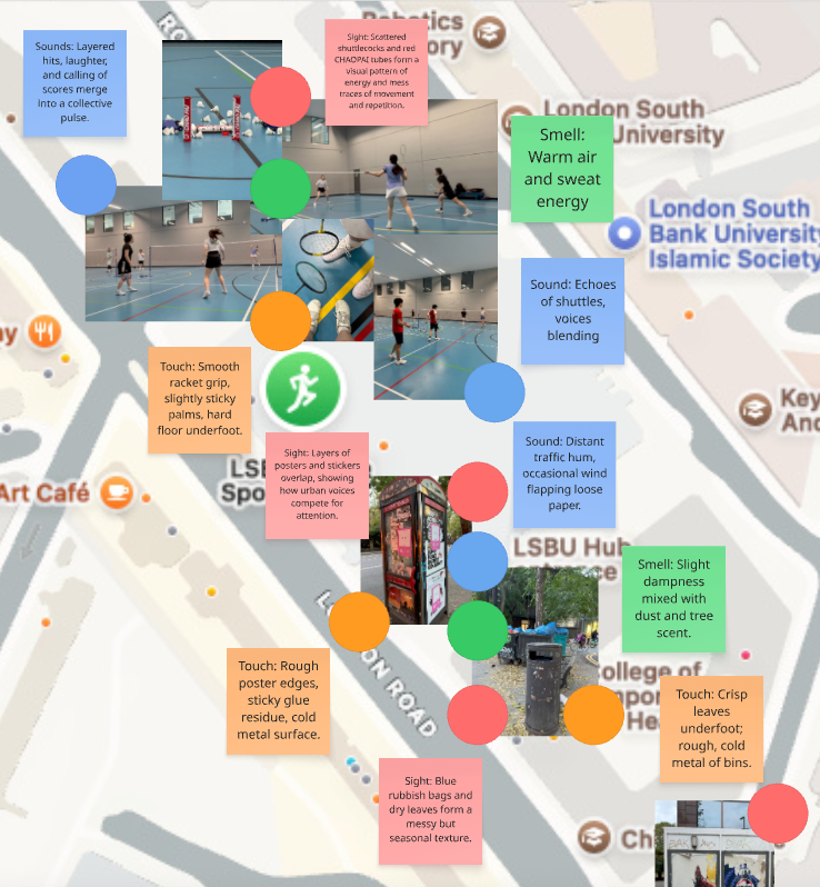
    My new mapping focuses on sensory impressions:

    • Sound: Layered hits and shouts merge into a rhythmic pulse.
    • Touch: Smooth racket grip, sticky palms, and the solid bounce of the floor.
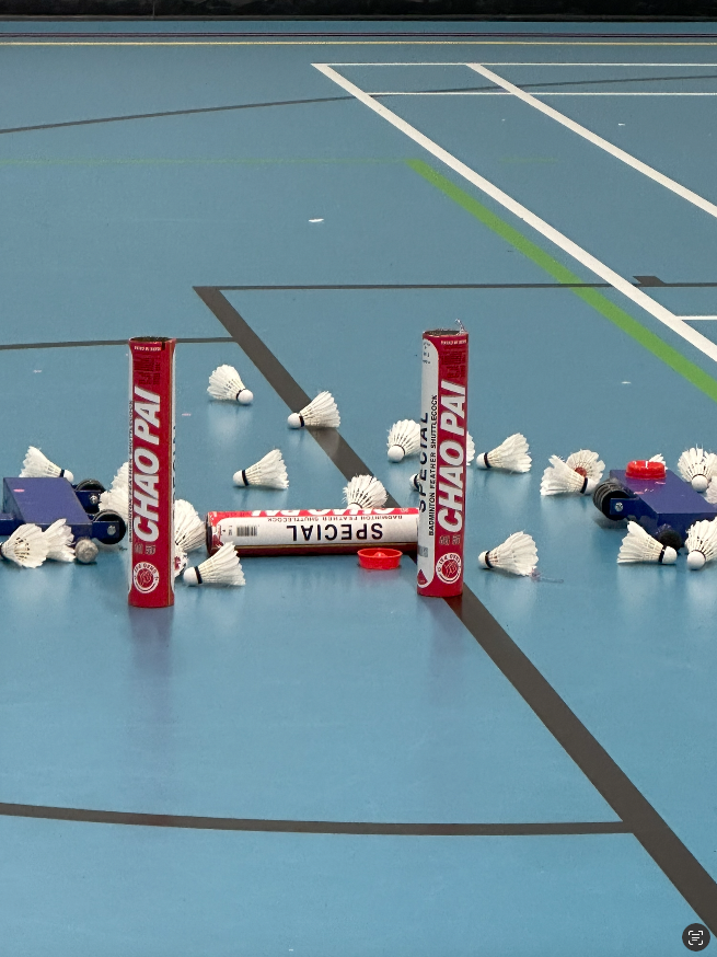
    • Sight: Scattered shuttlecocks and red Chao Pai tubes visualise energy and repetition.
    • Smell: Warm air and sweat a mix of effort and community.
      Together, these sensations form an embodied experience of focus and connection.

    These sensory layers together describe how badminton embodies community not through words, but through rhythm, energy, and shared focus.

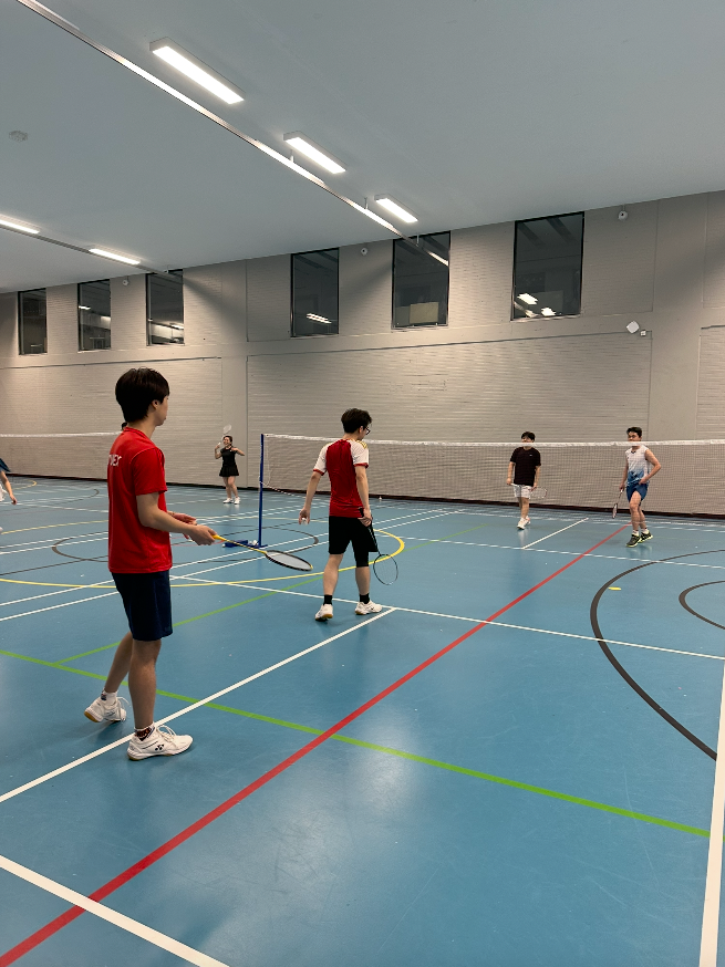
    Community Perception

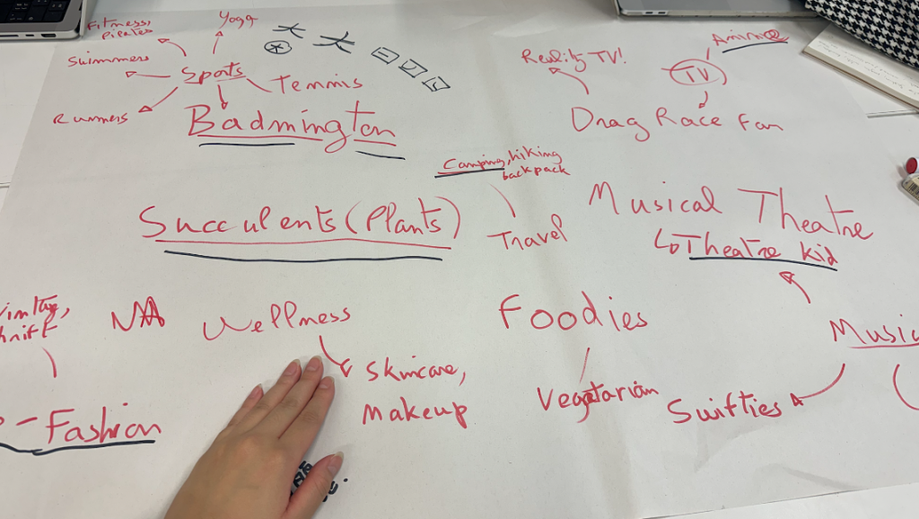
    I usually join three different badminton clubs each week:

    • Monday: International group, organised by a foreign host.
    • Thursday: Club run by Chinese players at LSBU.
    • Sunday: A Chinese community club.

    Each group has its own rhythm Monday feels more social and mixed, Thursday more intense and skill-focused, and Sunday more familiar and culturally connected.

    For me, as a foreigner living in London, these sessions are not only about sport but also about finding emotional belonging. The sound of the shuttlecock, the laughter, and even the friendly competitiveness remind me of home.ural on Mondays to more structured and familiar on Sundays.

    Pain Point

    Although badminton connects people through shared play, the sense of belonging can still fluctuate.
    Sometimes, I feel fully part of the community through rhythm, teamwork, and mutual understanding without words.
    Other times, I feel slightly distanced not because of language barriers, but because of the transient nature of city communities where people come and go quickly.

    Reflection

    At first, I misunderstood what sensory ethnography meant I focused too much on visuals and not enough on human experience. After receiving feedback, I realised that I needed to observe how emotions and senses construct belonging.


    This project helped me understand that my badminton community is not defined by space, but by movement, rhythm, and social energy.

  • Week 4: Brand Audience & The Fashion Wheel Workshop

    Lecture Summary: Community Principles & Brand Strategy

    This week’s session with Precious introduced us to the principles of community-led branding and how it connects to values, narrative, and strategy.

    We learned three key principles of community branding:

    1. Empower dialogue – Everyone deserves to be seen and heard.
    2. Understand nuances – No community is a single story due to intersectionality.
    3. Create with care – Safe and inclusive spaces are essential when designing for marginalised groups.

    Precious also highlighted that community-led branding is not just a design trend, but a response to changes in technology, culture, and human needs. Successful brands, such as Vaseline South Africa and Bayo, build trust and belonging by co-creating with their audiences and speaking in culturally authentic voices.

    Key takeaways:

    • Co-create with the community throughout the process.
    • Create from an authentic and inclusive space.
    • Use language and visuals that resonate.
    • Think about narrative and lived experience.

    Workshop: The Fashion Wheel (Brand Audience Exercise)

    In the afternoon, we applied these ideas to understand Gen Z subcultures and their consumption habits through a hands-on activity called the Fashion Wheel.

    Task 01 – Identify Subcultures / Tribes
    As a group (Wheel 07), we discussed our individual habits and interests to find six distinct subcultures:

    1. Plant Lover / Green Thumb
    2. Badminton Enthusiast
    3. Camping Fanatic
    4. Retro Core
    5. Otaku
    6. Theatre Kid

    These categories reflected our hobbies and shopping preferences, from eco-friendly lifestyles to sports gear and fandom culture.

    Task 02 – Create the Fashion Wheel
    Each group member’s chosen subculture was visualised through a collage-style outfit, arranged around a rotating circular wheel.
    For example:

    • Badminton – Sporty outfit with racquet and sneakers.
    • Camping Fanatic – Outdoor gear, boots, thermos, and beanie.
    • Otaku – Anime-inspired T-shirt and accessories.
    • Green Thumb – Costume with watering can.
    • Theatre Kid – Musical T-shirt and tote bag.
    • Retro Core – Vintage Clothes.

    This visual mapping helped us understand how fashion, personality, and consumption form identity markers within Gen Z culture.
    (See image: our group’s Fashion Wheel design.)

    Task 03 – What’s in the Tote Bag?
    We then selected one tribe Camping Fanatic to create a “tote bag” filled with items that represent this lifestyle.
    Our selections included a tent, hiking boots, reusable water bottle, beanie, map, camera, first aid kit, and healthy snacks.
    These objects reflect Gen Z’s adventurous, eco-conscious, and experience-driven values.
    (See image: our group’s Camping Fanatic bag moodboard.)

    Reflection

    Through this workshop, I learned how visual culture and fashion can communicate identity, belonging, and value systems. The “Fashion Wheel” made me realise that brand audiences are not just consumers they are communities with shared mindsets and lifestyles.

    From Precious’s lecture, I also understood that successful branding must be co-created with the audience, not imposed from above. Whether designing for a badminton community or a camping tribe, authenticity, dialogue, and inclusivity are key.

  • PlayLab workshop 05 Semiotics is the study of sigh process with Marco Minzoni

    Understanding Semiotics in Branding

    Semiotics is the study of sign processes how meaning is created, interpreted, and communicated through symbols, forms, and structures. In this workshop with Marco Minzoni, we explored how signs can function as systems of communication within visual design and branding. Marco introduced the theories of Charles Sanders Peirce, who identified three key categories of signs: icon, index, and symbol.
    An icon resembles what it represents (for example, Apple’s logo, which looks like an apple); an index shows a direct relationship or cause (such as Amazon’s arrow connecting A to Z); while a symbol depends purely on cultural understanding (like Nike’s swoosh or Mercedes-Benz’s star).

    Marco also discussed how the Bauhaus principles remind designers that shapes such as the square, triangle, and circle are not only visual elements but also carry psychological and emotional associations. In branding, these geometries form the foundation for structure, identity, and communication.

    Activity 1: Reinterpreting Brand-Marks through Shapes

    For the first activity, I was assigned the square as my foundational shape. I chose three existing brand-marks from different semiotic categories:
    Icon — Domino’s Pizza

    Index — Adobe

    Symbol — Microsoft

    Each of these brands already carries a distinct geometric structure that naturally relates to the characteristics of the square are stability, logic, and order. Domino’s represents the iconic level because its logo literally resembles a domino tile; Adobe’s mark functions as an index, linking the abstract “A” shape to the creative tools it provides; and Microsoft’s four squares stand as a symbol, representing systems, diversity, and integration across the digital world.

    I then reinterpreted these logos through circle and triangle compositions. The exercise revealed how much emotional weight the base shape carries:

    • When translated into circles, the marks felt softer, friendlier, and more human.
    • When transformed into triangles, they appeared sharper, more energetic, and dynamic.
    • The square, in contrast, remained calm, logical, and balanced the most structural of all three.

    Through this process, I realised how form alone can shift brand personality and even alter the semiotic category: for instance, Domino’s circular version moved closer to a symbolic sign than an icon, because the resemblance became less literal. This activity deepened my awareness of how geometry influences meaning.

    Activity 2: Group Project: “Lucky Table”

    For the second activity, I worked with four other Chinese classmates. We decided to celebrate a part of our shared heritage by creating a fictional brand inspired by Mahjong, a traditional Chinese cultural game. Our brand, called “Lucky Table,” aims to introduce Chinese board games to global audiences not only as entertainment, but also as cultural experiences that promote understanding and diversity.

    Through the Lucky Table, our social community invites others to experience the charm of Chinese heritage, fostering diversity, understanding, and harmony across cultures.

    The brand’s concept comes from the belief that each seat around a Mahjong table carries its own kind of fortune. In Chinese culture, where you sit your feng shui position can influence your luck and energy. Here, “lucky” becomes tangible, while the table itself becomes a shared platform of interaction and communication.

    Visually, our brand-mark uses the square to represent the four sides of a Mahjong table, each side reflecting one of our core brand values:

    • East — Structure: the logic of play.
    • South — Connection: the bond between players.
    • West — Balance: the harmony of strategy.
    • North — Heritage: the memory of culture.

    The logo’s structure is pieced together from four geometric forms that nearly form a complete square but leave a slight gap symbolising openness and ongoing cultural exchange. This incomplete frame suggests the meeting of players, cultures, and ideas at the same table.

    For the three semiotic versions:

    • The Icon mark directly represents the Mahjong table and tiles, making it tangible and recognisable.
    • The Index version uses overlapping rectangular structures that imply social connection and play.
    • The Symbol simplifies these elements into abstract green forms arranged in a square rotation, representing unity and balance without direct imagery.

    This translation between semiotic types subtly shifts the brand’s tone from playful and concrete (icon), to conceptual and relational (index), to modern and universal (symbol).

    Workshop Reflection

    This workshop helped me understand how deeply form and meaning are intertwined in brand communication.
    The square, my assigned shape, guided every design and storytelling decision it naturally suggested structure, order, and rationality, which became the essence of Lucky Table.
    By exploring how icon, index, and symbol function across visual and cultural levels, I learned that semiotics is not just about decoding visuals, but about constructing experiences that connect people through shared meaning.

    Ultimately, this session allowed me to bridge cultural heritage and design thinking, translating Mahjong’s traditional symbolism into a modern design language that reflects global communication where the table becomes a metaphor for connection, dialogue, and belonging.

  • PlayLab Workshop 03: If You Were a Square, Triangle or Circle with Eugenie Dodd & Karen Burbano

    This workshop invited us to imagine ourselves as one of the three Bauhaus shapes a square, triangle, or circle and explore how a simple form could express personality. Guided by Bauhaus thinking, we were encouraged to strip away ornament and focus on function, essence, and transformation.

    I was assigned the triangle, a shape often associated with direction, energy, and ambition. It also connects deeply with Kandinsky’s idea of upward striving and Gropius’s emphasis on clarity and purpose.

    I began by reflecting on my own personality and how it could be translated through the triangle:

    1. Competitive (Black) – This colour symbolises focus and determination, inspired by my badminton experience. The black surfaces of my folded triangles represent strength and confidence.
    2. Energetic (White) – White adds lightness and openness, expressing positivity and balance in everyday life.
    3. Ambitious (Yellow) – Yellow, as Kandinsky connected with triangles, reflects challenge, optimism, and upward motion. It represents my motivation to keep growing and evolving.

    Using these traits, I created a series of folded origami triangles. Each fold became a small act of discovery learning how the paper behaves, how edges meet, and how light and shadow create structure. Following Albers’s pragmatic view, I treated the paper respectfully, allowing its natural qualities to guide the design. Inspired by Itten, the making process became a meditative way of seeking inner clarity.

    In the end, the clustered triangles formed a self-portrait without a face a combination of energy, balance, and ambition. Guided by Moholy-Nagy, I embraced experimentation and the dialogue between hand and material. The outcome was simple but expressive: a personal translation of Bauhaus principles through form, colour, and emotion.

    This workshop felt abstract at first, but through making, the idea became clearer: “Making is thinking.” The process of folding and composing triangles helped me understand that identity can be visualised through geometry not as decoration, but as distilled essence.

  • PlayLab Workshop 02: Branding, Personality and Shapes with James Stockton

    In this week’s PlayLab workshop, we explored the idea that logos are overrated and began asking: what else makes a brand? A brand is not just a logo but an identity built through sound, smell, colours, shapes, and even the way products feel. For example, Apple’s brand goes far beyond the bitten apple logo. It’s in the shape and curve of the phone, the sleek glass UI, and even the packaging experience. Similarly, IKEA’s identity is not just its blue-and-yellow logo, but the iconic blue bag, the Swedish meatballs, and the feeling of straightforward affordability. Netflix has its instantly recognisable sound, Lush is tied to smell, and McDonald’s can be identified simply by the ambience of its restaurants.

    We also looked at how shapes carry personalities:

    • Circle: spiritual, warm, inclusive, nurturing, balanced
    • Square: stable, reliable, trustworthy
    • Triangle: ambitious, loud, aggressive, dynamic

    In our group, we were given the combination of Ambitious + Circle. At first, these two qualities seemed contradictory: circles are inclusive and balanced, while ambition is about pushing outward, expanding, and striving for more. But instead of seeing them as opposites, we framed ambition as a circle that keeps growing bigger and bigger, never standing still.

    From this, our idea was born: a service to help people who struggle to manage their agenda. Everyone has daily priorities short-term, long-term, and urgent tasks. But arranging them clearly can feel overwhelming. Our concept uses the circle as a way to organise and expand ambition, creating a tool that visually and intuitively sequences tasks. The circle becomes both nurturing and ambitious: it holds everything together while constantly expanding to reflect growth, energy, and resourcefulness.

    Visualising Ambition Through the Circle

    For our Ambitious + Circle brief, we wanted to explore how a brand could help people manage their busy lives and never-ending goals. Our idea was to create a service for people who struggle to organise their agenda those juggling long-term goals, urgent deadlines, and everyday tasks.

    We started by thinking about how to show the feeling of a messy agenda. Inspired by evidence boards (like in detective films), we decided to physically represent tasks as colourful sticky notes connected with threads. This approach let us visualise how ambition often feels: full of energy but tangled, scattered, and overwhelming.

    • Board One (Messy Agenda): a chaotic web of tasks, connected in random directions, capturing the stress of too many priorities competing for attention. The overlapping threads represent the confusion and pressure of trying to do everything at once.
    • Board Two (Organised Agenda): a circular structure with tasks arranged neatly, radiating outward. Here, the circle becomes ambitious but balanced growing bigger while still keeping order and clarity.

    To bring personality into the brand, we also added playful circle characters. These characters made the boards feel approachable and fun, reinforcing the idea that ambition doesn’t always have to be stressful. It can be light-hearted, inclusive, and supportive. Since we weren’t allowed to use logos in this project, these characters became the face of our brand moment.

    This exercise showed me that branding is not just about logos or visuals. It’s about personality, senses, and behaviours how a brand feels, acts, and even grows with you. Through this exercise, we translated the abstract idea of Ambitious + Circle into a physical, interactive experience. The circle is not static; it expands, organises, and embraces ambition helping people visualise and manage their goals with clarity and energy.

  • PlayLab Workshop 01: Shapes, Typography, and Branding with Alice Galli

    In our first PlayLab workshop, we were introduced to the world of shapes, typography, and branding through the lens of Alice Galli, a freelance graphic and motion designer from Catania, Italy. Alice shared her practice, particularly her unpublished typeface Lydra, and guided us in exploring how simple shapes can evolve into complex narratives.

    Shapes as the Foundation of Design

    Alice began with three primary forms square (red), circle (blue), and triangle (yellow) a nod to Bauhaus in Germany (1919), and Wassily Kandinsky’s exploration of geometry and colour. We also learned how women in the Bauhaus were largely confined to textile design, while figures like Herbert Bayer went on to design iconic typefaces later picked up by global brands like Nike and even vodka advertising.

    Each shape carries its own meaning in branding:

    • Square – stable, grounded
    • Circle – spiritual, calm
    • Triangle – dynamic, energetic

    This thinking immediately linked to real-world examples: the Headspace app uses circular forms in its motion videos to visualise breathing; London Underground employs strong geometric signage; and NTS radio plays with light as shape.

    Narrative Power of the Triangle

    The triangle proved to be the most versatile. It can signify mountains, play buttons (YouTube), or even luxury branding, like the downward-pointing triangle in Prada’s logo. Adding colour shifts meaning further: Toblerone builds its brand on a mountain-shaped triangle, while Doritos emphasises their snack’s geometry with “be more triangle.”

    Our Group’s Process: Fresh + Circle

    Our team chose to focus on the circle, pairing it with the idea of freshness to inspire a new brand concept. We brainstormed keywords such as natural, fundamental, molecular, organic, and sustainable. These values connected freshness (juicy, raw, unprocessed, green) with the circle (wholeness, cycles, energy, community).

    Finding Connections: Fresh × Circle

    One of the key exercises in our process was to bridge the idea of “Fresh” with the conceptual values of the circle, especially within food branding.

    We brainstormed words around freshness, juicy, cold, colourful, green, whole foods, organic, raw, unprocessed, natural and then aligned them with the symbolic qualities of the circle wholeness, 360° nutrition, sustainability, community, energy, cycles.

    Some interesting connections emerged:

    • Juicy ↔ Energy: the burst of flavour and vitality mirrors the energetic, flowing quality of a circle.
    • Green / Organic ↔ Sustainable / Community: fresh produce links to cycles of nature and shared food culture.
    • Raw / Unprocessed ↔ Fundamental / Cellular: the purity of raw food reflects the elemental, molecular meaning of the circle.
    • Morning ↔ Cycle / Orbit: freshness at the start of the day relates to daily rhythms and circular repetition.

    This mapping exercise helped us see how abstract shape values could be tied to concrete branding narratives. For example, a circle is not just a form it can stand for wholeness, balance, and community, all of which are deeply relevant to the story of “fresh” food products.

    From there, we began sketching names and identities:

    • OMI (from the Yoruba word for water)
    • OXI (oxygen, essential balance)
    • O-ter (orbit + water)
    • Ripples (a visual metaphor for expansion)

    We eventually gravitated towards OXI, because of its clean, elemental connection to oxygen and water. We developed the tagline:


    “Stay balanced. Stay essential. Stay Oxi.”

    Visual Exploration

    We experimented with both analogue sketches and digital mockups overlaying circles, repeating ripples, and intersecting “O” and “X” forms. Some ideas were inspired by molecules, cycles, and drops of water.

    Personally, I was most drawn to the wordmarks built with circular typeforms, since the workshop itself was framed around creating a typeface from shapes. For me, designing the letters through circular construction felt the most conceptually strong direction for OXI.

    Unfinished but Evolving

    This remains an unfinished design project. As a group, we spent a lot of time developing research and conceptual groundwork, but didn’t have enough time to fully resolve the final poster or typeface. We hope to revisit the project later to refine the wordmark and visual identity further.

    Reflection

    Even though incomplete, the workshop showed me how a single shape like the circle can generate powerful stories and identities. OXI represents a balance of concept and form, and this process reminded me that branding is not just about the final output, but also about exploring meaning and narrative through design.

  • Settling into Life at LCC

    My First Week at UAL: Beginning the Journey

    Last week marked the start of Welcome Week at UAL, and with it, I officially collected my student ID card, a small but symbolic moment that made everything feel real. It has always been a dream of mine to study here, and now that it has become reality, I feel both grateful and motivated.

    Although I have lived in London for nearly two years, my experience has always been from the perspective of a professional and a resident, not as a student. Returning to student life in this city feels different: it opens up new opportunities for learning, collaboration, and creative exploration.

    This MA in Graphic Branding & Identity represents the beginning of a new chapter in my journey as a designer. I am excited to expand my practice, challenge my ways of thinking, and connect with peers who share the same passion for design and communication. Over the coming weeks, I hope to use this space to document reflections, research, and projects as I navigate this new academic and creative environment.

    Day 1


    The week began with our first session in the lecture room, where we were introduced to the course structure and to one another. We played an ice-breaking game that encouraged us to share our thoughts on design, which was both fun and eye-opening. It was fascinating to see how differently everyone interprets design. Later, we toured LCC and explored the various workshops. I am excited to gain hands-on experience in each of them throughout the year.

    Another meaningful activity was writing a letter to my future self as a 2026 graduate. It felt like a reflective exercise capturing my current mindset, while leaving space for growth and change. To end of the day on a creative note, we designed and made our own badges, which was simple yet surprisingly joyful.

    Day 2


    We learned about the professional backgrounds of our tutors and had the opportunity to meet recent alumni from the course. Listening to their journeys, challenges, and advice gave us a clearer sense of what lies ahead, as well as reassurance that there is room for experimentation and failure. They also shared examples of their work, which was inspiring to see at this early stage.

    In the afternoon, we joined a social walk from LCC to St Paul’s. This was a relaxed and informal way to get to know one another, exchanging stories about our lives and design experiences. It was encouraging to realise how diverse our group is, with people coming from many different countries, disciplines, and perspectives.

    Day 3


    I attended my first photogram workshop in the darkroom. This was my very first time working in such an environment, and it felt both experimental and magical. A photogram is created by placing objects directly onto light-sensitive photographic paper and exposing it to light. Without using a camera, the result is a shadow like image that captures the outlines, transparencies, and textures of the objects.

    I experimented with everyday items like scissors, glass, and bottles, and was amazed at how they transformed into abstract compositions under the enlarger light. The process of developing the prints in trays of developer, stop bath, and fixer was both technical and meditative. Watching the image slowly emerge on the paper was a memorable experience, reminding me of the materiality of image making in a digital age.

    Day 4


    We had our first project briefing for Situating Practice. The session introduced us to the idea of using the course as an “experimental playground,” where we are encouraged to position ourselves by reflecting on our past experiences, personal backgrounds, and the evidence of our practice. Although the project sounds challenging, I am excited to explore it further.

    In the afternoon, we visited the Design Museum to see More Than Human, a major exhibition exploring how design can move beyond human-centered needs to embrace multispecies coexistence. The show presented over 140 works by more than 50 designers, artists, and architects, ranging from immersive installations to community driven projects.

    I was particularly struck by the diversity of approaches especially Julia Lohmann’s Kelp Council, a mixed media installation created with Ville Aslak Raasakka. Stepping into the “council of seaweed,” accompanied by the soundscape of the rising and falling tide, offered a powerful reminder of how design can shift our perspective on coastal ecosystems. The enigmatic seaweed forms revealed both the material potential and the fragile beauty of this regenerative resource, inviting connection on a human scale. It prompted me to reflect on questions such as: what does seaweed think of us? and how can we design responsibly while caring for non-human life in return?

    Together, these works challenged us to reconsider design not just as a human tool, but as a collaborative practice with the natural world. For me, this exhibition was both inspiring and unsettling, as it highlighted the urgent need for designers to rethink their role in the climate emergency.

    Summary

    Looking back on my first week at UAL, I feel both excited and challenged. From ice-breaking games and social walks to hands-on workshops in the darkroom and thought-provoking exhibitions at the Design Museum, each day introduced me to new perspectives on design and on myself. This week reminded me that studying design is not only about developing technical skills, but also about questioning our role in society, reflecting on our values, and exploring how creativity can respond to wider cultural and environmental issues. I am eager to see how these early experiences will shape my practice as I continue this journey.