Tag: Graphic Branding and Identity

  • Rotation 02: Branding in the Open

    Dear Farmer: Building a Brand Through Research, Empathy & Empowerment

    Part 1: Research

    Our Rotation 02 brief invited us to explore branding through open methods working transparently, showing our process publicly, and learning directly from systems rather than assumptions. Our group (Kee, Gwen, Roxanne, Roxin and I) began with five simple but powerful questions:

    Who’s here?
    Who knows about this?
    Who could it be for?
    What else is happening here?
    Who else is here?

    These five questions shaped the foundation of our research.
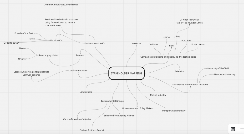
    1. Who’s here? Stakeholder Mapping

    We started with a wide stakeholder mapping exercise to understand who exists in the ecosystem of Enhanced Weathering (EW). Using online sources, industry reports, NGO documents, and competitor websites, we mapped a broad network:

    • Internal stakeholders: scientists, geochemists, engineers, project managers, designers, farm operators.
    • External stakeholders: farmers, landowners, NGOs, policymakers, environmental activists, carbon-credit platforms, mining suppliers, and academic institutions.

    This helped us see how interconnected and multi-layered the Enhanced Weathering world is from scientific knowledge all the way to local farming communities.
    2. Who knows about this? Expert Research & Outreach

    We then identified who currently holds knowledge in this field:
    climate researchers, soil scientists, regenerative agriculture experts, carbon market analysts, and government advisors.

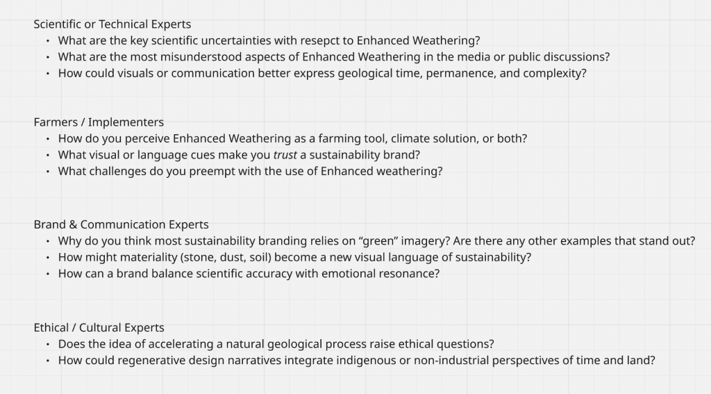
    We prepared interview questions for four categories of experts:

    • Scientific / Technical Experts
    • Farmers / Implementers
    • Brand & Communication Experts
    • Ethical / Cultural Experts

    We reached out to researchers, scientists, and policy advisors across climate-tech, agriculture, soil science, and carbon-removal sectors. Although we didn’t receive responses within the two-week window, the process helped us refine our blind spots and understand which expertise is central to the EW ecosystem.
    3. Who could it be for? Audience Definition & Personas

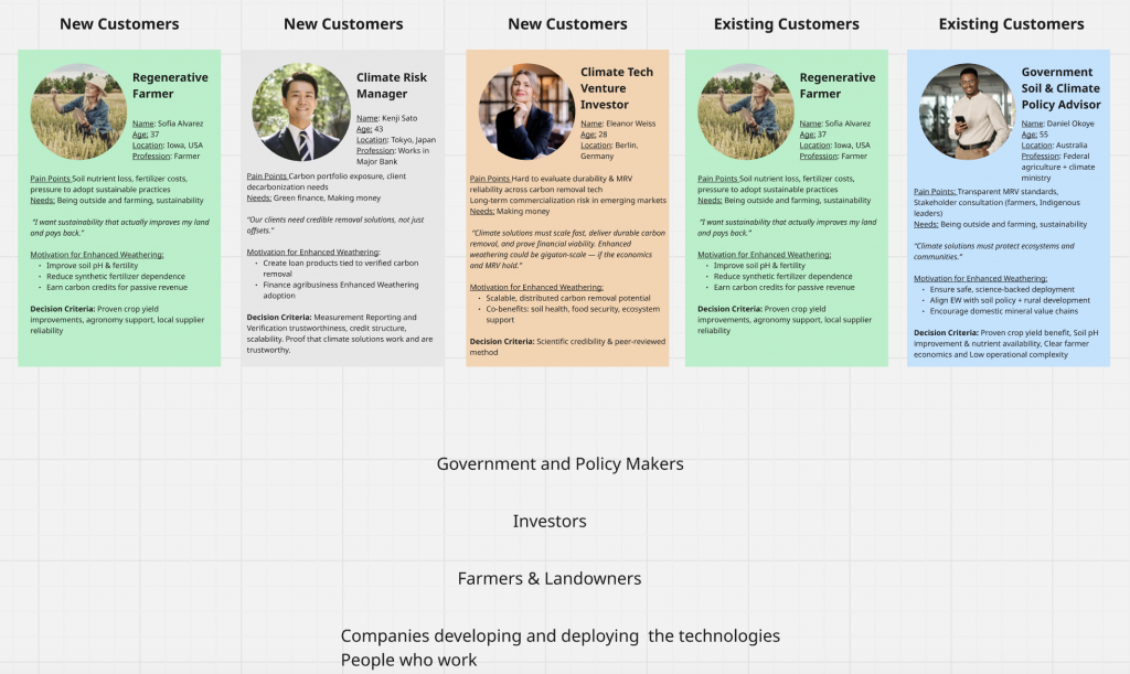
    Initially, we created five personas across different potential audiences: venture investors, policy advisors, climate-tech managers, general consumers, and regenerative farmers.

    Through discussions and early critique, we realised our project required a farmer-first direction. Enhanced Weathering succeeds only if farmers accept it, trust it, and experience real value from it. So our final audience became:

    → Farmers and agricultural communities.

    They became the emotional, functional, and narrative heart of our brand.
    4. What else is happening here? Ecosystem Mapping

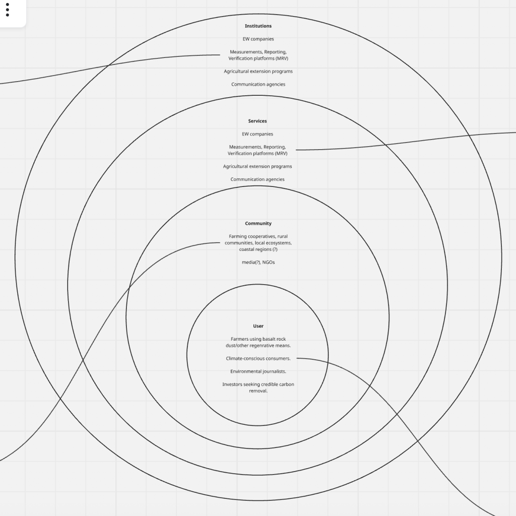
    Our ecosystem map reframed Enhanced Weathering as a living system supported by four layers:

    User Level

    • Farmers using basalt rock dust
    • Climate-conscious consumers
    • Environmental journalists
    • Investors seeking credible carbon removal

    Community Level

    • Farming cooperatives
    • Rural communities
    • Local ecosystems and coastal regions
    • Media groups and NGOs

    Services Level

    • EW companies
    • MRV (measurement, reporting, verification) platforms
    • Agricultural extension programs
    • Communication agencies

    Each layer had roles, enablers, and constraints, revealing systemic barriers like low farmer awareness, weak outreach capacity, high operational costs, or lack of trust in carbon markets.

    Institution Level

    • EW companies (regulation + technology)
    • MRV frameworks
    • Regulatory bodies
    • Soil and climate governance systems

    This mapping helped us understand where a brand could intervene not just visually, but structurally.
    5. Who else is here? Competitor Analysis

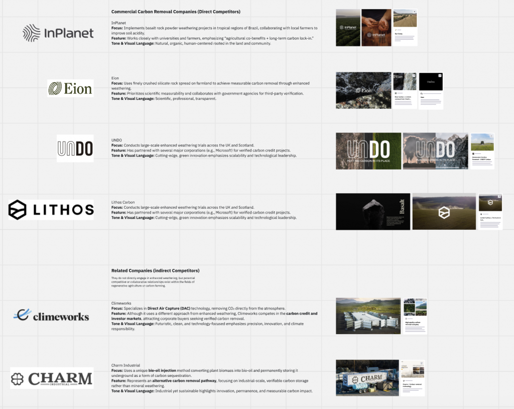
    We explored four direct EW competitors:

    • InPlanet (Brazil) — community-centred, tropical agriculture focus
    • Eion (US) — highly scientific, verification-driven
    • UNDO (UK/Scotland) — large-scale, industrial trials
    • Lithos (North America) — data-driven and AI-powered precision agriculture

    And indirect competitors like Climeworks (DAC) and Charm Industrial (bio-oil carbon storage).

    We analysed each company’s tone, visual language, brand positioning, audience, and experience journey.
    This helped us understand what EW brands were already doing well and where gaps existed:
    farmers were rarely the emotional centre of these brands.

    Part 2: Think, Feel, Do
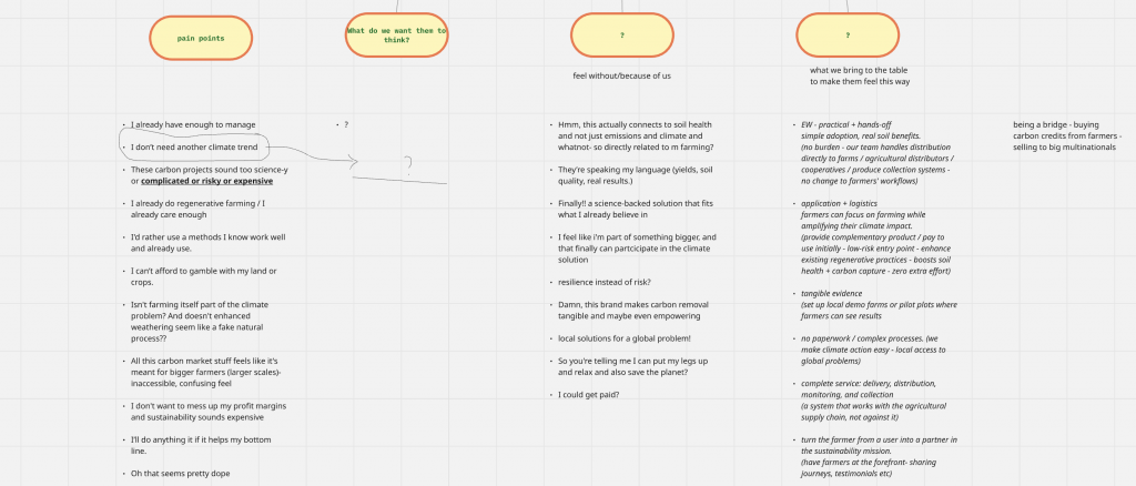
    We moved next into the emotional landscape of farmers:
    How do they currently see EW, and how do we want them to think, feel and act?

    Pain Points

    Farmers commonly expressed (through online sources, forums, research papers):

    • “I already have enough to manage.”
    • “I don’t need another climate trend.”
    • “This seems too risky, expensive or science-heavy.”
    • “I use methods I trust and understand.”
    • “I can’t gamble with my soil.”
    • “Carbon markets feel inaccessible and confusing.”
    • “It sounds like something only big farms benefit from.”

    These pain points guided our communication tone simple, familiar, practical.

    What We Want Them to Think

    • “This connects directly to my soil and yields.”
    • “This is science I can trust.”
    • “This solution fits the way I already farm.”
    • “Carbon credits feel less confusing now.”

    What We Want Them to Feel

    • Resilient instead of at-risk
    • Supported, not pressured
    • Part of something meaningful and bigger
    • That climate action is accessible, practical, and locally relevant

    What We Bring to the Table

    • Practical, no-disruption logistics
    • Tangible demonstrations (pilot plots, local evidence)
    • Clear, simplified science
    • A full-service system (distribution, monitoring, collection, carbon-credit handling)
    • A farmer-first narrative that treats them as leaders, not users
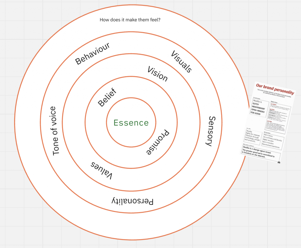
    Brand Essence Development

    We explored five early routes:

    1. Wisely sharing knowledge
    2. Land that earns
    3. Ease + empowerment
    4. Resilience over risk
    5. Investing in our future

    After critique, we realised we needed a single essence to build multiple routes from.
    “Regeneration” was our first attempt but felt too broad and not uniquely meaningful.

    So we pivoted to a more specific, grounded essence:
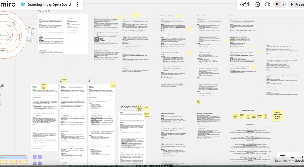
    Brand Essence: Empowerment

    Essence
    Empowering farmers to make climate action simple, profitable, and collaborative—turning complex science into everyday opportunities.

    Belief
    Everyone deserves access to clear, science-based climate solutions. Real change happens when we remove barriers and build connections.

    Promise
    We simplify Enhanced Weathering for real-world use. We handle the complexity so farmers can focus on growth, community, and impact.

    Vision
    A climate economy where participation is open to all—and where farmers become profitable environmental leaders.

    Values

    • Clarity first
    • Empowerment through connection
    • Shared success
    • Uncompromising trust

    Tone of Voice
    Clear, competent, collaborative.

    Personality
    The Ecosystem Connector.
    The Pragmatic Educator.
    The Action-Oriented Guide.

    Part 3: Verbal Narrative Exploration
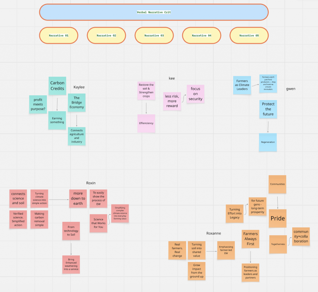
    Each of us developed one narrative route:

    1. Resilience Over Risk
    2. The Value Bridge
    3. Farmers as Climate Leaders
    4. Simplifying Climate Science
    5. Farmers Always First (Hero Archetype)

    Crit Feedback (Summary)

    During the verbal narrative crit, a few themes emerged:

    1. Keep the brand farmer-first, simple, and clear.
    Avoid abstract, conceptual visuals. Stick to real soil, real fields, real equipment.

    2. “Resilience Over Risk”
    Very relevant. Visuals needed to feel more grounded and less artistic.

    3. “The Value Bridge”
    Concept strong but initially too abstract. Needed to be expressed in down-to-earth language.

    4. “Farmers as Climate Leaders”
    A high-level identity piece useful for the emotional framing of the final narrative.

    5. “Simplifying Complex Science”
    A core pillar. Vital for adoption of EW.

    6. “Farmers Always First”
    A human, emotional route strong alignment between Gwen and Roxanne’s directions.
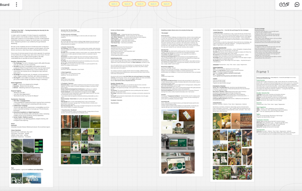
    Overall Synthesis

    Our final direction became a fusion of:

    • farmer identity & empowerment
    • clarity & simple science
    • security & resilience
    • shared value & connection

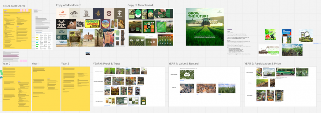
    This synthesis shaped our final narrative: Dear Farmer.
    Part 4: Final Narrative

    Dear Farmer: Our Brand Story

    Dear Farmer is a brand built on empowerment.
    A climate solution designed not to burden farmers, but to strengthen them.

    Our narrative begins with a simple belief: farmers already lead the way in adapting to a changing climate. Our role is to support that leadership with clarity, tools, and trust.

    Using Enhanced Weathering a natural volcanic mineral applied to soil we turn rainfall into a climate ally. The process enriches soil, improves yields, and captures carbon without adding extra work.

    Our story unfolds through yearly letters, mirroring the seasons. Farming takes time, and so does regeneration. Letters allow us to speak in the same rhythm farmers already understand: slow, steady, patient.

    Each letter shows what matters most:

    • Year 0 shows proof
    • Year 1 shows value
    • Year 2 shows pride

    Letters feel personal and grounded not like a digital notification or marketing message. They create continuity and trust, one season at a time.

    Year 0: Proof & Trust

    In Year 0, Dear Farmer introduces Ferratech® through proof, not pressure.

    We adopt a small section of land, apply volcanic rock at no cost, and let the natural process begin. Rainfall triggers carbon-locking reactions. Soil improves quietly beneath the crops. Farmers keep 100% of profits; we handle the science.

    Our touchpoints are practical:

    • split-field demonstrations
    • soil testing workshops
    • free samples through local farm shops
    • satellite-verified progress tracking
    • a simple, bot-less platform

    Year 0 exists to earn trust through results before asking for any commitment at all.

    Year 1: Value & Reward

    One year in, farmers can see and feel the difference.

    • Maize and soybean yields rise by 12–16%
    • CO₂ removal equals the footprint of 37 homes
    • Soil shows measurable improvements in pH and mineral balance

    Farmers begin unlocking financial benefits through carbon credits and agricultural incentives.

    Touchpoints now focus on value delivery:

    • a carbon-credit wallet
    • lower input costs
    • equipment discounts
    • micro-grants for regenerative upgrades
    • clear environmental statistics

    Year 1 empowers farmers with real, practical benefits not ideals.

    Year 2: Pride & Participation

    By Year 2, the farmer becomes a local climate leader.

    Soil tests from our “Regeneration on Wheels” mobile van reveal richer soil, stronger nutrient density, and long-term carbon storage equal to 22,400 mature trees.

    Cereal yields increase by 20%.

    Farmers begin sharing their experiences at markets, cooperatives, and conventions helping others join the movement.

    Touchpoints reflect community and pride:

    • soil-testing vans at local events
    • clear impact visuals (trees, yields, CO₂ savings)
    • presence at farmers’ markets
    • storytelling through the voices of farmers

    Year 2 shows sustainability not only working but spreading.

    The System Behind the Narrative

    To clarify the logic of our brand:

    Problem: farmers face rising climate pressure but carry all the risk.
    Belief: climate action should empower farmers, not add to their load.
    Solution: Enhanced Weathering supported fully by Dear Farmer.
    We provide the rock dust, logistics, verification, and carbon-credit access.
    Payoff: regenerated soil, better yields, clearer economics.
    Brand sustainability: built on trust, continuity, and community impact.

    This mirrors the “Brand System” summary in our PDF:
    challenge → bridge → payoff → solution → shift.

    Conclusion

    Rotation 02 taught me that branding isn’t just visuals or slogans it’s a system of relationships.
    Through open research, emotional mapping, expert framing, and narrative critique, our team built Dear Farmer, a brand that respects the pace of farming, the intelligence of farmers, and the complexity of climate solutions.

    Instead of selling sustainability, we grounded it.
    Instead of overwhelming farmers with science, we simplified it.
    Instead of asking them to trust us, we chose to earn it year after year.

    Dear Farmer became not just a brand, but a partnership built on empowerment, clarity and shared growth.

  • From Renée Materials to Regeneration.org: Finding Our Focus for Rotation 02

    Today’s session started with a lecture by Freida Bischoff, co-founder of Renée Materials. A platform that rethinks how we deal with waste by turning industrial offcuts and leftover materials into creative resources. Her talk really resonated with our Rotation 02 theme: “Beyond Green: Systems, Circularity & Sustainable Cultures.”

    Freida shared how Renée began from observing everyday waste within creative industries and built a new system around reuse rather than recycling. What stood out to me was how she positioned Renée not just as a materials provider, but as part of a circular ecosystem connecting businesses, designers, and makers. It was a great example of how design can close loops, shift mindsets, and create economic as well as environmental value.

    After the lecture, our group discussed how this idea of systems and regeneration could guide our own project. We explored the Regeneration.org / Nexus website, which lists a range of real-world climate solutions from energy and materials to food systems. The platform helped us think about sustainability beyond just “green visuals,” towards more systemic change.

    After the group discussion, our tutor assigned us to Group 11, which focuses on the theme of Energy. Within this broad category, we were given several potential directions to explore including Agrivoltaics, Biogas, Energy Efficiency, Electrify Everything, Energy Storage, Geothermal, and Green Hydrogen. Each of these topics offers a unique perspective on how energy systems can become more circular and regenerative. For example, Agrivoltaics combines agriculture with solar power, while Biogas transforms organic waste into renewable fuel. Together, these subtopics encourage us to look beyond traditional energy generation and consider how design, technology, and community action can work together to build more sustainable energy cultures.

    During the discussion, different ideas came up some of us were drawn to insects as a topic, while others preferred urban farming or energy-related systems. We compared how each could connect to people emotionally and work within our chosen methodology, Branding in the Open.

    In the end, we realised that what inspired us about Renée Materials was not only the sustainability message, but the participatory system behind it the way people become part of the process. So, we wanted to find a topic that could offer that same kind of human connection. That’s why Urban Farming felt so strong: it’s about community, participation, and creating a living system inside the city.

    For me, this transition from hearing Freida’s talk about material reuse to exploring systemic regeneration through Regeneration website helped me see how design can act as a bridge between environmental action and social engagement. It’s not only about creating sustainable visuals or branding, but about designing relationships between people, materials, and systems.

  • Initial Design Development Sensing Belonging: Re:Play

    Context and Progress

    As Rotation 1 concludes, this stage of my project marks the transition from research and conceptualisation to initial visual design development.
    Following my Sensing Belonging study at LSBU Sports Hall, my concept Re:Play was developed as a community-driven brand system that transforms the transient badminton environment into a space of reconnection and shared rhythm.
    Since the final submission is due in January 2026, these initial design assets represent an early visual exploration rather than a finished outcome.

    Working Process: Visual Exploration

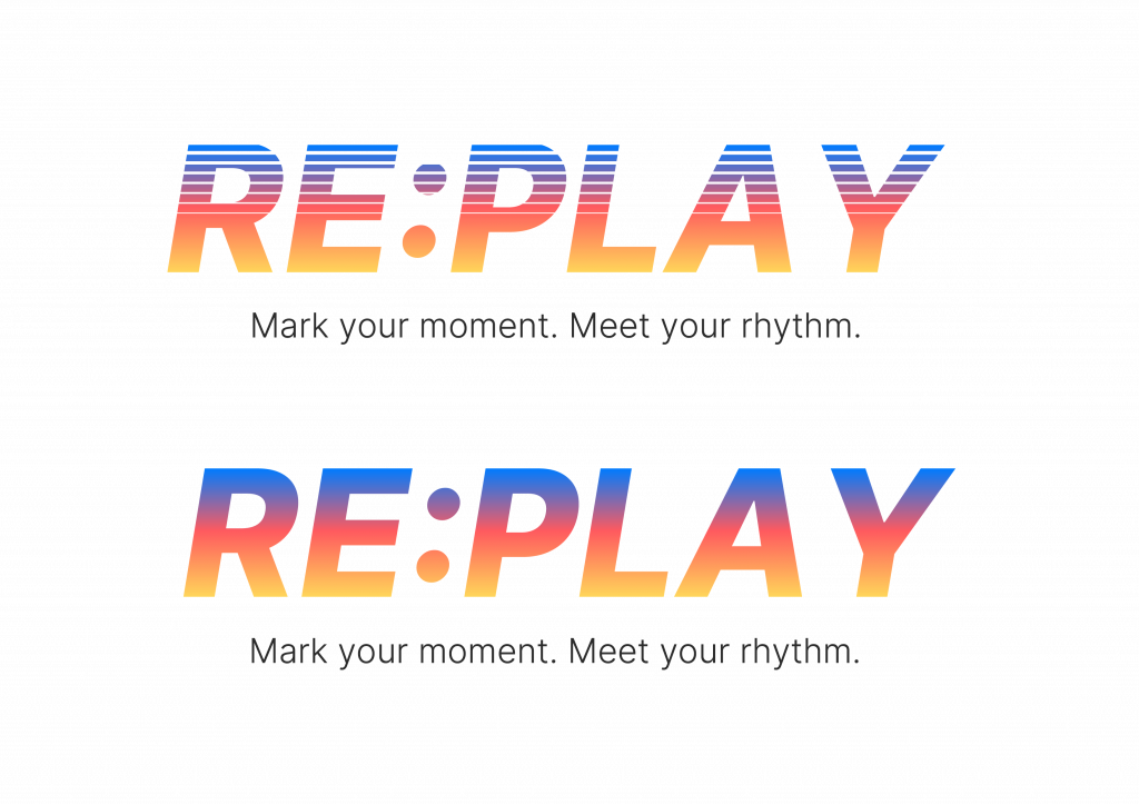
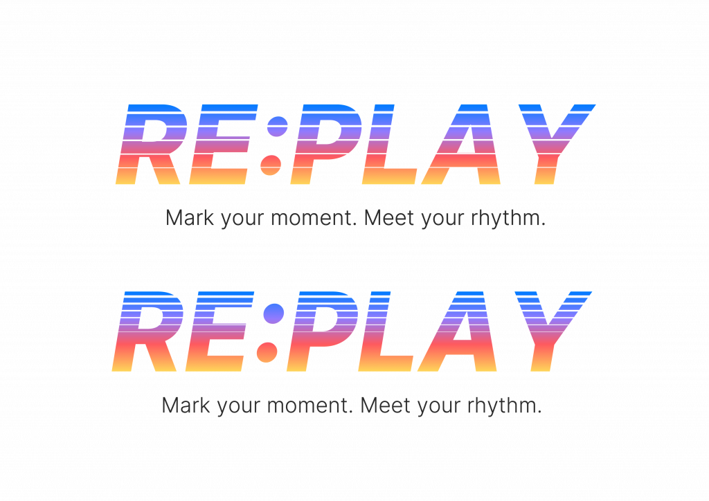
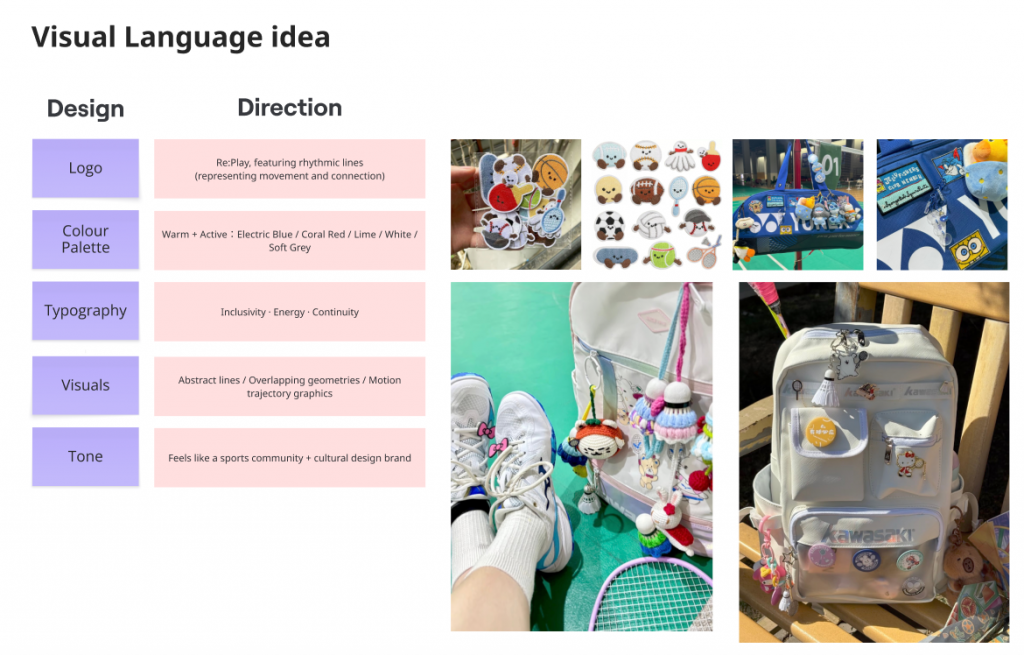
    Before developing the initial brand assets, I focused on building a visual foundation through iterative experiments with typography, effects, colour palettes, and composition.
    This stage aimed to translate the energetic and rhythmic qualities of the badminton experience into a cohesive visual identity.

    Typography & Motion Effect Exploration

    I began by experimenting with different typographic treatments to express rhythm, speed, and repetition.
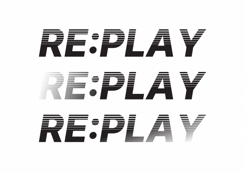
    Using motion-inspired line effects and angled letterforms, I tested how visual vibration could represent the sound and movement of rallies.
    These trials helped define the direction of the final wordmark dynamic yet structured, reflecting the collective rhythm of play rather than individual performance.

    Colour and Gradient Testing

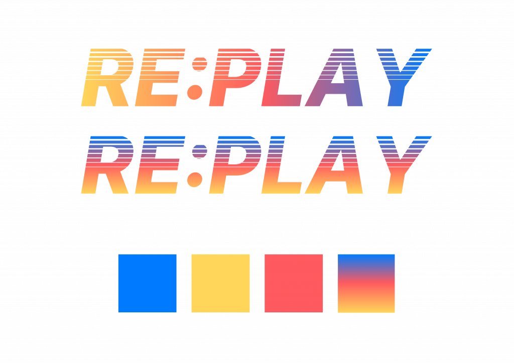
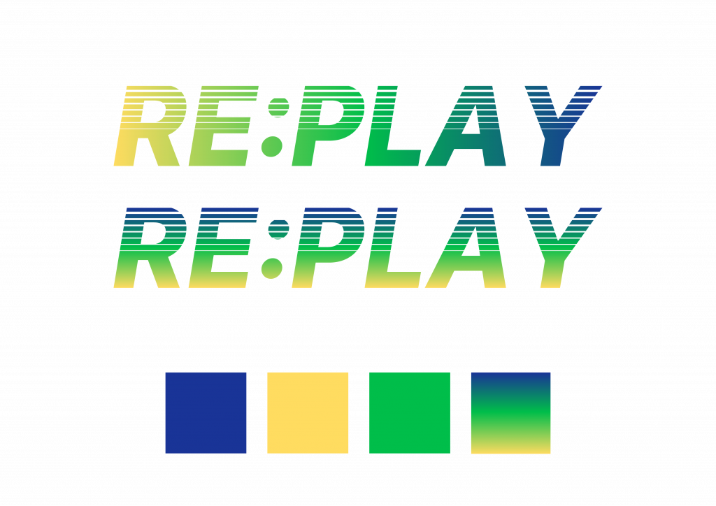
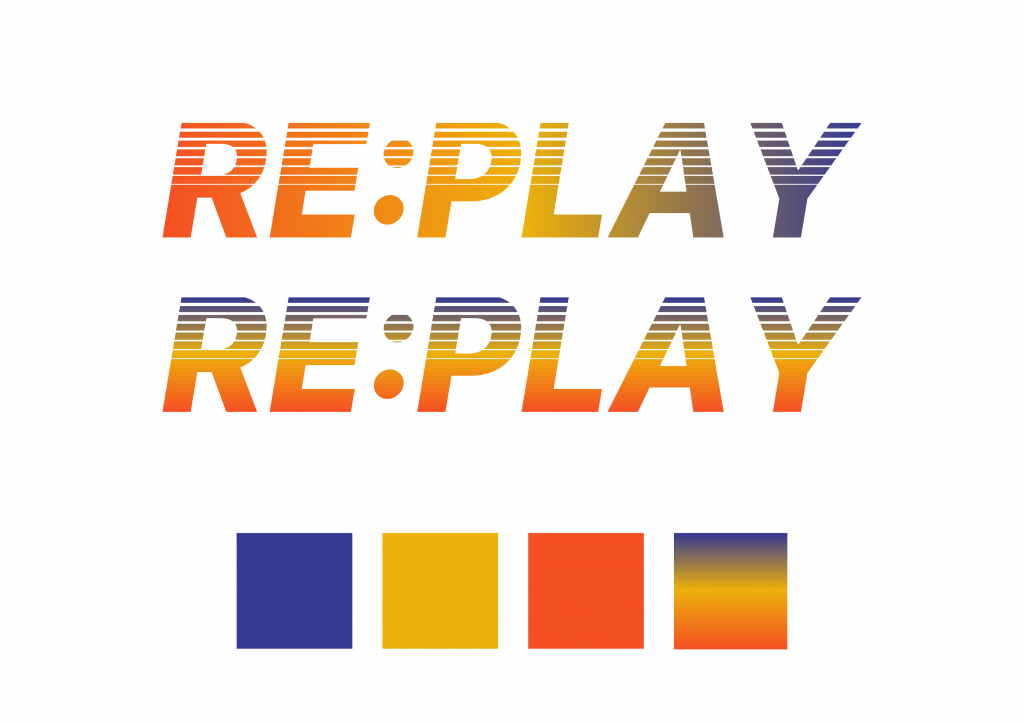
    Next, I explored several colour palette combinations, testing both solid and gradient applications.
    The goal was to find a balance between energy and inclusivity: colours that feel active and playful without being overly commercial.
    Gradients were particularly effective in visualising transition and connection echoing how players move, interact, and overlap across sessions.
    Through this process, I realised the gradient could symbolise diversity in rhythm rather than a fixed brand tone.

    Poster Illustration and Layout Experiments

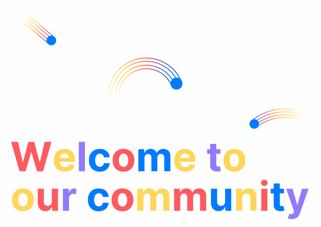
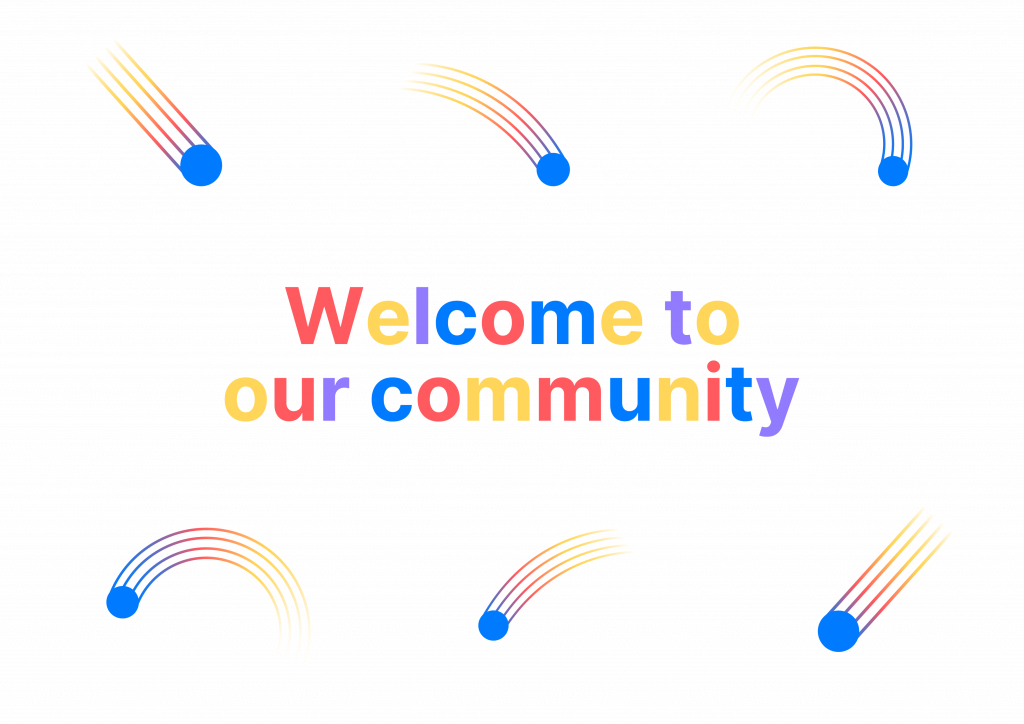
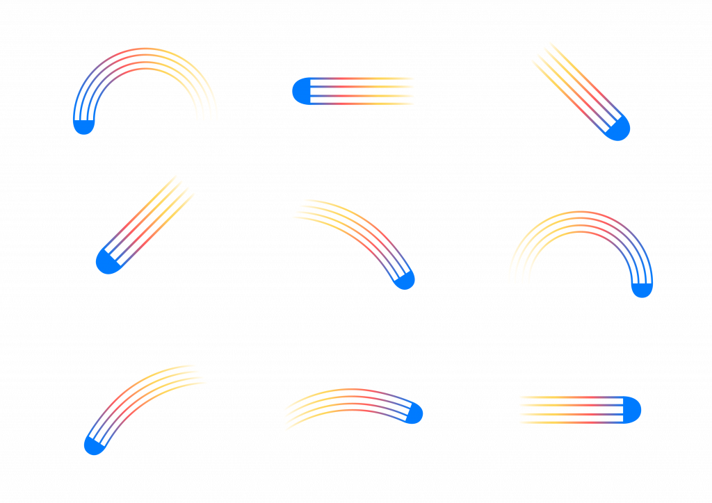
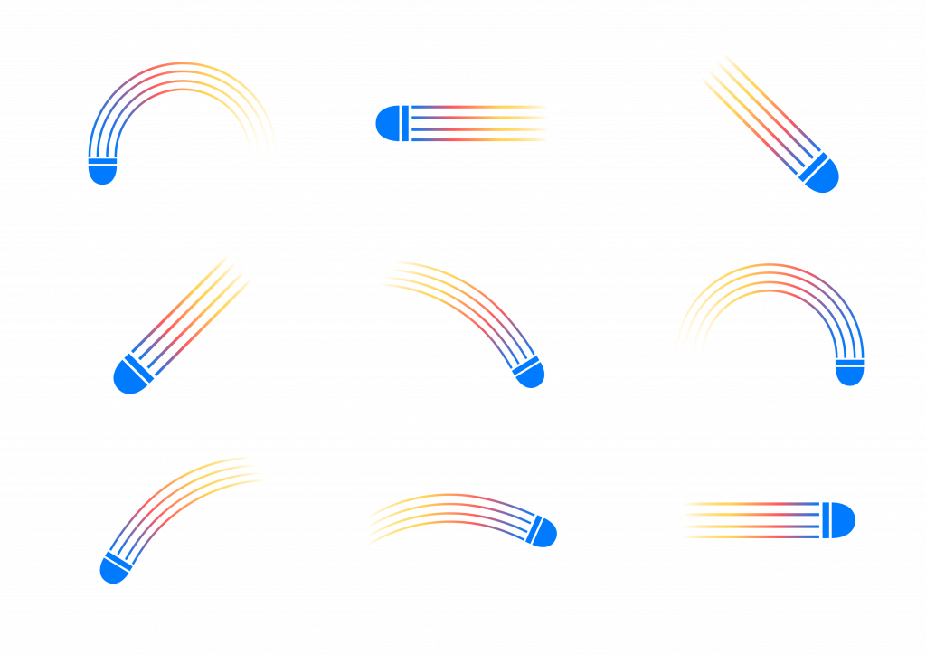
    The poster development began with testing the composition and visual rhythm of shuttle-inspired illustrations.
    Each curve was informed by actual badminton movements serve, smash, clear, drop, and drive transforming sport trajectories into graphic motion lines.
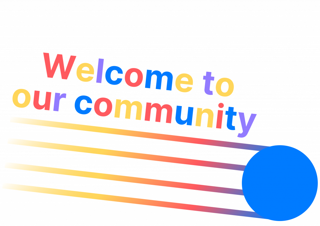
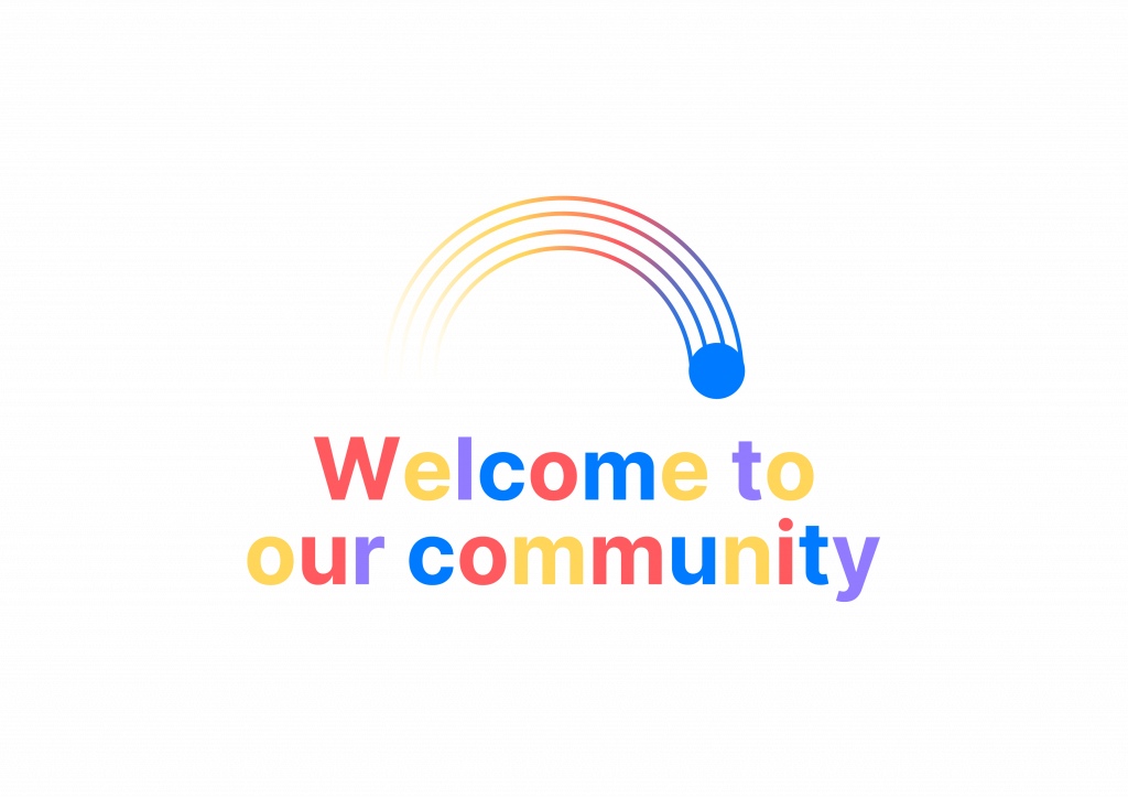
    I tested various ways to integrate the illustration with text elements such as “Welcome to our community”, aiming to find a layout that felt open, approachable, and rhythmically balanced.
    This exploration helped me understand how to visualise belonging through movement and how visual rhythm could support the brand’s welcoming tone.

    Initial Design Assets

    For this phase, I produced three key brand assets that visualise the early identity of Re:Play:

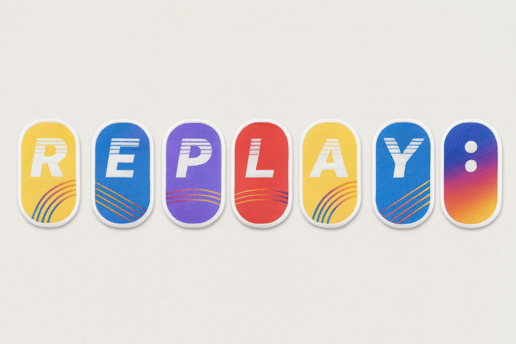
    1. Fabric Stickers – representing the collectible R, E, P, L, A, Y : tag system. Each colour and curve references movement and energy within the badminton hall.
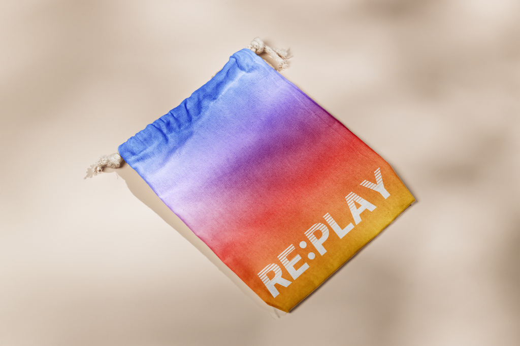
    2. Reusable Collection Bag – designed as a tactile, personal archive for players to store their collected tags. The soft gradient fabric reinforces the brand’s sensory focus on touch and motion.
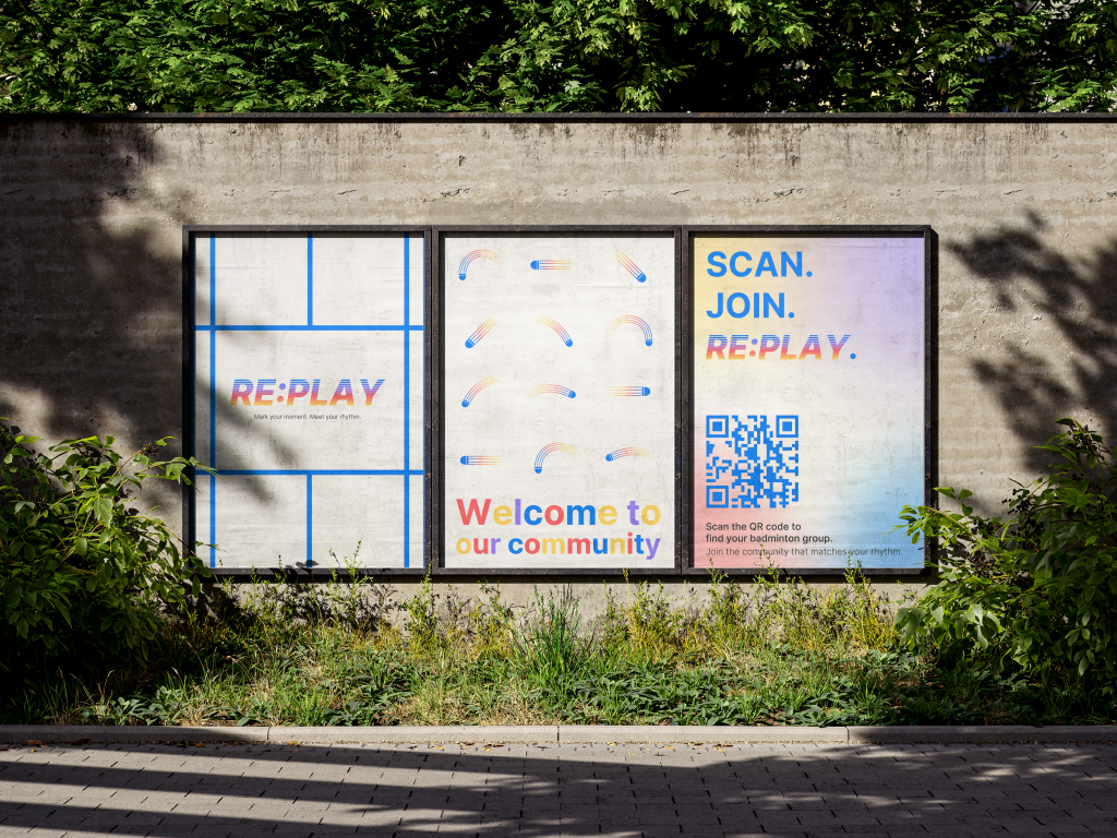
    3. Posters – positioned as public touchpoints for welcoming newcomers and promoting community visibility. The illustrations are based on the trajectories of shuttle movement Serve, Smash, Clear, Drop, and Drive translated into flowing curves and kinetic compositions.

    Design Rationale

    The identity currently focuses on rhythm, colour, and motion rather than literal representation of badminton.
    My intention was never to design a sports product brand, but a community experience brand.
    Therefore, the design language emphasises connection through rhythm rather than equipment or competition.

    The gradient palette emerged from my observation of players’ clothing and energy within the space sportswear in badminton culture is often vibrant, layered, and expressive.
    Rather than assigning symbolic meaning to each hue, I used gradients to visualise diversity in motion: multiple players, backgrounds, and tempos blending into a single shared rhythm.


    This reflects my earlier insight that belonging in badminton is dynamic, not fixed.

    Feedback Reflection

    During the recent feedback session, peers and tutors provided valuable perspectives that revealed gaps in clarity and communication:

    • Some viewers outside the badminton context perceived the visuals as belonging to a music or performance brand, due to the emphasis on rhythm and gradient colour.
    • Others noted that the brand could better communicate welcome and inclusion, suggesting that I integrate more explicit badminton cues (e.g. shuttle or racket forms).
    • A few comments encouraged the development of a distinct logo for the community itself, to strengthen its collective identity.

    This feedback highlighted an important challenge: balancing metaphorical design language (rhythm, connection, sound) with contextual specificity (badminton as cultural and spatial practice).

    Reconsideration and Next Steps

    Based on this critique, I am currently reframing my next design stage for Rotation 2:

    • Reconsidering the brand name (potentially Re:Match or Re:Game) to better align with the sporting context while preserving the idea of repetition and reconnection.
    • Exploring ways to integrate shuttle-inspired element possibly through iconography, motion lines, or texture so that the community connection is visibly anchored in badminton.
    • Refining the colour narrative, articulating how gradients express rhythm, diversity, and energy without becoming too abstract.
    • Continuing to test how the brand system functions socially, rather than visually how it enables players to feel recognised, included, and “in rhythm” with others.

    Reflection on Learning

    This design phase deepened my understanding of how visual identity operates as communication, not only aesthetics.
    Feedback revealed that clarity of intention is as crucial as conceptual strength.
    Designing for community requires empathy, translation, and iteration especially when representing intangible experiences like rhythm or belonging.

    In the next stage, I aim to create a more grounded visual system that balances symbolic meaning and recognisable form, ensuring that Re:Play (or its new form) resonates both with insiders of the community and with those encountering it for the first time.

  • Sensing Belonging: Re:Play from Observation to Brand Concept

    1. Revisiting My Community

    After the feedback session, I redefined my focus to the LSBU Sports Hall badminton community a place that truly represents my personal and cultural sense of belonging in London.
    Badminton is more than a sport for me; it’s a way to connect emotionally, socially, and culturally. The rhythm of rallies, the sound of the shuttle, and the synchronised movement of players form a shared language of belonging.

    As an international student, this community gives me a sense of home. It reminds me that belonging is not fixed by place or language, but by rhythm, participation, and shared presence. Through play, I experience both grounding and release a balance between personal focus and collective energy.

    2. Observation and Sensory Mapping

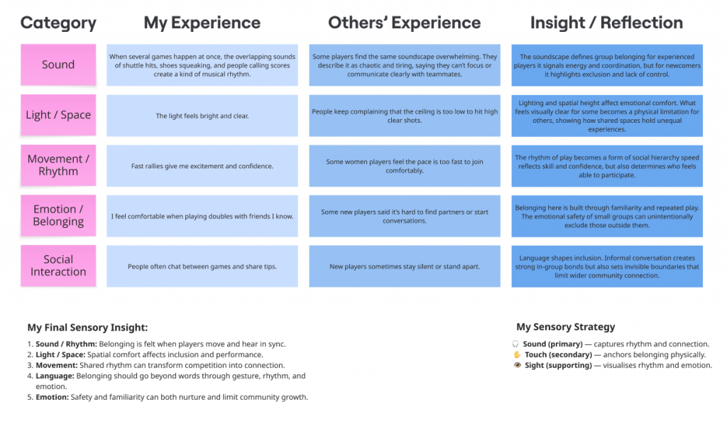
    Using sensory ethnography, I documented how belonging is expressed through five sensory and behavioural categories: sound, light/space, movement, emotion, and social interaction.

    Key Findings

    • Sound: overlapping hits, squeaks, and calls form a rhythmic soundscape a mix of focus, chaos, and familiarity.
    • Light / Space: bright fluorescent lighting energises but also compresses the visual field.
    • Movement / Rhythm: rallies produce both physical connection and social hierarchy speed signifies belonging.
    • Emotion / Belonging: comfort comes from familiarity and repetition; small in-groups form through routine.
    • Social Interaction: conversation between matches and small gestures like passing shuttles act as unspoken rituals of inclusion.

    Insight: Belonging in this community is not spoken but performed through rhythm, gesture, and timing.
    The same rhythm that unites experienced players can also isolate newcomers who can’t yet “read” the pace of the hall.

    3. Community Insights and Voices

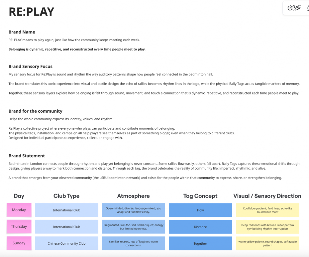
    Through short conversations with players from Monday, Thursday, and Sunday sessions, I found that the badminton community’s sense of belonging is rhythmic and situational rather than stable.

    Least-heard voices

    Quiet or transient members those who join alone or move between clubs often remain unnoticed, even though their quiet participation still contributes to the hall’s rhythm.

    Expression of belonging

    Players connect through movement and coordination more than through language. Laughter, rallies, and small gestures build inclusion; belonging emerges through shared timing rather than speech.
    Community perception
    1. You can recognise someone’s play by sound.
    2. The airflow by the side door is the best place to rest.
    3. The ceiling’s too low for clear shots.

    These comments reveal how physical space, rhythm, and interaction intertwine. The environment itself choreographs belonging it dictates pace, comfort, and visibility within the group.

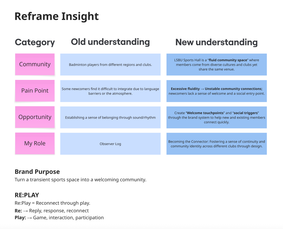
    5. Reframing Insight

    This reframing clarified the purpose of my design: to transform a transient sports space into a welcoming community.

    6. Brand Concept Development from Idea to Re:Play

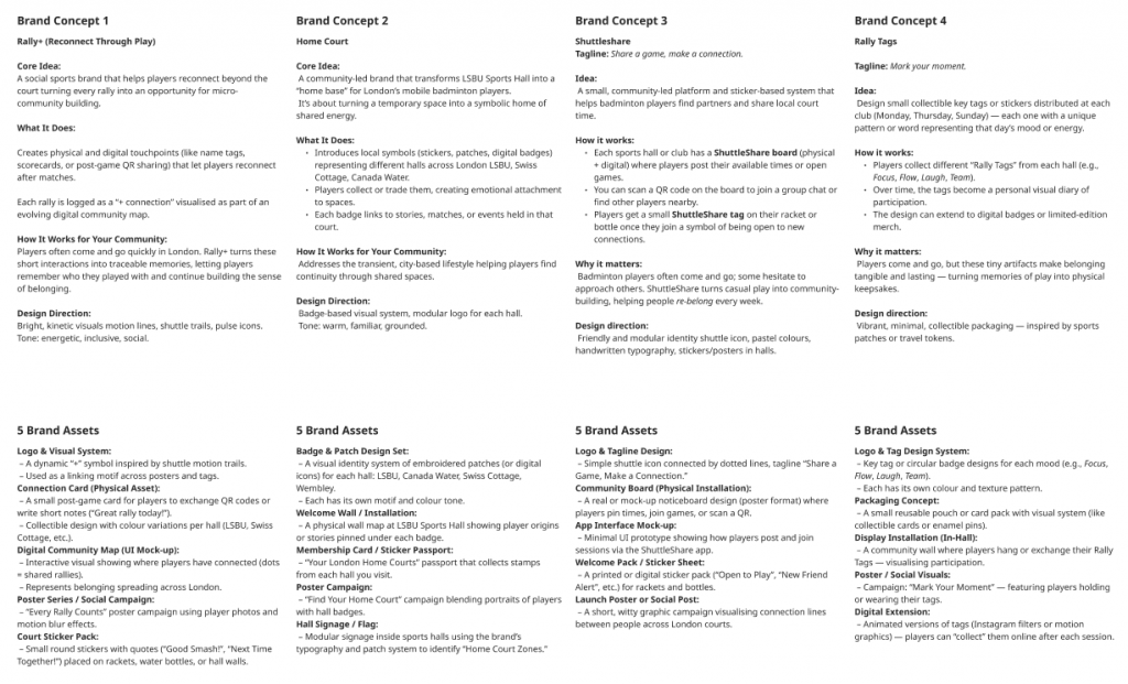
    I explored several directions during concept ideation Rally+, ShuttleShare, Home Court, and Rally Tags each testing how visual design can translate connection through motion.
    After feedback, I selected Rally Tag as the foundation because it embodies the physicality of play and turns invisible connections into tangible memory objects.

    The final brand name emerged as RE:PLAY, built from two ideas:
    Re: reply, response, reconnect
    Play: game, interaction, participation

    Together, Re:Play symbolises the repetitive, rhythmic nature of community life belonging that is reconstructed every time people meet to play.

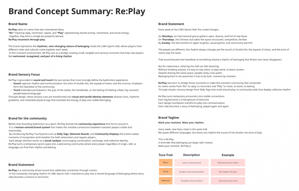
    7. Brand Concept: Re:Play connect through Motion

    Brand Purpose

    To transform a transient sports hall into a welcoming and connective community, where every game becomes a chance to reconnect.

    Brand Statement

    Re:Play is a community-driven brand that celebrates connection through motion.
    In the constantly changing rhythm of LSBU Sports Hall, it transforms play into a shared language of belonging where every rally becomes a moment to mark, remember, and reconnect.

    Sensory Focus

    • Sound captures rhythm and communication: the echo of shuttles, the squeak of shoes, the murmur of players.
    • Touch embodies participation and physical connection the grip of the racket, handshake, or collecting a tag.

    Through design, these sensory cues are translated into visual and tactile identity elements abstract lines, rhythmic gradients, and collectible physical tags.

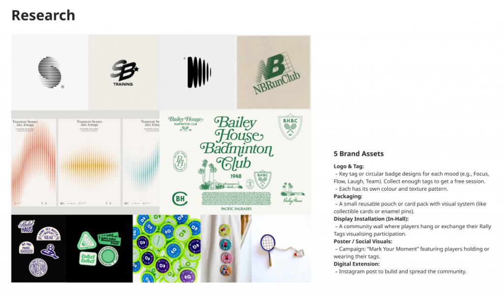
    8. Brand Assets

    1. Logo & Tag System

    A collectible tag series forms the core of Re:Play’s identity.
    Each week’s session releases a fabric sticker—R, E, P, L, A, Y—with the “:” tag as a limited edition.
    Players attach them to their badminton bags, gradually spelling RE:PLAY as they attend more sessions.
    Completing the full set unlocks a free session transforming participation into playful motivation.

    2. Packaging Design

    A reusable fabric pouch allows players to store and display their tags. It serves as both a tactile keepsake and a record of community presence.

    3. Animation for Sports Hall Display

    A looping animation of rhythmic lines and shuttle trails projected inside LSBU Hall acts as a digital pulse of belonging, reminding players that every rally adds to the shared rhythm.

    4. Posters & Social Visuals

    Three main posters communicate Re:Play’s tone:

    1. Mark your moment. Meet your rhythm.
    2. Welcome to our community.
    3. Scan. Join. Re:Play.

    These are adapted for social media and digital screens to attract new members.

    5. Digital Extension

    An Instagram page and WhatsApp group allow players to connect between sessions bridging online continuity and offline participation.

    9. Reflection

    Re:Play taught me how methodology can evolve into brand strategy. What began as sensory observation of light, sound, and rhythm developed into a systemic understanding of community dynamics.
    Through ethnography, mapping, and reframe, I learned that design can act as a connector turning motion, sound, and shared space into a collective identity.

    Belonging is dynamic, not static.
    It happens in rhythm, repetition, and the moments when people play together again.

    This project helped me see myself not just as a designer but as a translator between movement and meaning, using visual and sensory design to make invisible social bonds visible.

  • Brand Experience: Glocalising Tusker in the UK

    Workshop Summary: Understanding Brand Experience and Glocalisation

    This week’s Brand Experience workshop explored how global brands adapt and translate their identity into new cultural contexts through brand activations experiences that invite direct interaction between brands and audiences. The key takeaway was that brands are not static symbols but dynamic cultural resources that co-create meaning within specific social and geographic contexts.

    We learned that glocalisation (global and local) is the process where global brand strategies are reinterpreted and reshaped by local cultures. Rather than imposing a one-size-fits-all identity, successful brands adapt their visual language, storytelling, and experiences to resonate with local audiences while maintaining core values.

    Glocal marketing was described as blending global consistency with local relevance keeping brand DNA intact while responding to local consumer preferences, trends, and cultural touchpoints. Examples like Coca-Cola’s “Tasty Fun” localisation in China and The Old Irish Pub chain in Scandinavia showed how cultural translation builds authenticity and connection.

    We also discussed cultural identity in branding how brands reflect and shape cultural values. As Holt (2006) and Schroeder (2009) note, brands act as carriers of meaning, embedding themselves in cultural narratives. For this workshop, we were challenged to explore this through the design of a brand experience that imports one culture into another, using creative localisation to bridge the two worlds.

    Task 1: Brand Activation — “Rhythm & Roll by Tusker”

    Allocated Brand: Tusker Lager, Kenya’s most iconic beer brand (founded 1922).
    Core Values: Togetherness · Adventure · Authenticity · Cultural Pride

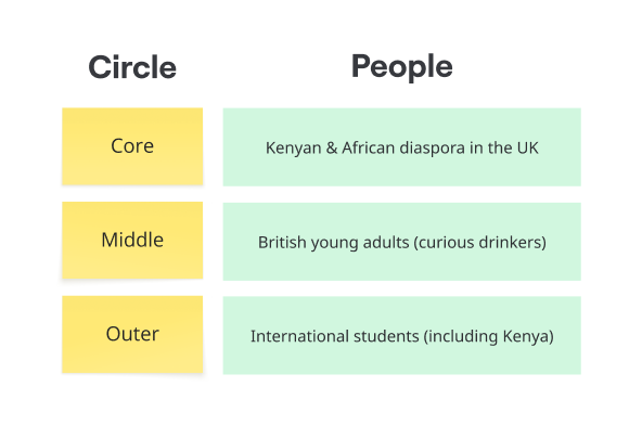
    Tusker embodies East African heritage a celebration of community, music, and the joy of shared experiences. Our challenge was to bring that spirit to the UK in a way that feels both authentically Kenyan and locally engaging.

    Concept Overview

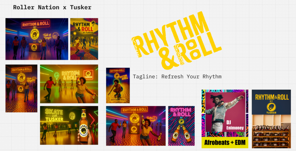
    Title: Rhythm & Roll by Tusker
    Meaning: A creative nod to “Rhythm & Blues” and the roller-skating rhythm culture popular in both Kenya and the UK. It blends African rhythm, urban nightlife, and the social energy of skating connecting people through movement, music, and togetherness.

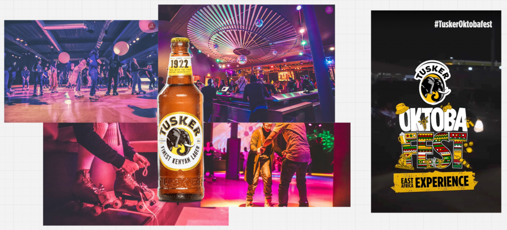
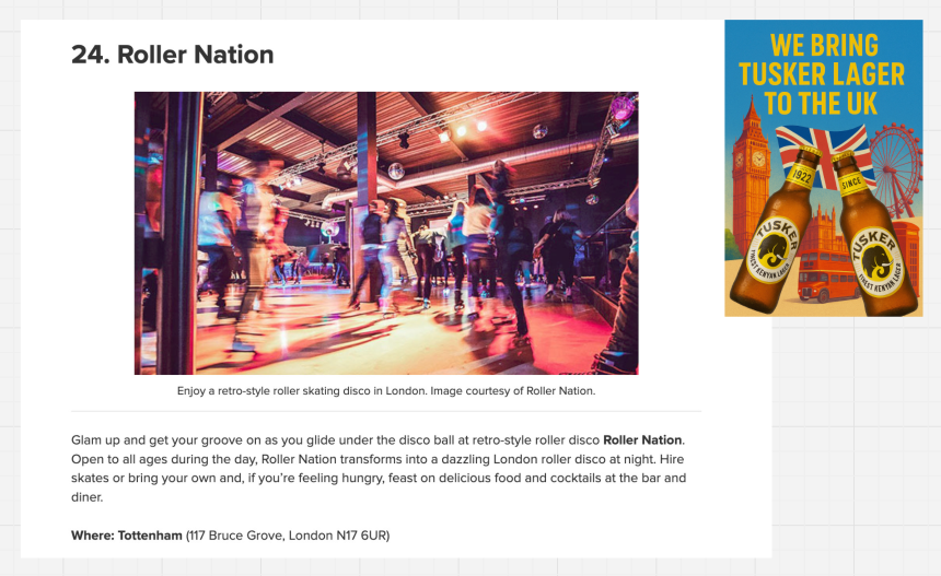
    The activation reimagines Tusker’s East African warmth within London’s dynamic social scene through a roller-skating pop-up event, partnering with Roller Nation (Tottenham), one of the UK’s leading retro roller disco venues.

    Task 2: Brand Experience Design

    Brand Positioning in the UK Market

    The UK beer market is dominated by global giants such as Heineken, Guinness, and Carlsberg, yet consumers aged 25–40 are increasingly drawn to story-driven, experiential, and culturally diverse brands. With rising demand for global flavours and event-based drinking, Tusker has the opportunity to position itself as a taste of Kenya through shared rhythm and energy.

    The Activation Experience

    Event Name: Rhythm & Roll by Tusker
    Tagline: Refresh Your Rhythm

    Experience Design:

    • Venue: Roller Nation, Tottenham transformed into an immersive space combining Afrobeat and EDM, neon lights, and African pattern graphics inspired by Tusker’s iconic elephant and Kenyan textiles.
    • Visual Identity: Elephant-skin and tribal patterns merge with neon roller-rink aesthetics, creating a vibrant fusion of Kenyan tradition and London nightlife.
    • Activities:
      • Roller skating sessions to live DJ sets
      • “Skate with Tusker” photo zone
      • Pop-up bar serving Tusker Lager and mocktail variants
      • Interactive wall featuring the Kenya–UK connection map (Nairobi ↔ London)
    • Cultural Touchpoints:
      • Afrobeat rhythms symbolising Kenyan vitality
      • Pattern and colour palette (yellow, pink, blue neon) merging African motifs with London’s retro disco vibes
      • Inclusion of the growing Black roller-skating community in the UK, highlighting cultural continuity and inclusivity

    Launch Campaign Strategy

    Campaign Objective

    Introduce Tusker as a cultural bridge “Kenya’s beer meets London’s rhythm” celebrating diversity, togetherness, and global-local fusion.

    Key Campaign Elements

    1. Social Media Launch
      • Hashtag: #RhythmAndRoll #TuskerUK #TasteOfKenya
      • Teaser clips featuring roller skaters, Afrobeats soundtracks, and Tusker bottles under neon lights.
      • Countdown posts and influencer collaborations from both Kenyan diaspora and UK roller-skating communities.
    2. Collaborations
      • Partner with Roller Nation London, Afrobeats DJs, and diaspora community groups for cultural authenticity.
      • Pop-up tastings at universities (targeting international students).
    3. Visual Campaign Assets
      • Posters: “We Bring Tusker Lager to the UK” featuring London icons (Big Ben, red buses) blended with Kenyan flag colours.
      • Ambient branding: Elephant-inspired floor projections and LED signage.
      • Merchandise: “Refresh Your Rhythm” T-shirts and limited-edition Tusker cans with UK–Kenya dual flag design.
    4. Event Launch
      • Soft launch during Black History Month in October.
      • Press and influencer night featuring live music, skating demos, and interviews with Kenyan creatives in the UK.

    Reflection

    Through this project, I learned how glocalisation allows a brand to evolve not by abandoning its origins, but by translating cultural essence into local relevance. Tusker’s Kenyan identity is not diluted in the UK context; instead, it becomes a connector of communities, uniting Londoners through shared rhythm, joy, and inclusivity.

    This exercise reinforced how brand experience design goes beyond marketing it’s about creating spaces of cultural exchange where products, people, and place intersect meaningfully.

  • Signs, Symbols & Belonging: Civic Identity in Design

    This week’s session explored how identity is not a fixed essence but a positioning a way of becoming through signs, symbols, and representations. Drawing on Stuart Hall’s idea of representation and Chantal Mouffe’s notion that “every symbol of unity also marks a boundary,” the lecture questioned how design both connects and divides communities.

    We discussed national identity as a designed invention a semiotic fiction made visible through flags, rituals, and myths of unity (Benedict Anderson, 1983). Examples such as Cool Britannia or the London 2012 Olympics show how branding can temporarily reimagine what “Britishness” means. Yet, these representations often simplify complex realities and raise questions about who gets to define belonging.

    By contrast, civic identity is more local, lived, and negotiated. It is performed through everyday spaces and visual systems from street art and uniforms to architecture and signage. These material cultures shape how people see themselves within the city and how inclusion or exclusion operates visually.

    The lecture also introduced ideas of City Branding and Symbolic Repair, showing how campaigns like London is Open use design to project inclusivity, while revealing the political tension behind such claims. Design activism was presented as a form of reclaiming the civic: using flags, logos, and public graphics not as static emblems but as open systems that invite participation and diversity.

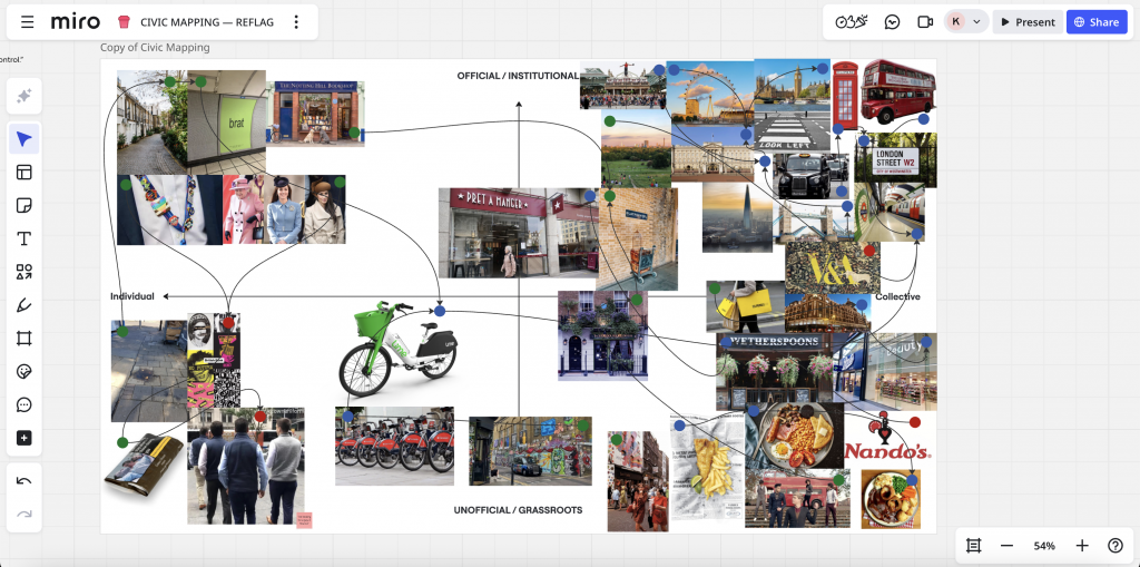
    Workshop Activity 1: Civic Mapping

    In the morning, we conducted a semiotic mapping of London’s civic identity. Using an X-axis (Individual ↔ Collective) and a Y-axis (Unofficial ↔ Official), we plotted images that represent different aspects of belonging — from the London Eye and Buckingham Palace (official/collective) to street murals, Pret A Manger, and bike-sharing schemes (grassroots or everyday collective systems).

    Each item was annotated as:

    • Icon – direct representation (e.g. skyline, monuments)
    • Index – presence or activity (e.g. signage, bikes, uniforms)
    • Symbol – abstract meaning (e.g. flags, crests, mottos)

    This mapping revealed how London’s civic identity emerges from both institutional symbols and everyday gestures a mix of pride, commerce, and multicultural expression.

    Workshop Activity 2: Re-Flag

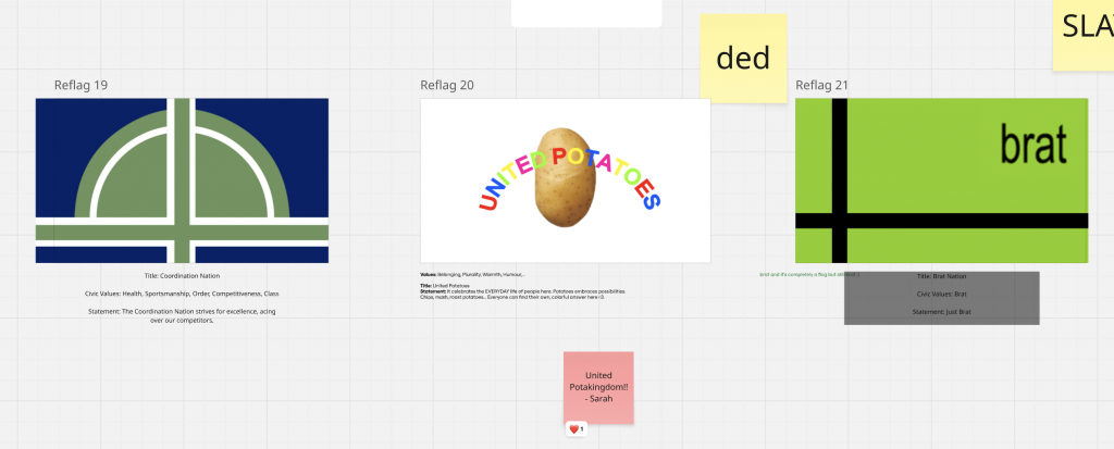
    In the afternoon, we reimagined flags as living semiotic systems that express the plural, hybrid, and everyday nature of civic identity today. Each group designed a new “flag of belonging” inspired by their morning map.

    Our group created three proposals:

    • United Potatoes – my concept, celebrating the warmth, humour, and everyday diversity of life in the UK. The potato, a staple of British food culture, becomes a playful symbol of inclusivity: “Everyone can find their own, colourful answer here.”
    • Coordination Nation – highlighting values of sportsmanship, order, and competitiveness.
    • Brat Nation – referencing a youthful, self-expressive energy.

    Through this exercise, we learned that every flag is a proposal for community, not a statement of fact. The project turned national symbols into tools of dialogue ways of questioning how belonging is designed and how humour, care, and plurality can reshape civic identity.

    Reflection

    This workshop helped me see design as a social language every colour, form, and word carries ideological weight. Civic symbols are not just decorative. They are performative gestures that shape how people feel seen. My United Potatoes flag uses humour and food as a common ground, turning an everyday object into a message of shared belonging.

  • Week 4 Sensory Ethnography Community Mapping

    Sensing Belonging: The LSBU Badminton Community

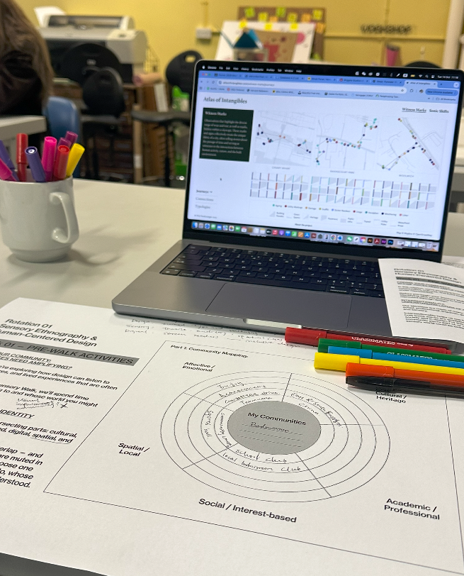
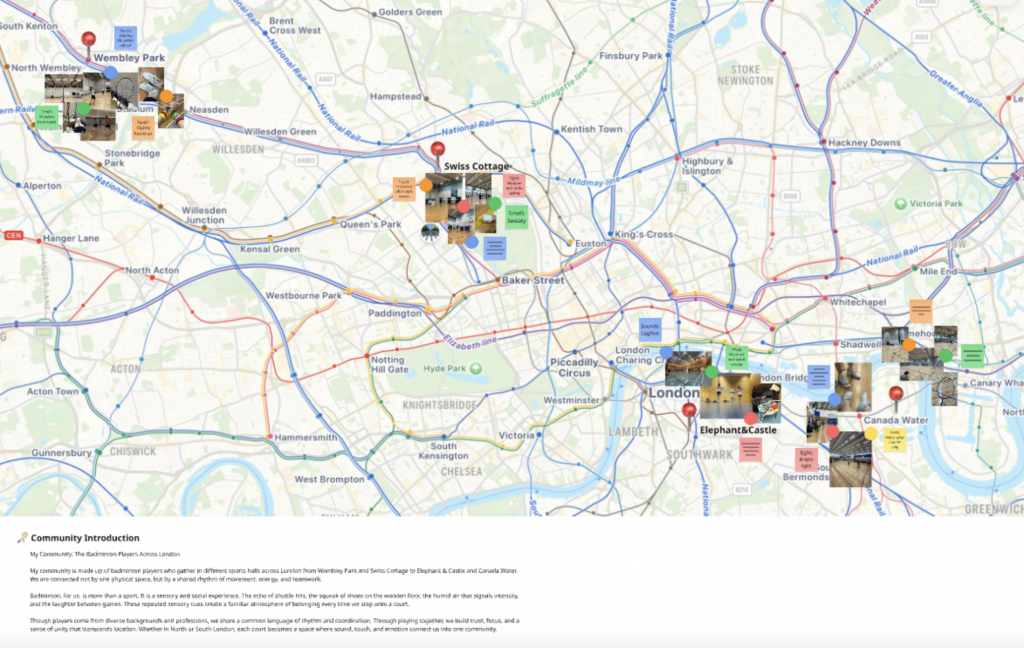
    My chosen community is the badminton community, which I belong to both culturally and socially. It connects to my emotional well-being, cultural background, and creative curiosity. Through this project, I explore how the sensory experience of badminton — sound, rhythm, motion, and teamwork — can be understood through design. It’s a community that unites people across languages and identities through shared energy and play.

    At the beginning, my community mapping covered four different areas in London Wembley Park, Swiss Cottage, Elephant & Castle, and Canada Water where I joined various badminton clubs using an app over the past two years. These clubs weren’t connected by a single location, but by a shared rhythm and energy that bonded players through play.

    After the Thursday feedback session, I decided to narrow my focus to the LSBU Sports Hall, a place I visit most frequently. This helped me go deeper into sensory observation and analyse how design can express the feeling of belonging through motion and sound.

    Revised Mapping: LSBU Sports Hall

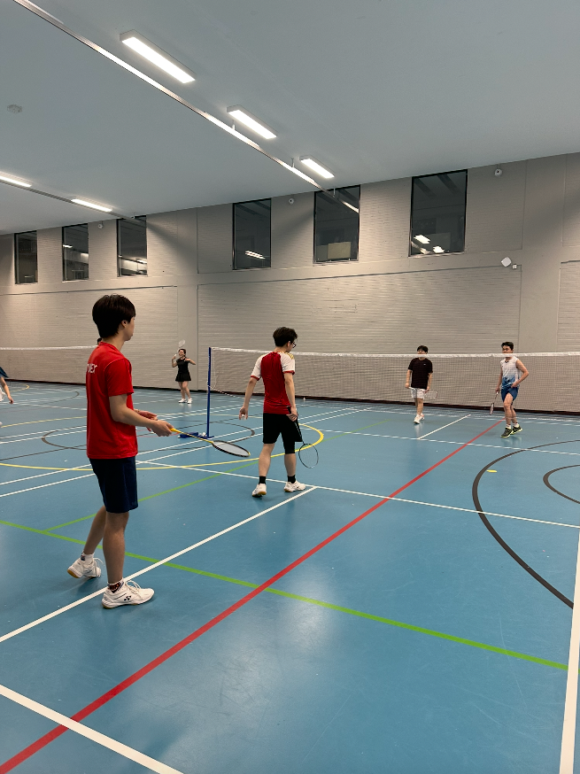
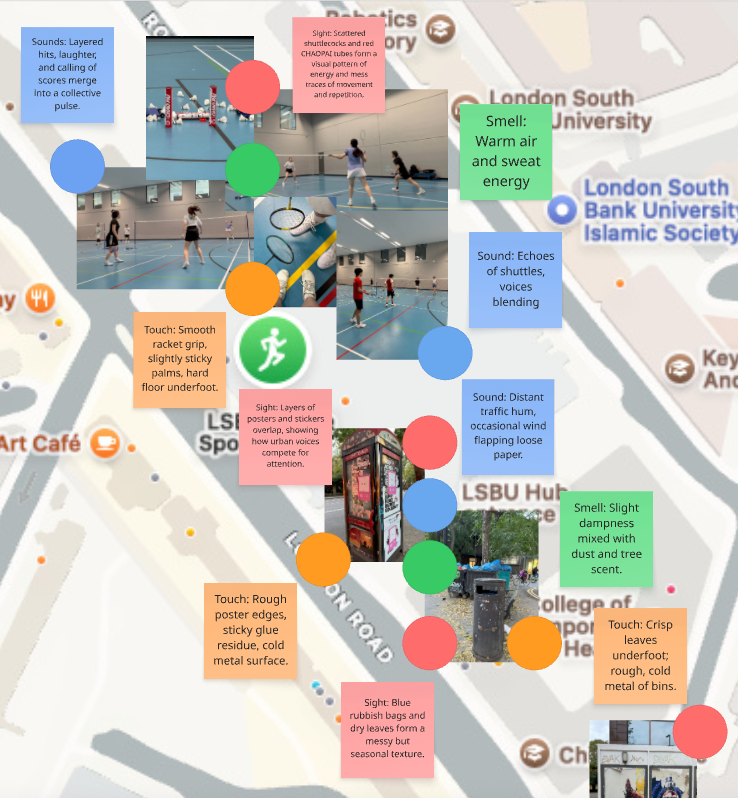
    The LSBU Sports Hall feels compact and enclosed, amplifying every sound and movement. The crisp impact between the shuttlecock and racket becomes a rhythmic cue a language of motion that every player can understand.
    When I play, I can almost “hear” the style of my opponent before I see it. The echo of shuttles, shoes sliding, and voices merging create a soundscape that feels both competitive and comforting.

    My new mapping focuses on sensory impressions:

    • Sound: Layered hits and shouts merge into a rhythmic pulse.
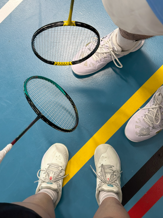
    • Touch: Smooth racket grip, sticky palms, and the solid bounce of the floor.
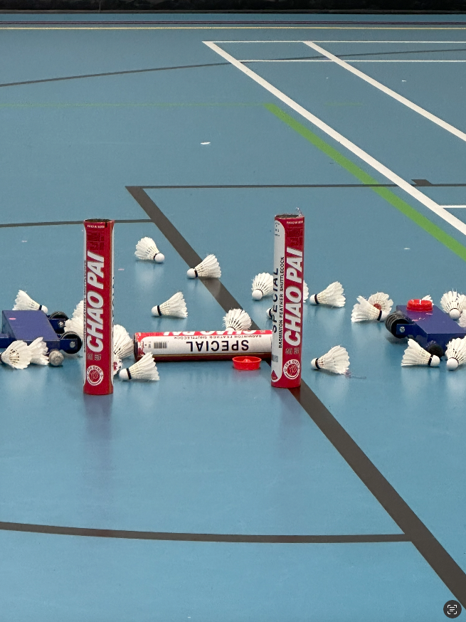
    • Sight: Scattered shuttlecocks and red Chao Pai tubes visualise energy and repetition.
    • Smell: Warm air and sweat a mix of effort and community.
      Together, these sensations form an embodied experience of focus and connection.

    These sensory layers together describe how badminton embodies community not through words, but through rhythm, energy, and shared focus.

    Community Perception

    I usually join three different badminton clubs each week:

    • Monday: International group, organised by a foreign host.
    • Thursday: Club run by Chinese players at LSBU.
    • Sunday: A Chinese community club.

    Each group has its own rhythm Monday feels more social and mixed, Thursday more intense and skill-focused, and Sunday more familiar and culturally connected.

    For me, as a foreigner living in London, these sessions are not only about sport but also about finding emotional belonging. The sound of the shuttlecock, the laughter, and even the friendly competitiveness remind me of home.ural on Mondays to more structured and familiar on Sundays.

    Pain Point

    Although badminton connects people through shared play, the sense of belonging can still fluctuate.
    Sometimes, I feel fully part of the community through rhythm, teamwork, and mutual understanding without words.
    Other times, I feel slightly distanced not because of language barriers, but because of the transient nature of city communities where people come and go quickly.

    Reflection

    At first, I misunderstood what sensory ethnography meant I focused too much on visuals and not enough on human experience. After receiving feedback, I realised that I needed to observe how emotions and senses construct belonging.


    This project helped me understand that my badminton community is not defined by space, but by movement, rhythm, and social energy.

  • Week 4 Sensory Ethnography Walk

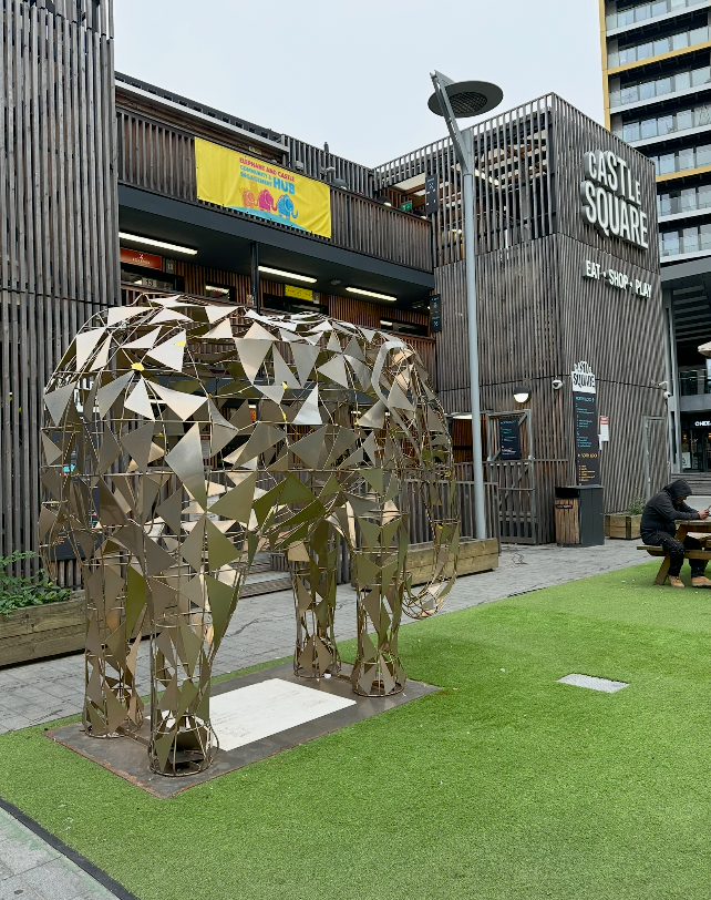
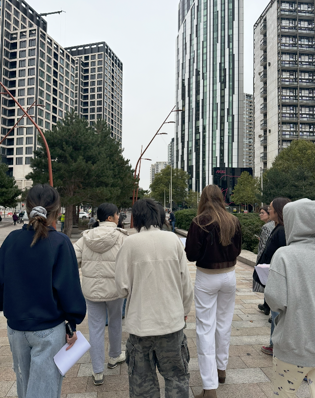
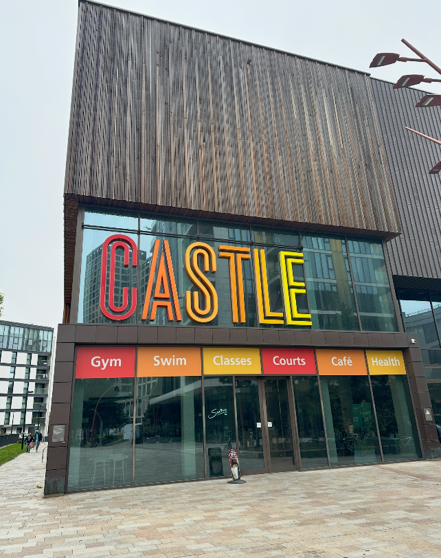
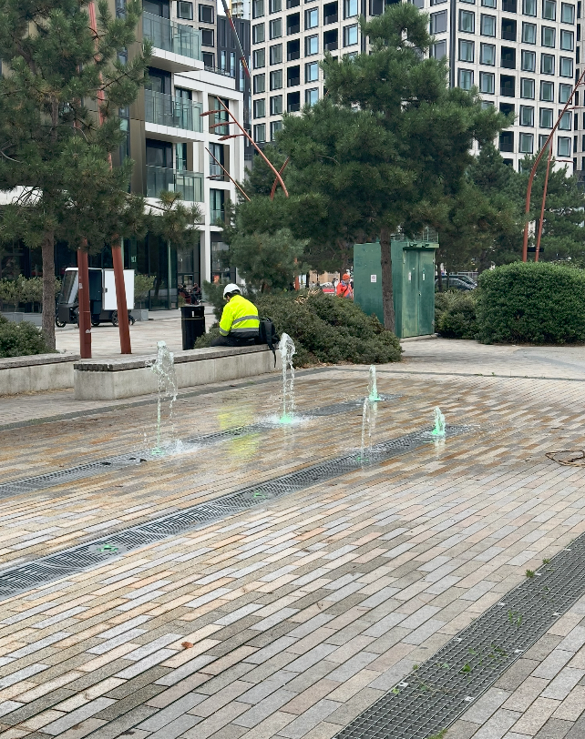
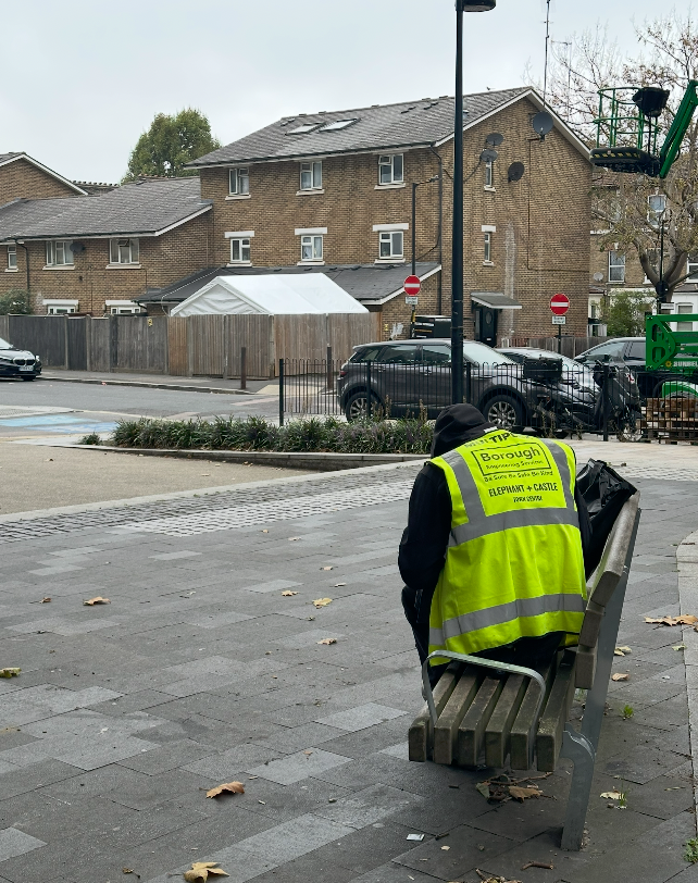
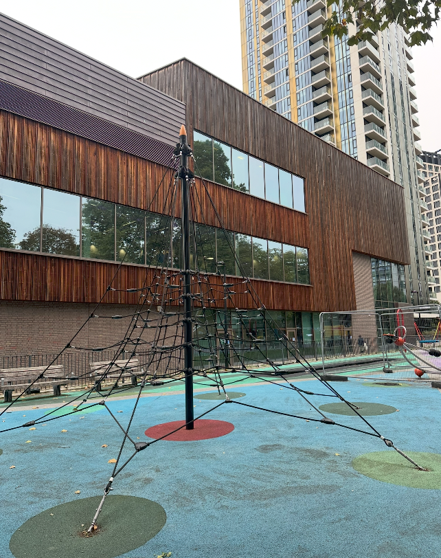
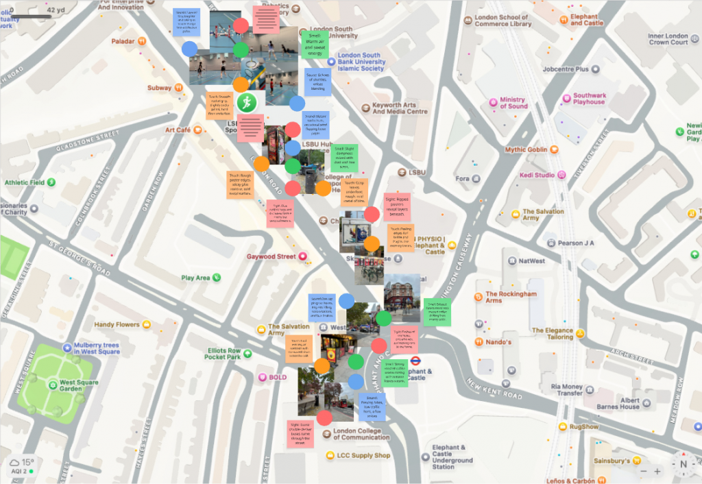
    During the Sensory Ethnography workshop, we were asked to walk around Elephant & Castle and record our impressions through the five senses. At first, I felt quite confused about the purpose of this task. I wasn’t sure whether I was meant to record my personal feelings, or to connect it with my own community. However, as I began walking, I realised the activity was about training our ability to observe the world through embodied experience noticing how sound, smell, texture, and movement shape the atmosphere of a place.

    The environment felt cold and windy, with the rhythmic noise of buses, cars, and people passing by. I noticed red buses moving through the grey sky, and a strong smell of rubbish near the street corners. At one point, the smell of food from nearby stalls made me feel unexpectedly hungry showing how emotion and memory can be triggered by sensory cues.

    Through this process, I learned how sensory ethnography allows designers to feel rather than just analyse. Even though I was unsure at first, I now understand this walk as a method for exploring belonging and identity through sensory experience. Moving forward, I want to apply this approach to my badminton community, capturing how sound, rhythm, and space shape our shared sense of energy and connection.

  • Week 4: Brand Audience & The Fashion Wheel Workshop

    Lecture Summary: Community Principles & Brand Strategy

    This week’s session with Precious introduced us to the principles of community-led branding and how it connects to values, narrative, and strategy.

    We learned three key principles of community branding:

    1. Empower dialogue – Everyone deserves to be seen and heard.
    2. Understand nuances – No community is a single story due to intersectionality.
    3. Create with care – Safe and inclusive spaces are essential when designing for marginalised groups.

    Precious also highlighted that community-led branding is not just a design trend, but a response to changes in technology, culture, and human needs. Successful brands, such as Vaseline South Africa and Bayo, build trust and belonging by co-creating with their audiences and speaking in culturally authentic voices.

    Key takeaways:

    • Co-create with the community throughout the process.
    • Create from an authentic and inclusive space.
    • Use language and visuals that resonate.
    • Think about narrative and lived experience.

    Workshop: The Fashion Wheel (Brand Audience Exercise)

    In the afternoon, we applied these ideas to understand Gen Z subcultures and their consumption habits through a hands-on activity called the Fashion Wheel.

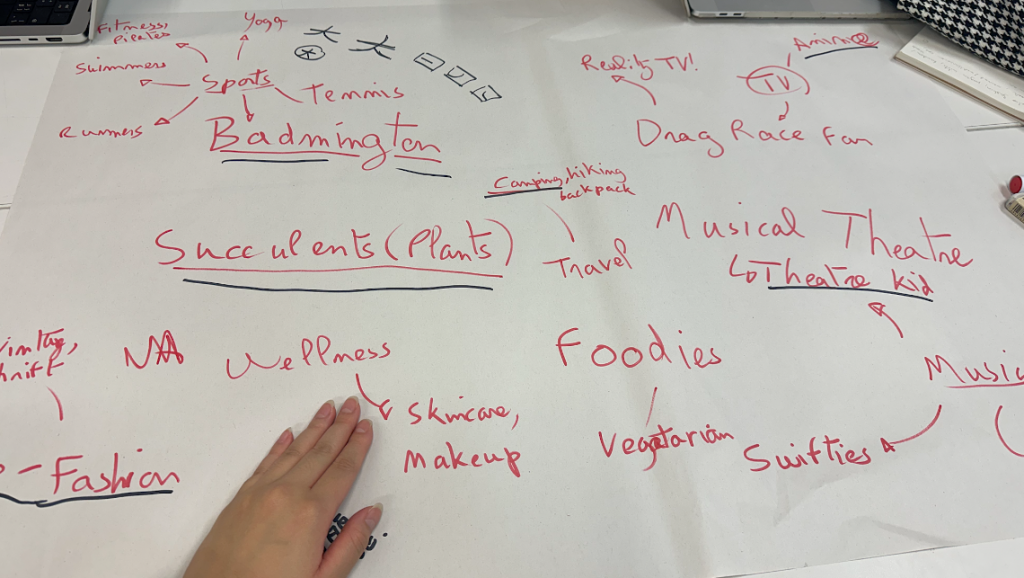
    Task 01 – Identify Subcultures / Tribes
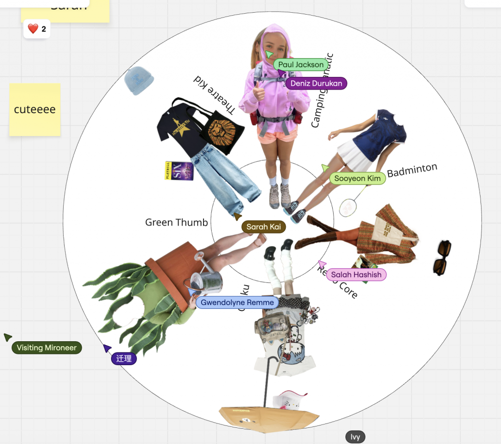
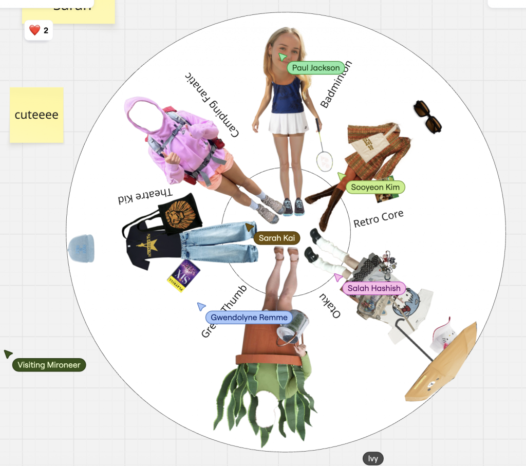
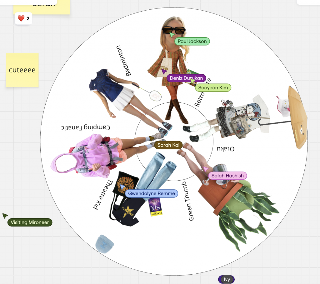
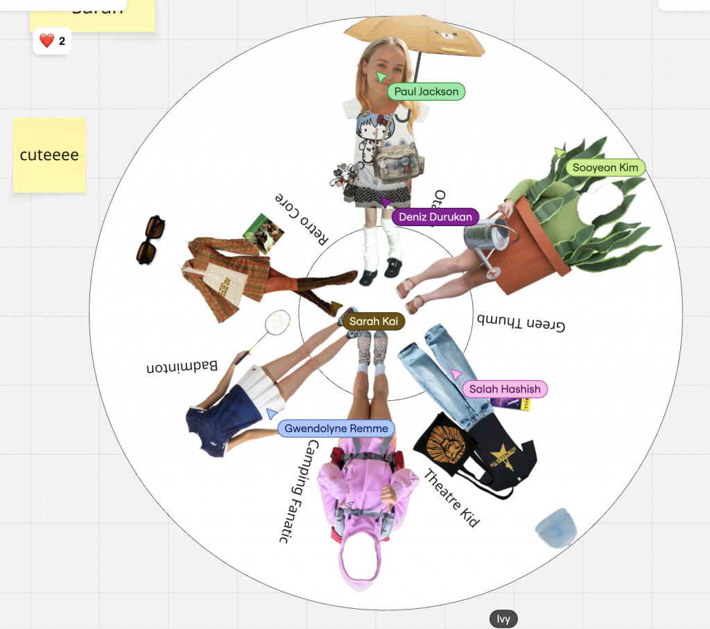
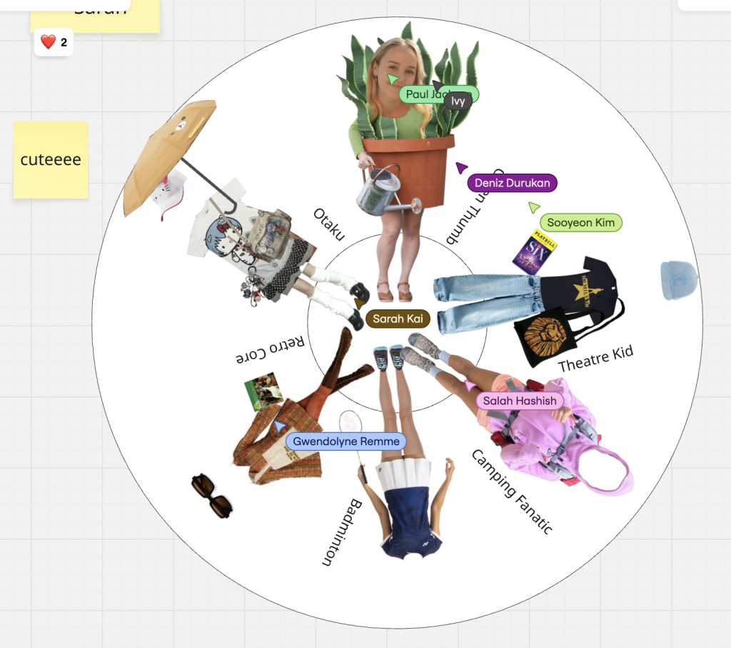
    As a group (Wheel 07), we discussed our individual habits and interests to find six distinct subcultures:

    1. Plant Lover / Green Thumb
    2. Badminton Enthusiast
    3. Camping Fanatic
    4. Retro Core
    5. Otaku
    6. Theatre Kid

    These categories reflected our hobbies and shopping preferences, from eco-friendly lifestyles to sports gear and fandom culture.

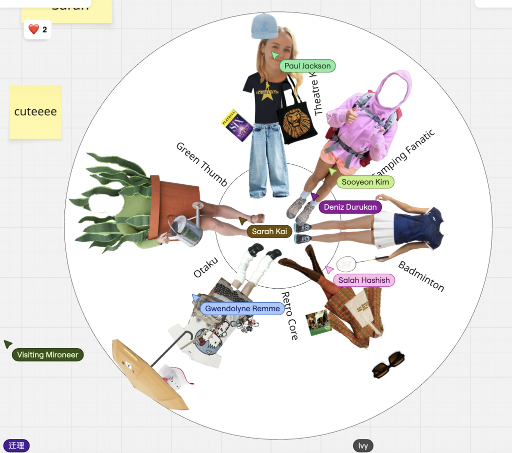
    Task 02 – Create the Fashion Wheel
    Each group member’s chosen subculture was visualised through a collage-style outfit, arranged around a rotating circular wheel.
    For example:

    • Badminton – Sporty outfit with racquet and sneakers.
    • Camping Fanatic – Outdoor gear, boots, thermos, and beanie.
    • Otaku – Anime-inspired T-shirt and accessories.
    • Green Thumb – Costume with watering can.
    • Theatre Kid – Musical T-shirt and tote bag.
    • Retro Core – Vintage Clothes.

    This visual mapping helped us understand how fashion, personality, and consumption form identity markers within Gen Z culture.
    (See image: our group’s Fashion Wheel design.)

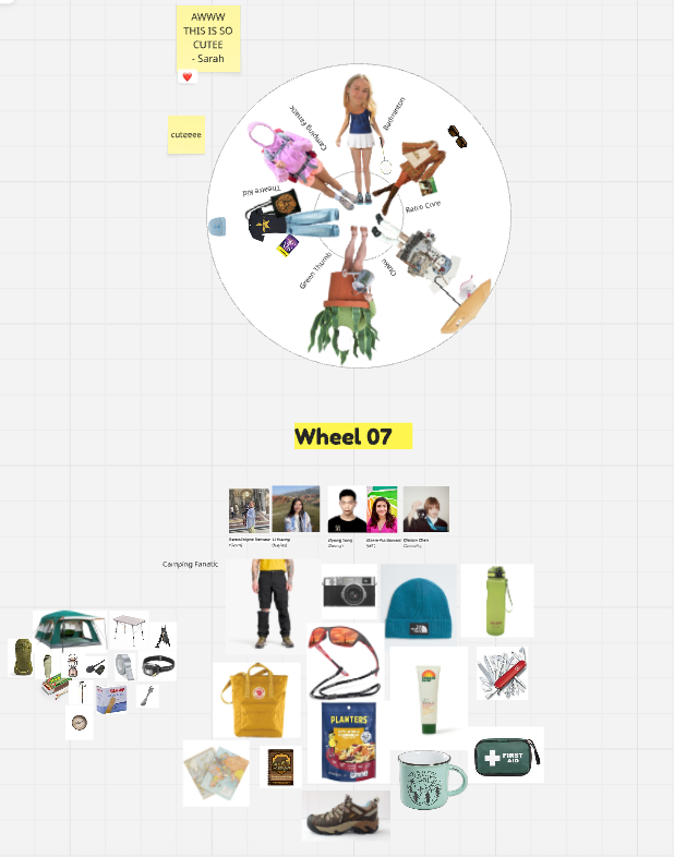
    Task 03 – What’s in the Tote Bag?
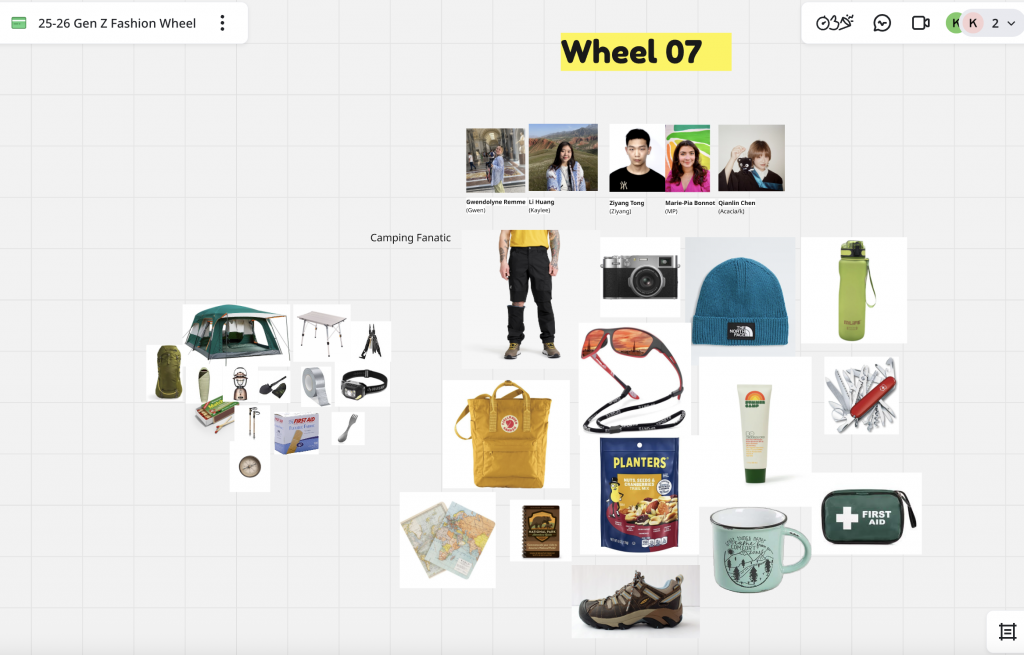
    We then selected one tribe Camping Fanatic to create a “tote bag” filled with items that represent this lifestyle.
    Our selections included a tent, hiking boots, reusable water bottle, beanie, map, camera, first aid kit, and healthy snacks.
    These objects reflect Gen Z’s adventurous, eco-conscious, and experience-driven values.
    (See image: our group’s Camping Fanatic bag moodboard.)

    Reflection

    Through this workshop, I learned how visual culture and fashion can communicate identity, belonging, and value systems. The “Fashion Wheel” made me realise that brand audiences are not just consumers they are communities with shared mindsets and lifestyles.

    From Precious’s lecture, I also understood that successful branding must be co-created with the audience, not imposed from above. Whether designing for a badminton community or a camping tribe, authenticity, dialogue, and inclusivity are key.

  • PlayLab workshop 05 Semiotics is the study of sigh process with Marco Minzoni

    Understanding Semiotics in Branding

    Semiotics is the study of sign processes how meaning is created, interpreted, and communicated through symbols, forms, and structures. In this workshop with Marco Minzoni, we explored how signs can function as systems of communication within visual design and branding. Marco introduced the theories of Charles Sanders Peirce, who identified three key categories of signs: icon, index, and symbol.
    An icon resembles what it represents (for example, Apple’s logo, which looks like an apple); an index shows a direct relationship or cause (such as Amazon’s arrow connecting A to Z); while a symbol depends purely on cultural understanding (like Nike’s swoosh or Mercedes-Benz’s star).

    Marco also discussed how the Bauhaus principles remind designers that shapes such as the square, triangle, and circle are not only visual elements but also carry psychological and emotional associations. In branding, these geometries form the foundation for structure, identity, and communication.

    Activity 1: Reinterpreting Brand-Marks through Shapes

    For the first activity, I was assigned the square as my foundational shape. I chose three existing brand-marks from different semiotic categories:
    Icon — Domino’s Pizza

    Index — Adobe

    Symbol — Microsoft

    Each of these brands already carries a distinct geometric structure that naturally relates to the characteristics of the square are stability, logic, and order. Domino’s represents the iconic level because its logo literally resembles a domino tile; Adobe’s mark functions as an index, linking the abstract “A” shape to the creative tools it provides; and Microsoft’s four squares stand as a symbol, representing systems, diversity, and integration across the digital world.

    I then reinterpreted these logos through circle and triangle compositions. The exercise revealed how much emotional weight the base shape carries:

    • When translated into circles, the marks felt softer, friendlier, and more human.
    • When transformed into triangles, they appeared sharper, more energetic, and dynamic.
    • The square, in contrast, remained calm, logical, and balanced the most structural of all three.

    Through this process, I realised how form alone can shift brand personality and even alter the semiotic category: for instance, Domino’s circular version moved closer to a symbolic sign than an icon, because the resemblance became less literal. This activity deepened my awareness of how geometry influences meaning.

    Activity 2: Group Project: “Lucky Table”

    For the second activity, I worked with four other Chinese classmates. We decided to celebrate a part of our shared heritage by creating a fictional brand inspired by Mahjong, a traditional Chinese cultural game. Our brand, called “Lucky Table,” aims to introduce Chinese board games to global audiences not only as entertainment, but also as cultural experiences that promote understanding and diversity.

    Through the Lucky Table, our social community invites others to experience the charm of Chinese heritage, fostering diversity, understanding, and harmony across cultures.

    The brand’s concept comes from the belief that each seat around a Mahjong table carries its own kind of fortune. In Chinese culture, where you sit your feng shui position can influence your luck and energy. Here, “lucky” becomes tangible, while the table itself becomes a shared platform of interaction and communication.

    Visually, our brand-mark uses the square to represent the four sides of a Mahjong table, each side reflecting one of our core brand values:

    • East — Structure: the logic of play.
    • South — Connection: the bond between players.
    • West — Balance: the harmony of strategy.
    • North — Heritage: the memory of culture.

    The logo’s structure is pieced together from four geometric forms that nearly form a complete square but leave a slight gap symbolising openness and ongoing cultural exchange. This incomplete frame suggests the meeting of players, cultures, and ideas at the same table.

    For the three semiotic versions:

    • The Icon mark directly represents the Mahjong table and tiles, making it tangible and recognisable.
    • The Index version uses overlapping rectangular structures that imply social connection and play.
    • The Symbol simplifies these elements into abstract green forms arranged in a square rotation, representing unity and balance without direct imagery.

    This translation between semiotic types subtly shifts the brand’s tone from playful and concrete (icon), to conceptual and relational (index), to modern and universal (symbol).

    Workshop Reflection

    This workshop helped me understand how deeply form and meaning are intertwined in brand communication.
    The square, my assigned shape, guided every design and storytelling decision it naturally suggested structure, order, and rationality, which became the essence of Lucky Table.
    By exploring how icon, index, and symbol function across visual and cultural levels, I learned that semiotics is not just about decoding visuals, but about constructing experiences that connect people through shared meaning.

    Ultimately, this session allowed me to bridge cultural heritage and design thinking, translating Mahjong’s traditional symbolism into a modern design language that reflects global communication where the table becomes a metaphor for connection, dialogue, and belonging.