Tag: Shape

  • PlayLab workshop 05 Semiotics is the study of sigh process with Marco Minzoni

    Understanding Semiotics in Branding

    Semiotics is the study of sign processes how meaning is created, interpreted, and communicated through symbols, forms, and structures. In this workshop with Marco Minzoni, we explored how signs can function as systems of communication within visual design and branding. Marco introduced the theories of Charles Sanders Peirce, who identified three key categories of signs: icon, index, and symbol.
    An icon resembles what it represents (for example, Apple’s logo, which looks like an apple); an index shows a direct relationship or cause (such as Amazon’s arrow connecting A to Z); while a symbol depends purely on cultural understanding (like Nike’s swoosh or Mercedes-Benz’s star).

    Marco also discussed how the Bauhaus principles remind designers that shapes such as the square, triangle, and circle are not only visual elements but also carry psychological and emotional associations. In branding, these geometries form the foundation for structure, identity, and communication.

    Activity 1: Reinterpreting Brand-Marks through Shapes

    For the first activity, I was assigned the square as my foundational shape. I chose three existing brand-marks from different semiotic categories:
    Icon — Domino’s Pizza

    Index — Adobe

    Symbol — Microsoft

    Each of these brands already carries a distinct geometric structure that naturally relates to the characteristics of the square are stability, logic, and order. Domino’s represents the iconic level because its logo literally resembles a domino tile; Adobe’s mark functions as an index, linking the abstract “A” shape to the creative tools it provides; and Microsoft’s four squares stand as a symbol, representing systems, diversity, and integration across the digital world.

    I then reinterpreted these logos through circle and triangle compositions. The exercise revealed how much emotional weight the base shape carries:

    • When translated into circles, the marks felt softer, friendlier, and more human.
    • When transformed into triangles, they appeared sharper, more energetic, and dynamic.
    • The square, in contrast, remained calm, logical, and balanced the most structural of all three.

    Through this process, I realised how form alone can shift brand personality and even alter the semiotic category: for instance, Domino’s circular version moved closer to a symbolic sign than an icon, because the resemblance became less literal. This activity deepened my awareness of how geometry influences meaning.

    Activity 2: Group Project: “Lucky Table”

    For the second activity, I worked with four other Chinese classmates. We decided to celebrate a part of our shared heritage by creating a fictional brand inspired by Mahjong, a traditional Chinese cultural game. Our brand, called “Lucky Table,” aims to introduce Chinese board games to global audiences not only as entertainment, but also as cultural experiences that promote understanding and diversity.

    Through the Lucky Table, our social community invites others to experience the charm of Chinese heritage, fostering diversity, understanding, and harmony across cultures.

    The brand’s concept comes from the belief that each seat around a Mahjong table carries its own kind of fortune. In Chinese culture, where you sit your feng shui position can influence your luck and energy. Here, “lucky” becomes tangible, while the table itself becomes a shared platform of interaction and communication.

    Visually, our brand-mark uses the square to represent the four sides of a Mahjong table, each side reflecting one of our core brand values:

    • East — Structure: the logic of play.
    • South — Connection: the bond between players.
    • West — Balance: the harmony of strategy.
    • North — Heritage: the memory of culture.

    The logo’s structure is pieced together from four geometric forms that nearly form a complete square but leave a slight gap symbolising openness and ongoing cultural exchange. This incomplete frame suggests the meeting of players, cultures, and ideas at the same table.

    For the three semiotic versions:

    • The Icon mark directly represents the Mahjong table and tiles, making it tangible and recognisable.
    • The Index version uses overlapping rectangular structures that imply social connection and play.
    • The Symbol simplifies these elements into abstract green forms arranged in a square rotation, representing unity and balance without direct imagery.

    This translation between semiotic types subtly shifts the brand’s tone from playful and concrete (icon), to conceptual and relational (index), to modern and universal (symbol).

    Workshop Reflection

    This workshop helped me understand how deeply form and meaning are intertwined in brand communication.
    The square, my assigned shape, guided every design and storytelling decision it naturally suggested structure, order, and rationality, which became the essence of Lucky Table.
    By exploring how icon, index, and symbol function across visual and cultural levels, I learned that semiotics is not just about decoding visuals, but about constructing experiences that connect people through shared meaning.

    Ultimately, this session allowed me to bridge cultural heritage and design thinking, translating Mahjong’s traditional symbolism into a modern design language that reflects global communication where the table becomes a metaphor for connection, dialogue, and belonging.
  • PlayLab workshop 04 Talk about Narratives with Mikala Georgia Grante

    This week’s PlayLab invited us to explore how simple geometric forms can become storytelling devices. Our task was to mix and match a kind of narrative, a narrative space, and a kind of media, using our assigned shape as the starting point.

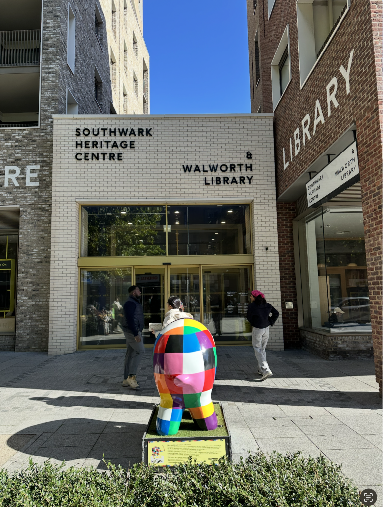
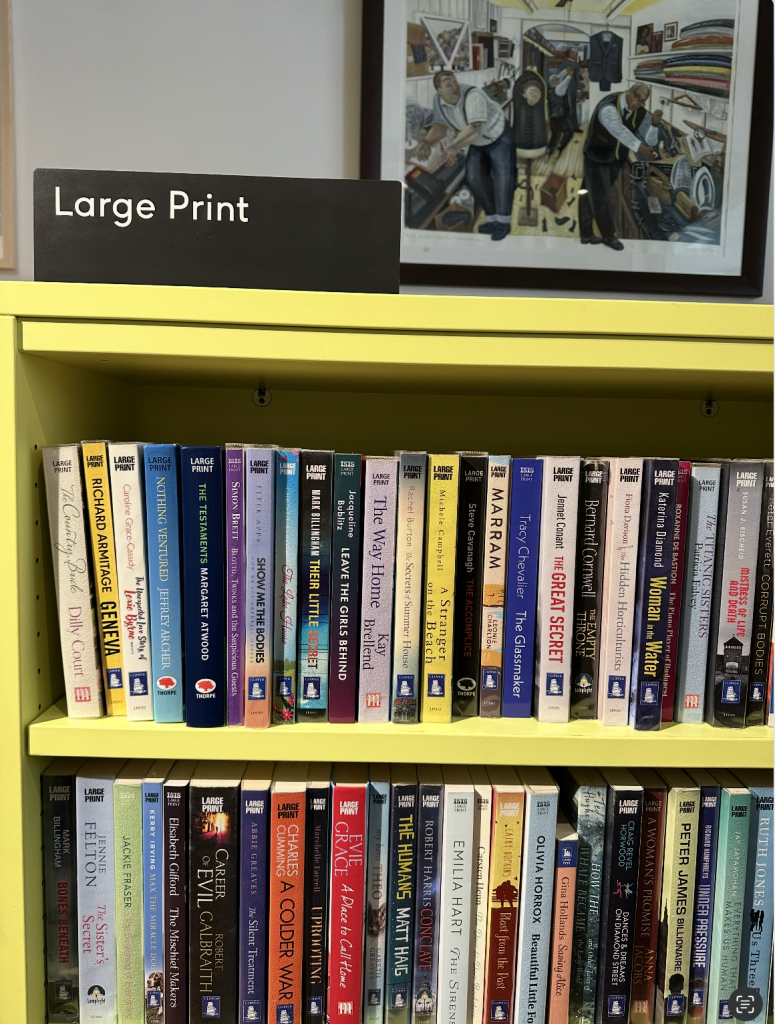
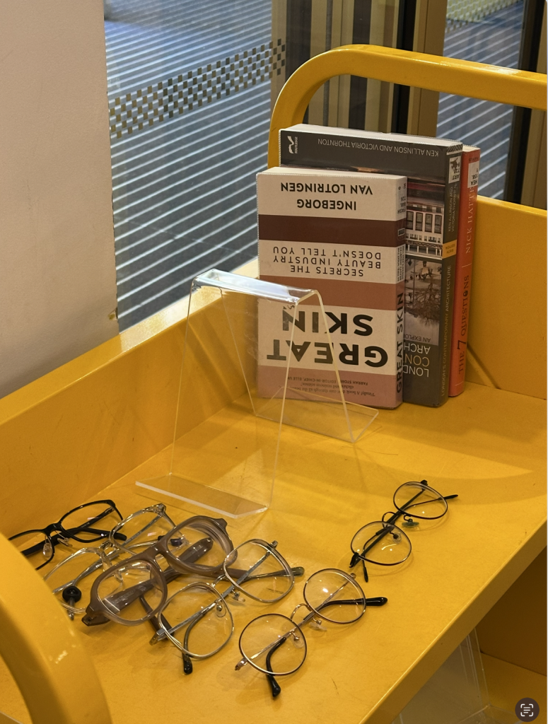
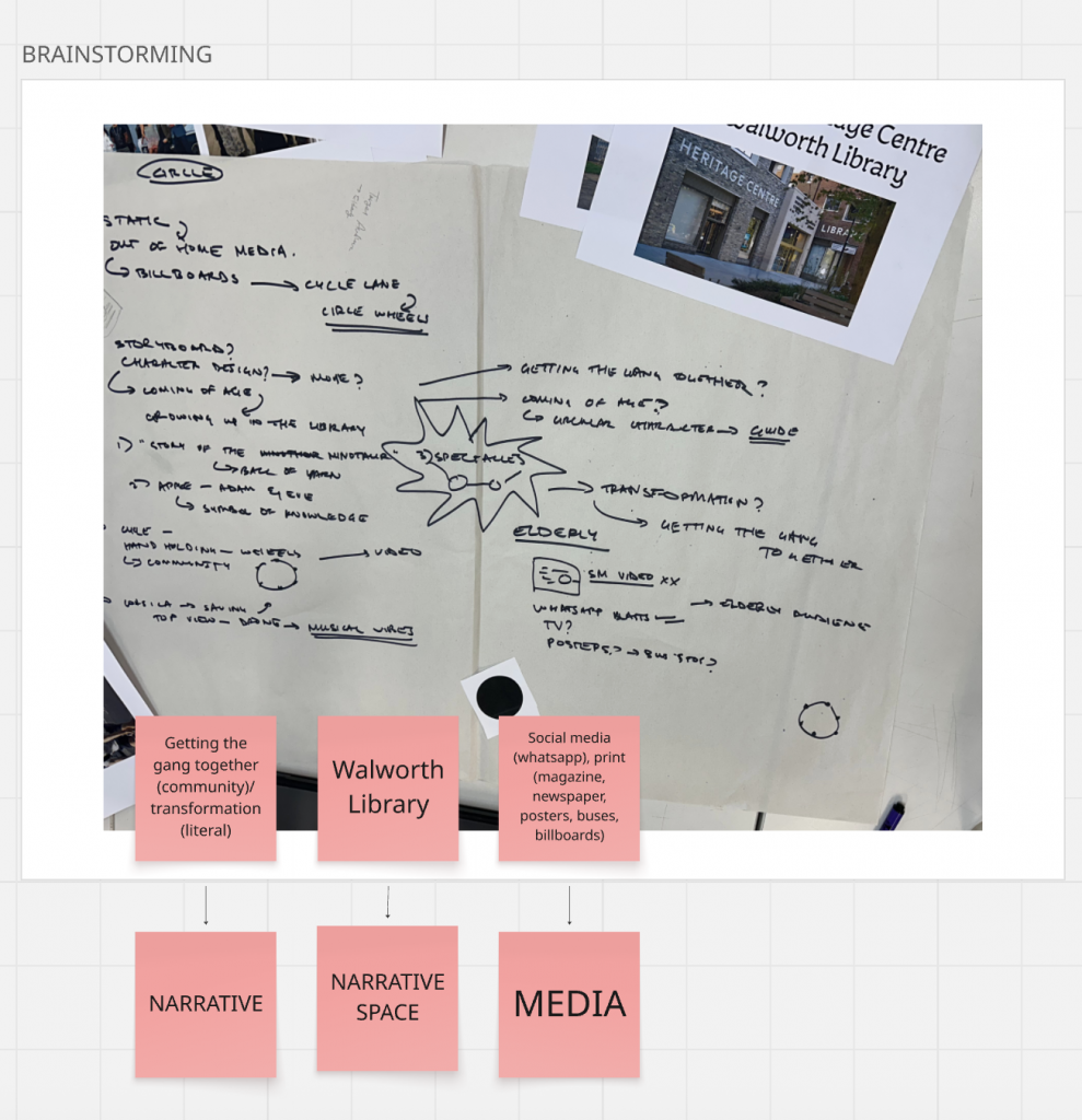
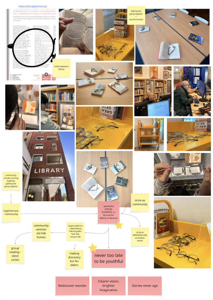
    Our group received the circle a symbol of connection, continuity, and community. We chose the Walworth Library as our narrative space and built our story around the idea of spectacles a literal and metaphorical lens through which older readers rediscover clarity, imagination, and belonging. Inspired by a Korean library that lends reading glasses to elderly visitors, we transformed this functional gesture into a narrative of transformation and togetherness.
    Narrative: Getting the Gang Together + Transformation
    Narrative Space: Walworth Library
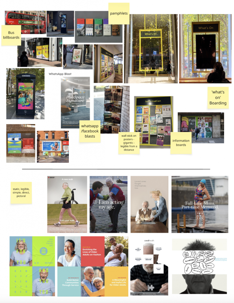
    Media: Print-led (posters, bus-shelter ads, library signage) with limited WhatsApp and Facebook use

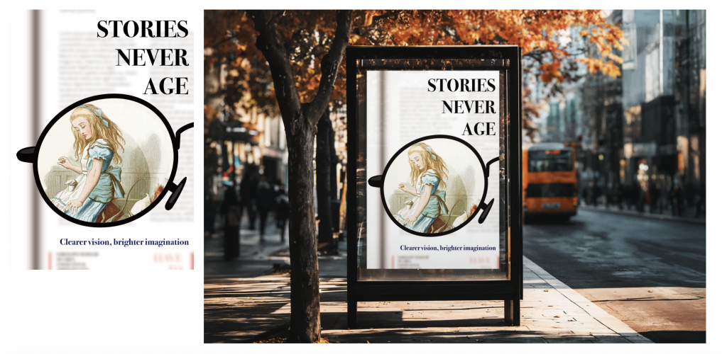
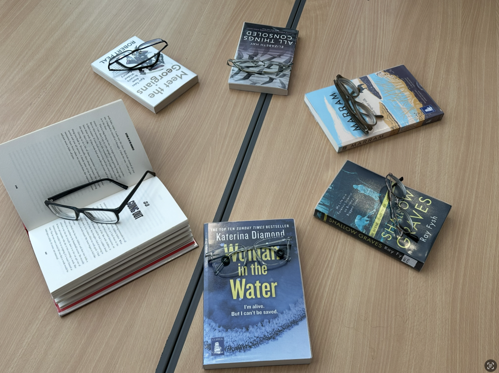
    Our campaign, titled Stories Never Age, celebrates ageing as another chapter of imagination. The circular lens became our central visual motif framing the transition from blurred to clear, isolated to connected. Each poster plays with depth of field: sharp inside the lens, soft beyond it, symbolising how libraries help people refocus on the world and one another.

    We deliberately chose print over digital, aligning with the idea of a “digital detox” that many library visitors seek. The tone of voice is gentle, inclusive, and quietly confident “Clearer vision, brighter imagination.” Through this visual narrative, the circle evolves from a flat shape into a social gesture, turning sight into insight and transforming the act of reading into a shared experience.

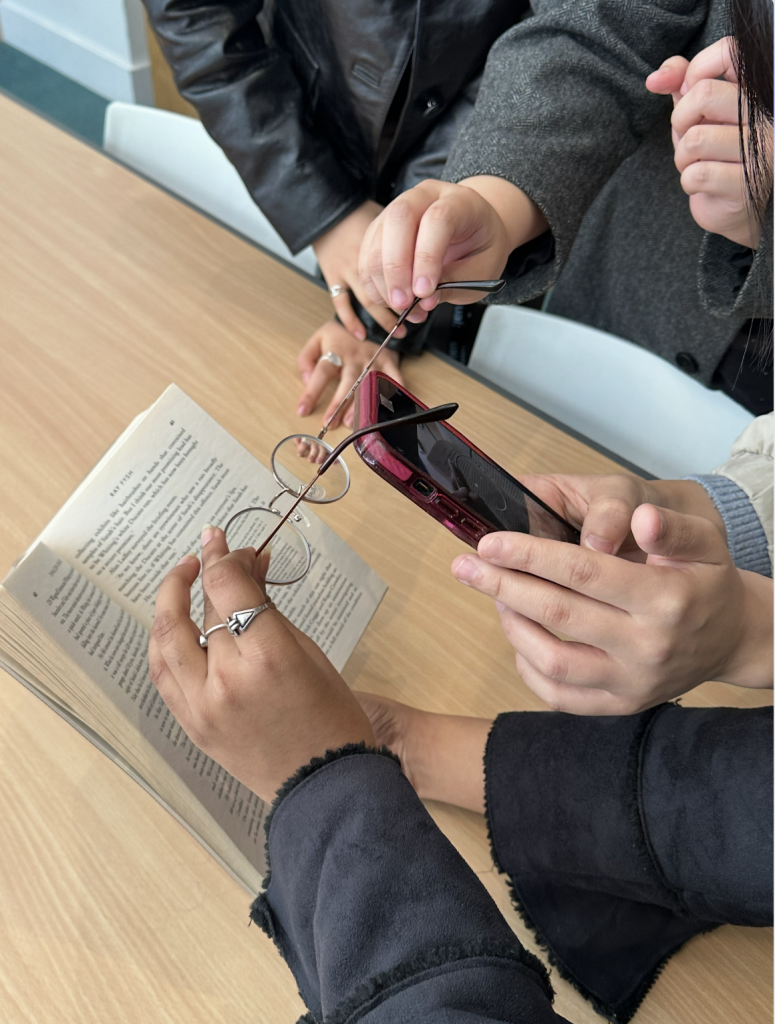
    By visiting Walworth Library to test our idea in context photographing shelves, light, and reflections through real glasses we learned how physical space and human experience can shape a brand story. What began as an abstract circle became a symbol of empathy: a reminder that storytelling, like vision, is most powerful when it brings people together.

  • PlayLab Workshop 03: If You Were a Square, Triangle or Circle with Eugenie Dodd & Karen Burbano

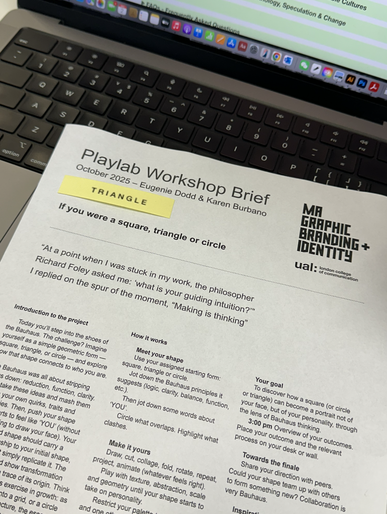
    This workshop invited us to imagine ourselves as one of the three Bauhaus shapes a square, triangle, or circle and explore how a simple form could express personality. Guided by Bauhaus thinking, we were encouraged to strip away ornament and focus on function, essence, and transformation.

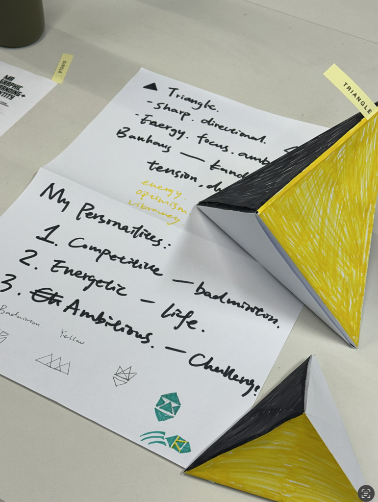
    I was assigned the triangle, a shape often associated with direction, energy, and ambition. It also connects deeply with Kandinsky’s idea of upward striving and Gropius’s emphasis on clarity and purpose.

    I began by reflecting on my own personality and how it could be translated through the triangle:

    1. Competitive (Black) – This colour symbolises focus and determination, inspired by my badminton experience. The black surfaces of my folded triangles represent strength and confidence.
    2. Energetic (White) – White adds lightness and openness, expressing positivity and balance in everyday life.
    3. Ambitious (Yellow) – Yellow, as Kandinsky connected with triangles, reflects challenge, optimism, and upward motion. It represents my motivation to keep growing and evolving.

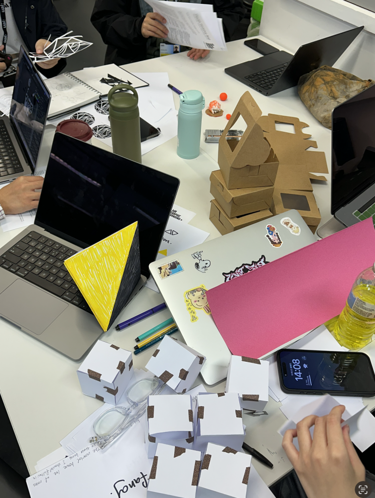
    Using these traits, I created a series of folded origami triangles. Each fold became a small act of discovery learning how the paper behaves, how edges meet, and how light and shadow create structure. Following Albers’s pragmatic view, I treated the paper respectfully, allowing its natural qualities to guide the design. Inspired by Itten, the making process became a meditative way of seeking inner clarity.

    In the end, the clustered triangles formed a self-portrait without a face a combination of energy, balance, and ambition. Guided by Moholy-Nagy, I embraced experimentation and the dialogue between hand and material. The outcome was simple but expressive: a personal translation of Bauhaus principles through form, colour, and emotion.

    This workshop felt abstract at first, but through making, the idea became clearer: “Making is thinking.” The process of folding and composing triangles helped me understand that identity can be visualised through geometry not as decoration, but as distilled essence.

  • PlayLab Workshop 01: Shapes, Typography, and Branding with Alice Galli

    In our first PlayLab workshop, we were introduced to the world of shapes, typography, and branding through the lens of Alice Galli, a freelance graphic and motion designer from Catania, Italy. Alice shared her practice, particularly her unpublished typeface Lydra, and guided us in exploring how simple shapes can evolve into complex narratives.

    Shapes as the Foundation of Design

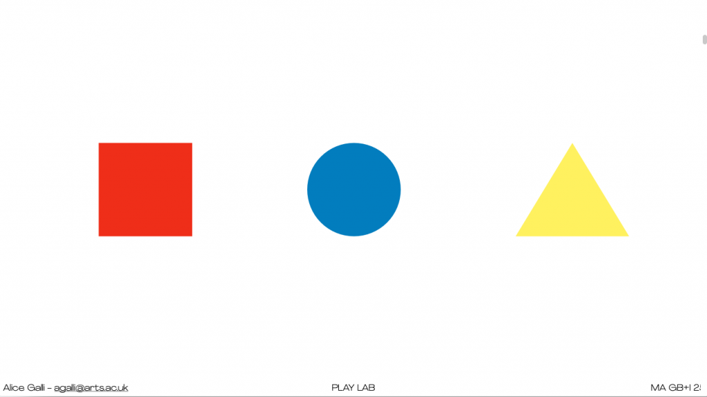
    Alice began with three primary forms square (red), circle (blue), and triangle (yellow) a nod to Bauhaus in Germany (1919), and Wassily Kandinsky’s exploration of geometry and colour. We also learned how women in the Bauhaus were largely confined to textile design, while figures like Herbert Bayer went on to design iconic typefaces later picked up by global brands like Nike and even vodka advertising.

    Each shape carries its own meaning in branding:

    • Square – stable, grounded
    • Circle – spiritual, calm
    • Triangle – dynamic, energetic

    This thinking immediately linked to real-world examples: the Headspace app uses circular forms in its motion videos to visualise breathing; London Underground employs strong geometric signage; and NTS radio plays with light as shape.

    Narrative Power of the Triangle

    The triangle proved to be the most versatile. It can signify mountains, play buttons (YouTube), or even luxury branding, like the downward-pointing triangle in Prada’s logo. Adding colour shifts meaning further: Toblerone builds its brand on a mountain-shaped triangle, while Doritos emphasises their snack’s geometry with “be more triangle.”

    Our Group’s Process: Fresh + Circle

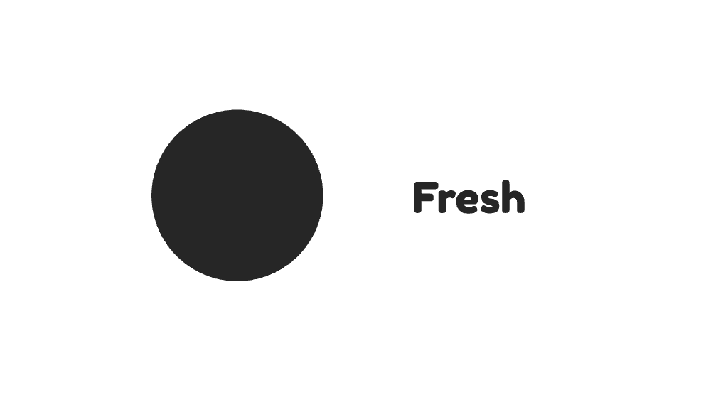
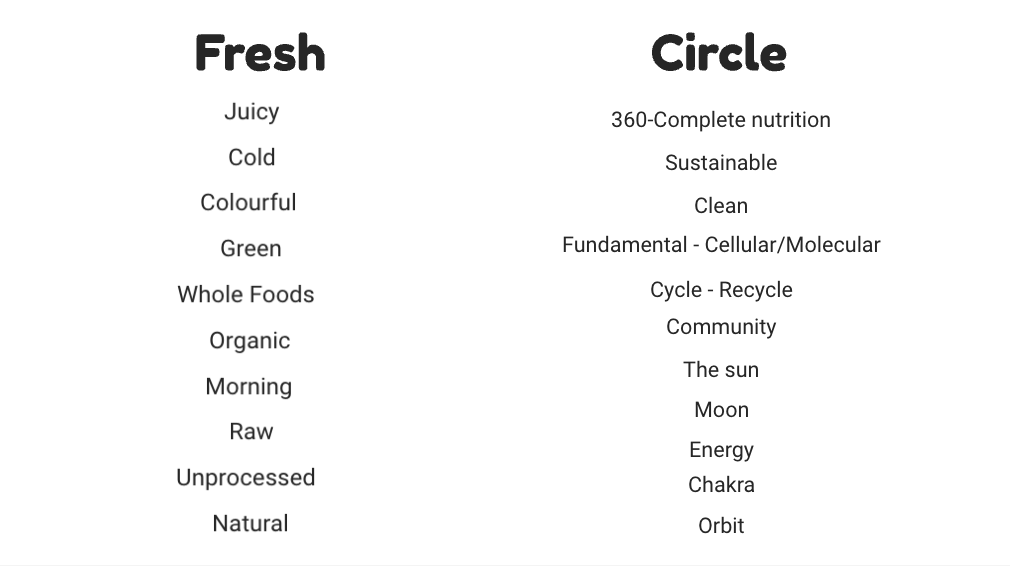
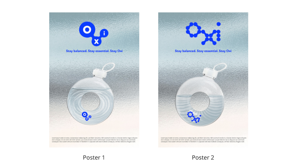
    Our team chose to focus on the circle, pairing it with the idea of freshness to inspire a new brand concept. We brainstormed keywords such as natural, fundamental, molecular, organic, and sustainable. These values connected freshness (juicy, raw, unprocessed, green) with the circle (wholeness, cycles, energy, community).

    Finding Connections: Fresh × Circle

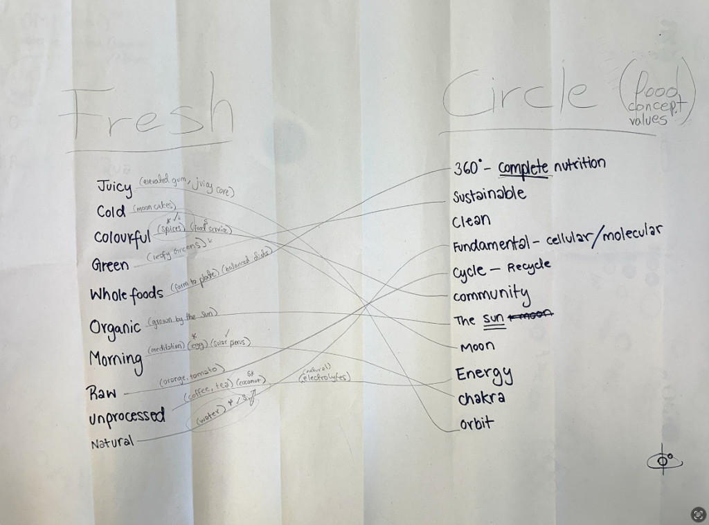
    One of the key exercises in our process was to bridge the idea of “Fresh” with the conceptual values of the circle, especially within food branding.

    We brainstormed words around freshness, juicy, cold, colourful, green, whole foods, organic, raw, unprocessed, natural and then aligned them with the symbolic qualities of the circle wholeness, 360° nutrition, sustainability, community, energy, cycles.

    Some interesting connections emerged:

    • Juicy ↔ Energy: the burst of flavour and vitality mirrors the energetic, flowing quality of a circle.
    • Green / Organic ↔ Sustainable / Community: fresh produce links to cycles of nature and shared food culture.
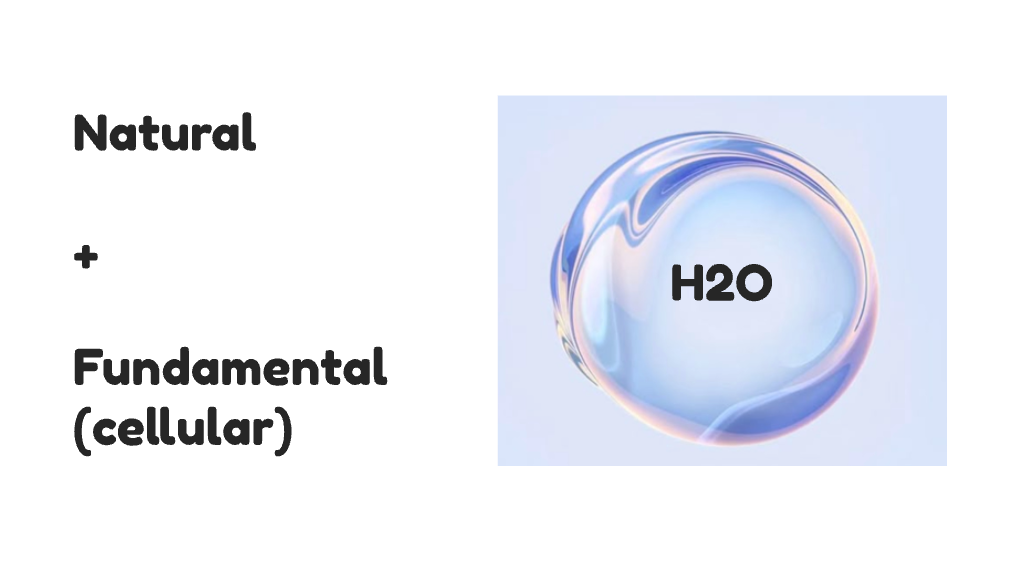
    • Raw / Unprocessed ↔ Fundamental / Cellular: the purity of raw food reflects the elemental, molecular meaning of the circle.
    • Morning ↔ Cycle / Orbit: freshness at the start of the day relates to daily rhythms and circular repetition.

    This mapping exercise helped us see how abstract shape values could be tied to concrete branding narratives. For example, a circle is not just a form it can stand for wholeness, balance, and community, all of which are deeply relevant to the story of “fresh” food products.

    From there, we began sketching names and identities:

    • OMI (from the Yoruba word for water)
    • OXI (oxygen, essential balance)
    • O-ter (orbit + water)
    • Ripples (a visual metaphor for expansion)

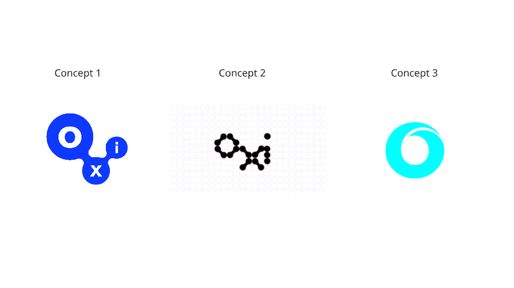
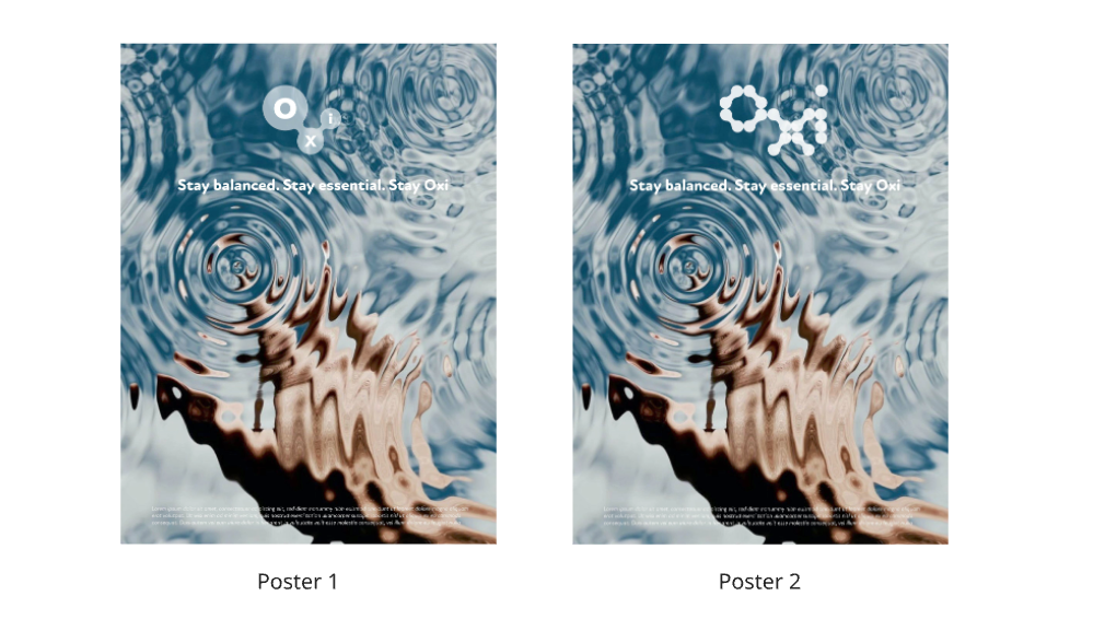
    We eventually gravitated towards OXI, because of its clean, elemental connection to oxygen and water. We developed the tagline:


    “Stay balanced. Stay essential. Stay Oxi.”

    Visual Exploration

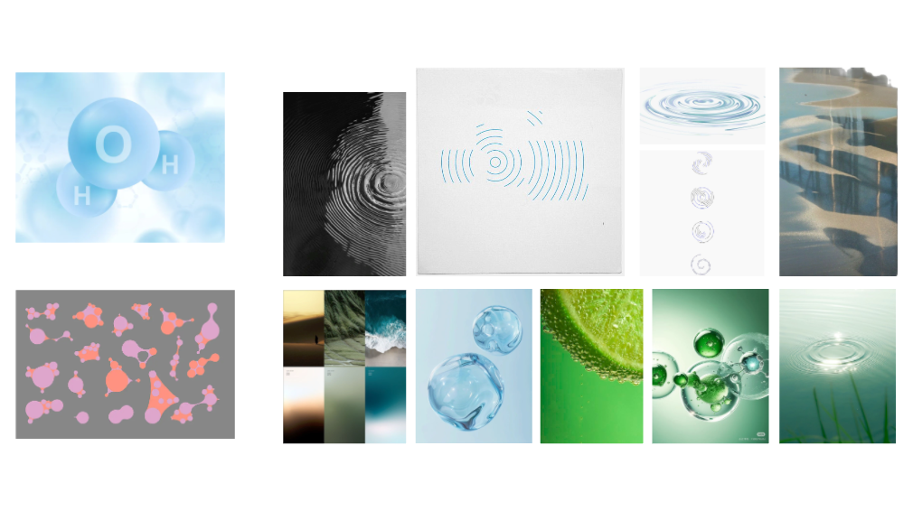
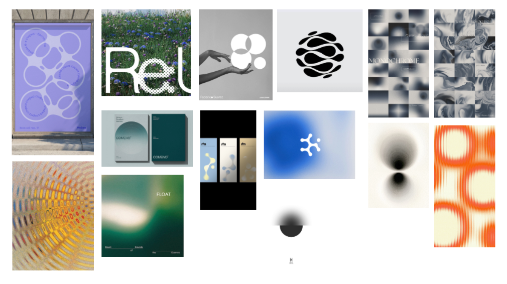
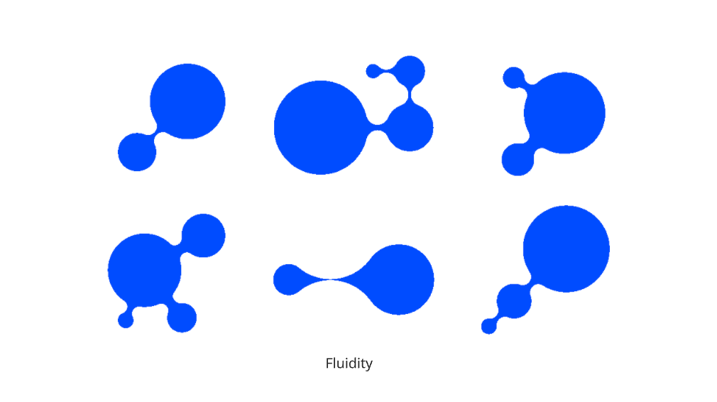
    We experimented with both analogue sketches and digital mockups overlaying circles, repeating ripples, and intersecting “O” and “X” forms. Some ideas were inspired by molecules, cycles, and drops of water.

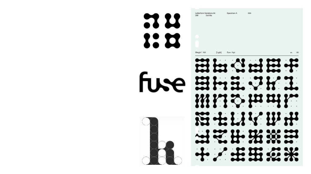
    Personally, I was most drawn to the wordmarks built with circular typeforms, since the workshop itself was framed around creating a typeface from shapes. For me, designing the letters through circular construction felt the most conceptually strong direction for OXI.

    Unfinished but Evolving

    This remains an unfinished design project. As a group, we spent a lot of time developing research and conceptual groundwork, but didn’t have enough time to fully resolve the final poster or typeface. We hope to revisit the project later to refine the wordmark and visual identity further.

    Reflection

    Even though incomplete, the workshop showed me how a single shape like the circle can generate powerful stories and identities. OXI represents a balance of concept and form, and this process reminded me that branding is not just about the final output, but also about exploring meaning and narrative through design.