Workshop Summary: Understanding Brand Experience and Glocalisation
This week’s Brand Experience workshop explored how global brands adapt and translate their identity into new cultural contexts through brand activations experiences that invite direct interaction between brands and audiences. The key takeaway was that brands are not static symbols but dynamic cultural resources that co-create meaning within specific social and geographic contexts.
We learned that glocalisation (global and local) is the process where global brand strategies are reinterpreted and reshaped by local cultures. Rather than imposing a one-size-fits-all identity, successful brands adapt their visual language, storytelling, and experiences to resonate with local audiences while maintaining core values.
Glocal marketing was described as blending global consistency with local relevance keeping brand DNA intact while responding to local consumer preferences, trends, and cultural touchpoints. Examples like Coca-Cola’s “Tasty Fun” localisation in China and The Old Irish Pub chain in Scandinavia showed how cultural translation builds authenticity and connection.
We also discussed cultural identity in branding how brands reflect and shape cultural values. As Holt (2006) and Schroeder (2009) note, brands act as carriers of meaning, embedding themselves in cultural narratives. For this workshop, we were challenged to explore this through the design of a brand experience that imports one culture into another, using creative localisation to bridge the two worlds.
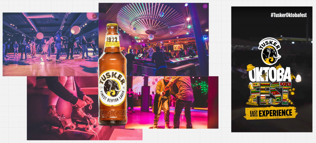
Task 1: Brand Activation — “Rhythm & Roll by Tusker”
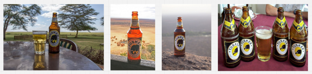
Allocated Brand: Tusker Lager, Kenya’s most iconic beer brand (founded 1922).
Core Values: Togetherness · Adventure · Authenticity · Cultural Pride
Tusker embodies East African heritage a celebration of community, music, and the joy of shared experiences. Our challenge was to bring that spirit to the UK in a way that feels both authentically Kenyan and locally engaging.
Concept Overview
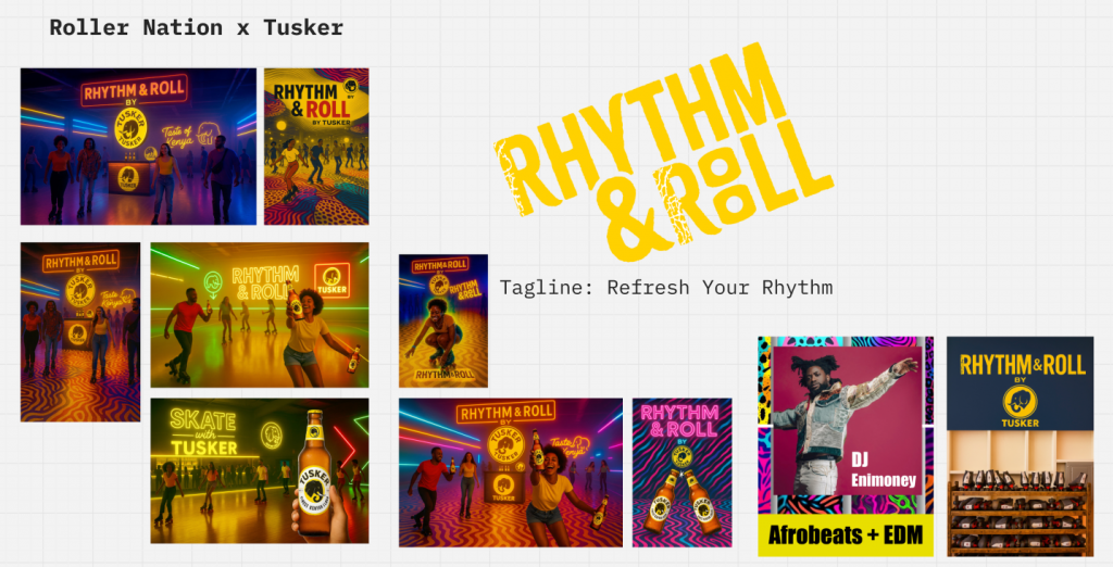
Title: Rhythm & Roll by Tusker
Meaning: A creative nod to “Rhythm & Blues” and the roller-skating rhythm culture popular in both Kenya and the UK. It blends African rhythm, urban nightlife, and the social energy of skating connecting people through movement, music, and togetherness.
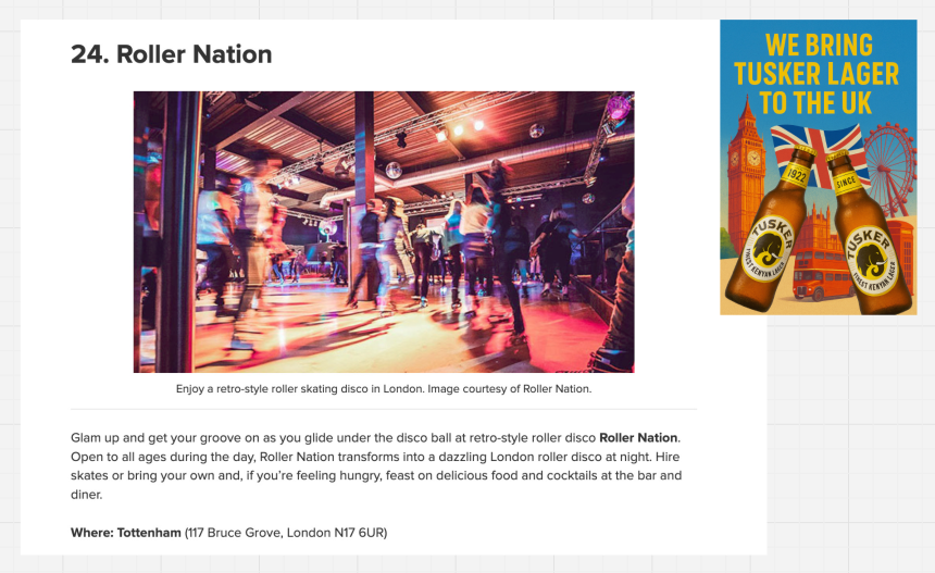
The activation reimagines Tusker’s East African warmth within London’s dynamic social scene through a roller-skating pop-up event, partnering with Roller Nation (Tottenham), one of the UK’s leading retro roller disco venues.
Task 2: Brand Experience Design
Brand Positioning in the UK Market
The UK beer market is dominated by global giants such as Heineken, Guinness, and Carlsberg, yet consumers aged 25–40 are increasingly drawn to story-driven, experiential, and culturally diverse brands. With rising demand for global flavours and event-based drinking, Tusker has the opportunity to position itself as a taste of Kenya through shared rhythm and energy.
The Activation Experience
Event Name: Rhythm & Roll by Tusker
Tagline: Refresh Your Rhythm
Experience Design:
- Venue: Roller Nation, Tottenham transformed into an immersive space combining Afrobeat and EDM, neon lights, and African pattern graphics inspired by Tusker’s iconic elephant and Kenyan textiles.
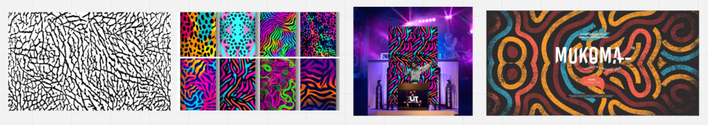
- Visual Identity: Elephant-skin and tribal patterns merge with neon roller-rink aesthetics, creating a vibrant fusion of Kenyan tradition and London nightlife.
- Activities:
- Roller skating sessions to live DJ sets
- “Skate with Tusker” photo zone
- Pop-up bar serving Tusker Lager and mocktail variants
- Interactive wall featuring the Kenya–UK connection map (Nairobi ↔ London)
- Cultural Touchpoints:
- Afrobeat rhythms symbolising Kenyan vitality
- Pattern and colour palette (yellow, pink, blue neon) merging African motifs with London’s retro disco vibes
- Inclusion of the growing Black roller-skating community in the UK, highlighting cultural continuity and inclusivity
Launch Campaign Strategy
Campaign Objective
Introduce Tusker as a cultural bridge “Kenya’s beer meets London’s rhythm” celebrating diversity, togetherness, and global-local fusion.
Key Campaign Elements
- Social Media Launch
- Hashtag: #RhythmAndRoll #TuskerUK #TasteOfKenya
- Teaser clips featuring roller skaters, Afrobeats soundtracks, and Tusker bottles under neon lights.
- Countdown posts and influencer collaborations from both Kenyan diaspora and UK roller-skating communities.
- Collaborations
- Partner with Roller Nation London, Afrobeats DJs, and diaspora community groups for cultural authenticity.
- Pop-up tastings at universities (targeting international students).
- Visual Campaign Assets
- Posters: “We Bring Tusker Lager to the UK” featuring London icons (Big Ben, red buses) blended with Kenyan flag colours.
- Ambient branding: Elephant-inspired floor projections and LED signage.
- Merchandise: “Refresh Your Rhythm” T-shirts and limited-edition Tusker cans with UK–Kenya dual flag design.
- Event Launch
- Soft launch during Black History Month in October.
- Press and influencer night featuring live music, skating demos, and interviews with Kenyan creatives in the UK.
Reflection
Through this project, I learned how glocalisation allows a brand to evolve not by abandoning its origins, but by translating cultural essence into local relevance. Tusker’s Kenyan identity is not diluted in the UK context; instead, it becomes a connector of communities, uniting Londoners through shared rhythm, joy, and inclusivity.
This exercise reinforced how brand experience design goes beyond marketing it’s about creating spaces of cultural exchange where products, people, and place intersect meaningfully.